Art Museum Mobile App
Streamlining the museum visit experience

Overview
As part of Google’s UX Design Certificate program, I designed a mobile application tailored for a conceptual art museum. While the design was not tethered to any particular museum, I drew inspiration from various Philadelphia-based institutions to shape its aesthetic and functionality.
Problem
How can I design a mobile app that enables people of all abilities to plan a trip to the museum and navigate the museum after they arrive with ease?
Solution
Although mobile app design might not be museums' primary focus, my aim was to design an application that streamlines the museum visit experience, making trip planning and navigation effortless and inclusive for individuals of all abilities.
Responsibilities
UX Research, UX Design, Usability study and testing
Role
Interactive mobile app prototype
Tools
Figma, Survey Monkey, Procreate, Google Docs
Timeline
Winter/Spring 2023
User Research
User Personas

Joseph
Joseph is an international college student that has recently moved to the US for his studies. English is not his primary language, and he sometimes struggles to communicate while out running errands, ordering at a restaurant, etc. He has a passion for the arts and enjoys going to museums.

Neelam
Neelam is an established education professional with 10 years of teaching experience. She is passionate about her job but sometimes has trouble managing the stress of teaching while also raising a young child. Neelam appreciates products that help her stay more organized and manage her time in the classroom and at home. She has a young daughter that she would like to expose to the arts, and wants to easily fit visits to museums in their busy schedule.
Competitive Analysis
Philadelphia has many great museums that I looked into for my mobile app analysis. Here are some important points I found about their online presence. Each museum had useful features to consider and some downsides to avoid.
-
Direct Competitor
Pros:
A bold, simple, and beautifully designed website.
Intuitive navigation bar and items.
Simplified ticket purchasing process.
Cons:
No designated mobile app.
Overall thoughts:
This is an amazing example of functional and aesthetically pleasing web/UI design. The design is modern, has personality, but isn't too flashy. A great example to work with.
-
Direct Competitor
Pros:
Clean and simple web presence.
Feature-rich mobile app, including accessibility features.
Cons:
Although the mobile app is loaded with features, it seems a bit over cluttered and bloated.
The layout of the mobile app could be simplified to be more user friendly.
Overall thoughts:
While the museum has a polished web presence as well as a fully-fledged mobile app, the app itself could use some work to be more user friendly to those who aren’t as technically inclined.
-
Direct competitor
Pros:
Cleanly branded website that conveys the image of the museum.
The website overall is simple and easy to navigate.
Cons:
No mobile app.
The main user story of purchasing a ticket to the museum could be simplified. The “plan your visit” page does require a good bit of scrolling to get to the “purchase tickets” button, which could be presented more prominently as well.
Text gets lost over images in several places.
Overall thoughts:
While the presentation of the website is well done and polished, the functionality of purchasing tickets could be improved and simplified.
-
Indirect competitor
Pros:
Website has a comfortable and simple layout.
The “get tickets” button is prominently displayed on the navigation bar.
The tone of the website is fun and playful, yet professional.
Cons:
The site could use some additional accessibility information.
Overall thoughts:
This site maintains great balance of both clean design as well as intuitive functionality.
-
Indirect competitor
Pros:
Polished and well laid out website.
The “buy tickets” call to action is prominently displayed on the navigation bar.
Cons:
No mobile app.
Overall thoughts:
It appears that The Franklin Institute had redid their website while I was conducting my research. Initially the website felt outdated and clunky. However now it is polished, laid out logically, and has strong branding.
Ideation Process
Design Decisions

QR Code System
I aimed to introduce a QR code scanner, allowing visitors to access museum maps, accessibility info, and details on exhibits, artists, and artwork. This feature would enhance accessibility and personalization for all visitors.
While valuable, implementing a system of QR codes would require significant planning, coordination, and ongoing maintenance as exhibits change. Assessing its feasibility and user impact would need further research beyond the scope of this academic project.
Additionally, I prioritized this feature early on without research to confirm its value to users. It was more of a “QR codes are useful, so let’s include them” decision rather than a solution driven by user needs.
Initial Designs
Hand Drawn Wireframes

Digital Wireframes

Usability Study
Study Overview
Study Type: Unmoderated usability study via Google Doc
Participants: 4 participants
Location: United States, remote
Length: ~10 minutes
Testing Insights
High Fidelity Designs
-
![]()
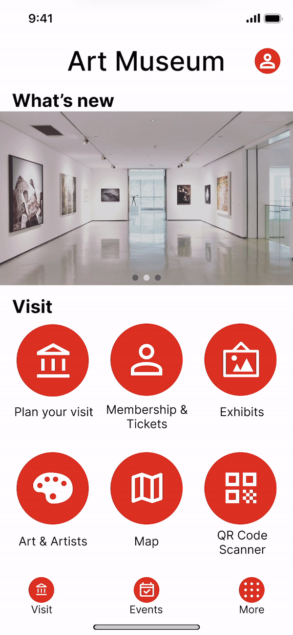
Home
-
![]()
Ticket selection - day and time
-
![]()
Ticket selection - admission types
-
![]()
Checkout
-
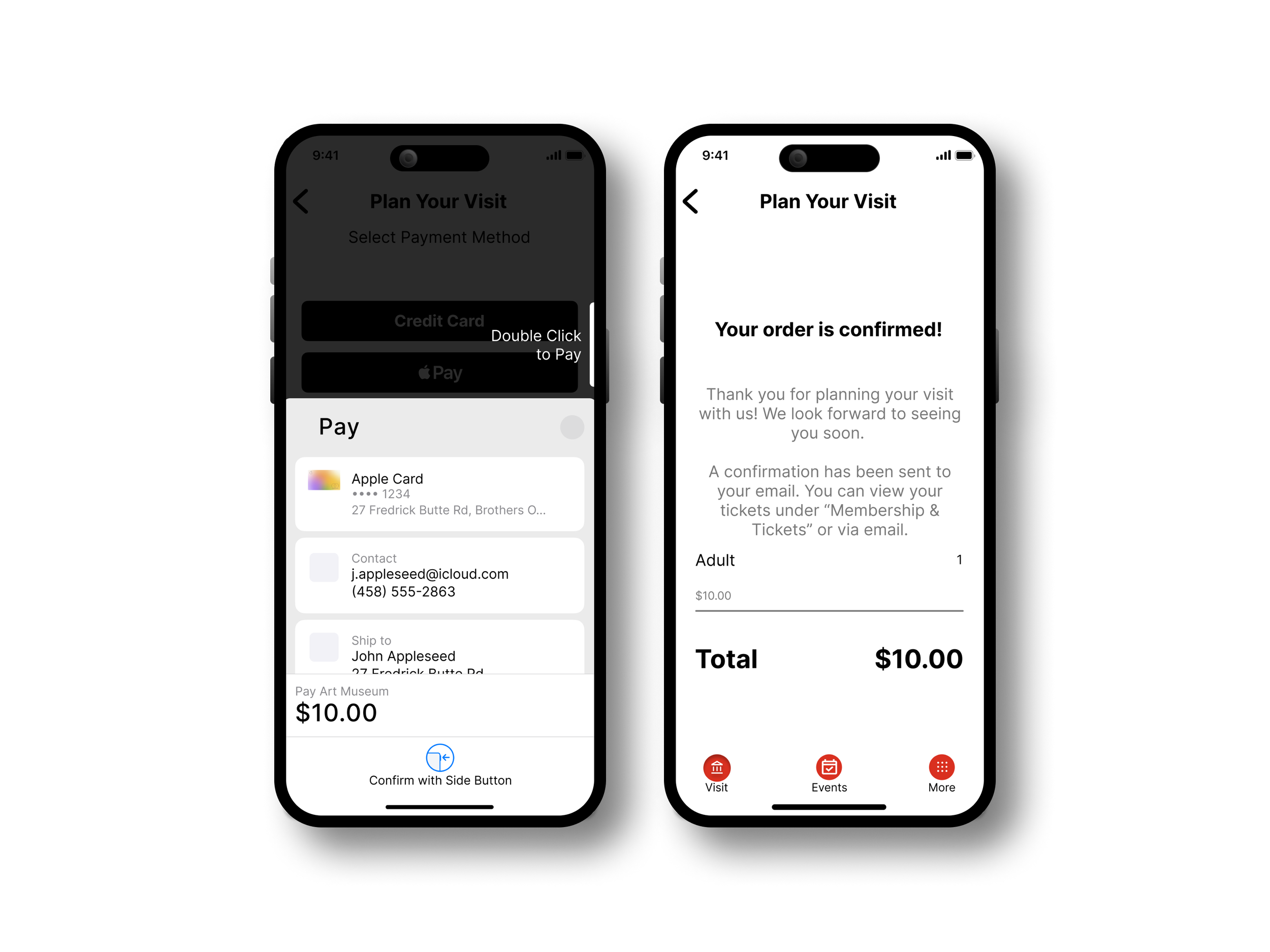
![]()
Payment and confirmation
-
![]()
Artist list and detail
-
![]()
Events list and event details
-
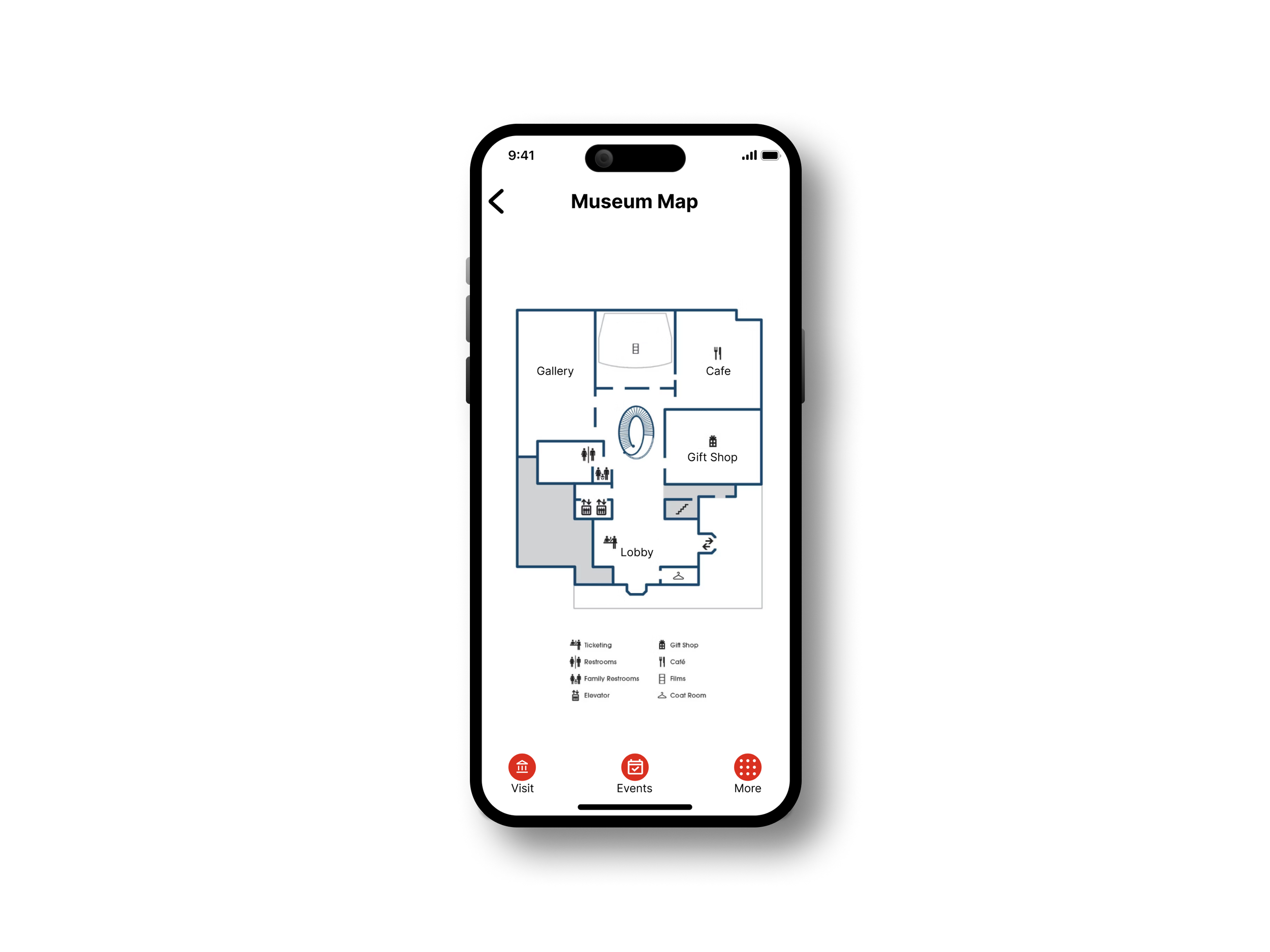
![]()
Museum map
-
![]()
More options
-
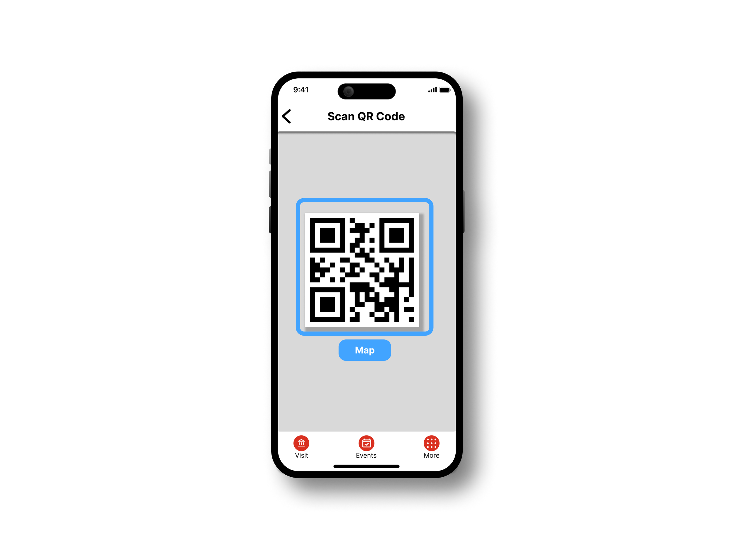
![]()
QR Code scanner concept

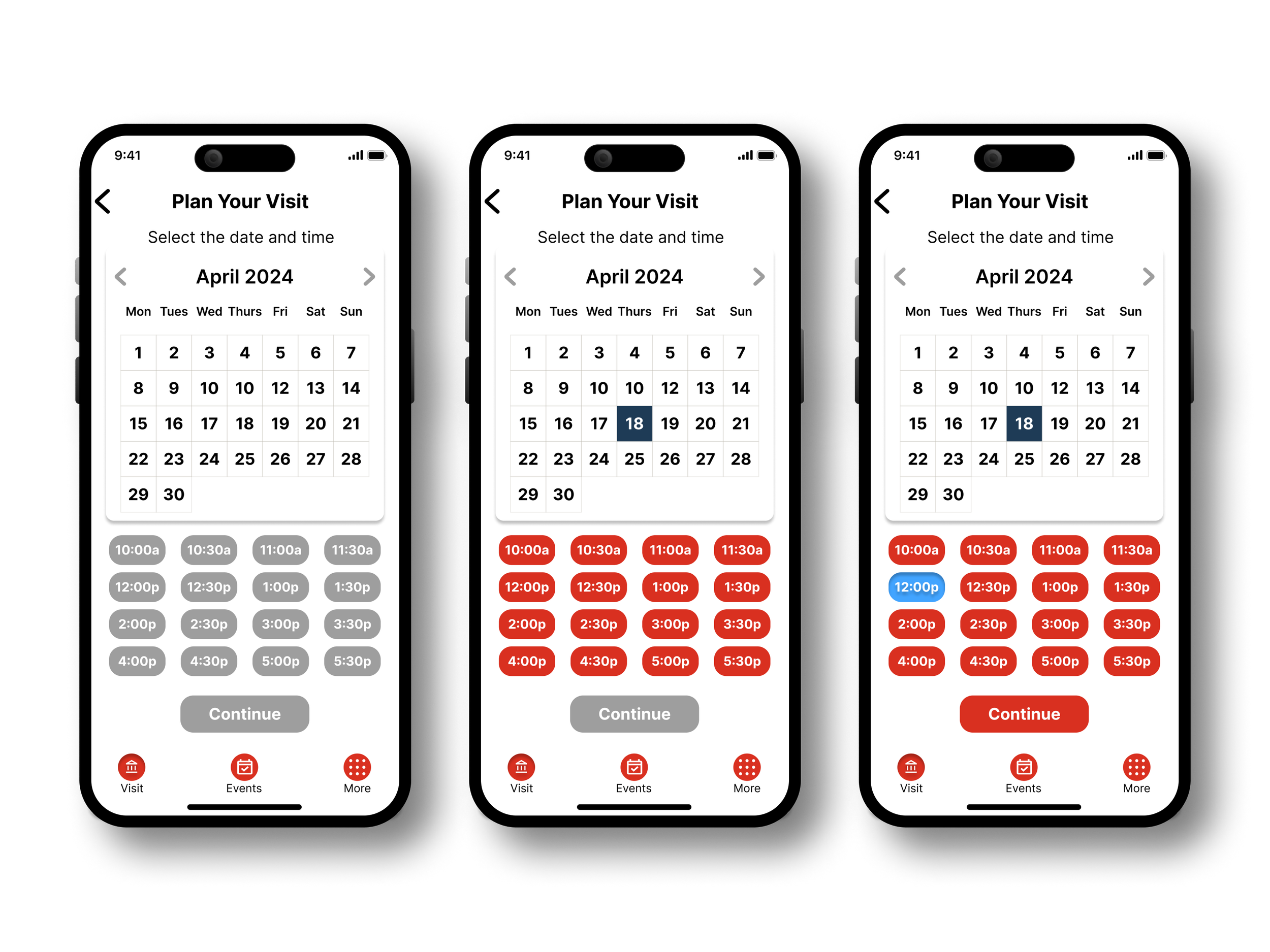
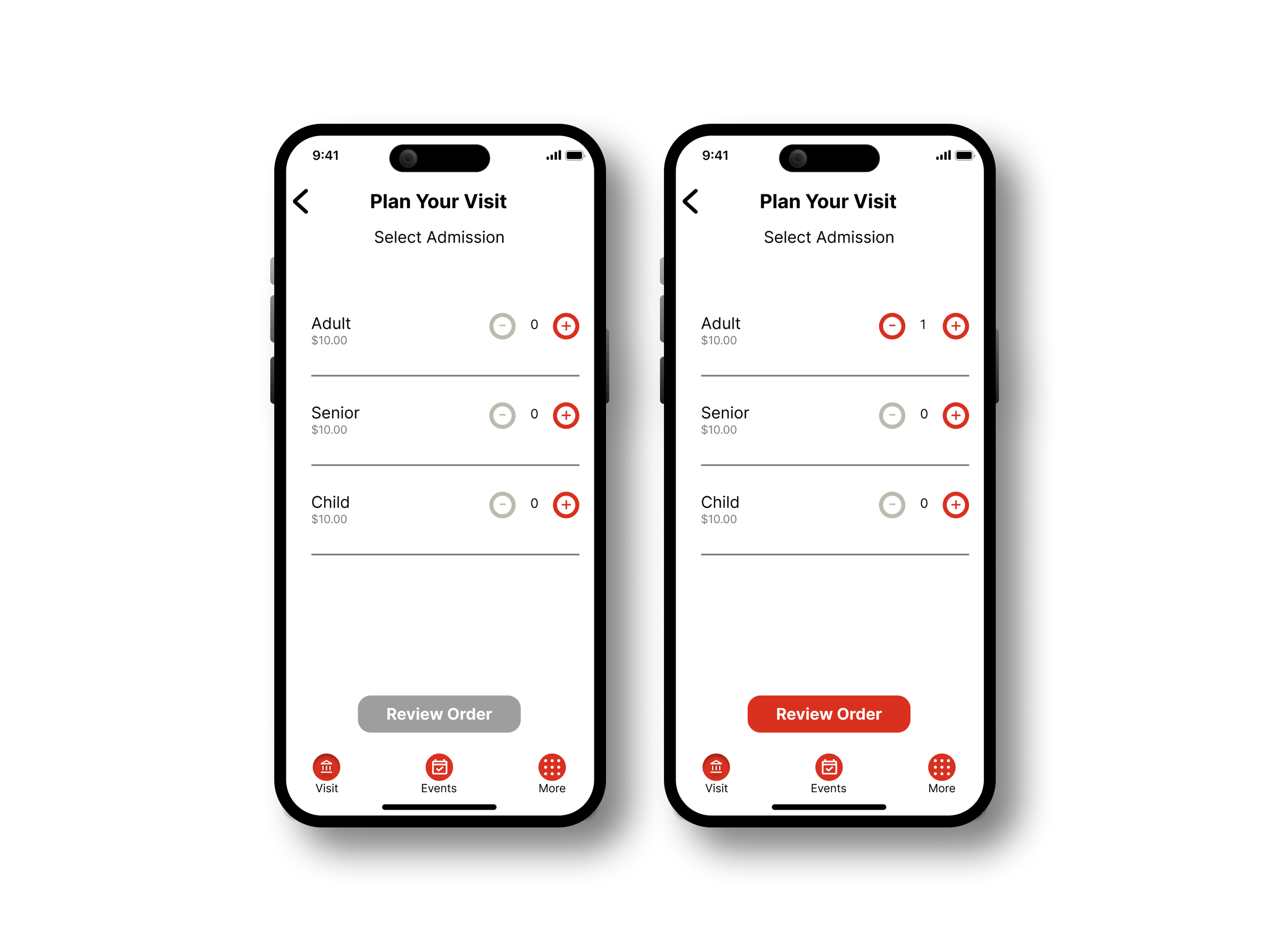
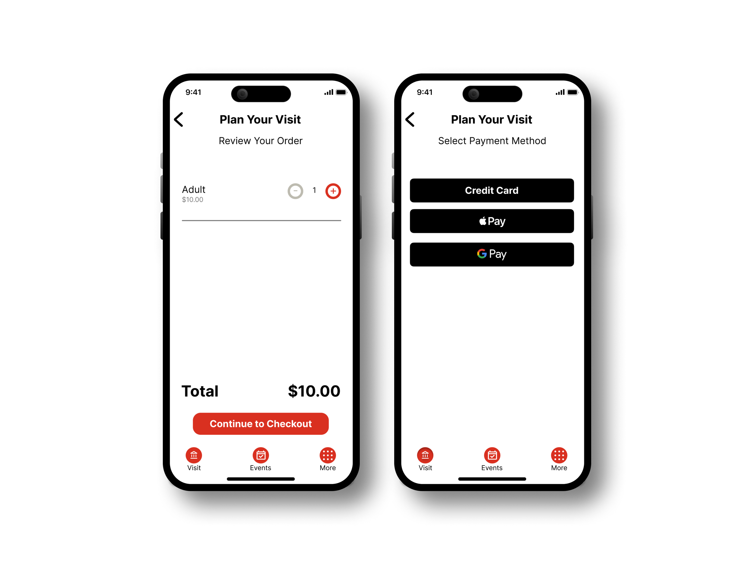


Core User Flow
This video demonstrates the interactivity that I implemented into my design. This follows a user as the proceed through the process of purchasing a ticket to the museum.
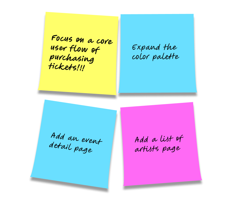
Key Takeaways
What’s the Problem?
Looking back at this project, I feel that it is lacked a clear direction as I never clearly defined a key part of a UX project: a problem. Sure, I decided to design an app for an art museum. But by not defining a specific problem about the experience of going to a museum, it lacked a clear direction and purpose.
Brush Up Before You Design
Research is important, and I wish I had prioritized research and planning before jumping into design. My excitement led me to start ideating and designing without a focus on user needs, making my research less focused and my problem statement unclear. As a result, I spent too much time refining non-essential features instead of addressing the core user needs.
Nobody’s Perfect
In addition to learning an entire new profession of UX, a major takeaway that I learned from this project has been to forgo perfection. When learning any new skill, as I was at the time of working on this project, it is important to allow oneself to simply be bad at it, make mistakes, and learn.
This mindset applies to UX as a whole. The iterative nature of design revolves around identifying shortcomings and refining solutions. While we aim for polished, user-friendly products, early ideation and mockups should prioritize exploration over perfection. Being open to alternative ideas, user feedback, and even mistakes can lead to more innovative and effective solutions.
Future Improvements
Revisiting this project after a year, I can clearly see my novice approach—it was my first attempt at UX! I lacked knowledge of best practices in design, spacing, typography, and color. The goal was to familiarize myself with the end-to-end design process and tools. If I were to redo it now, I’d refine the core problem, expand the color palette, apply industry-standard UI spacing, consider element states throughout user flows, and focus on the most valuable features.