Art Museum Website
Enhancing engagement for museum goers online
Overview
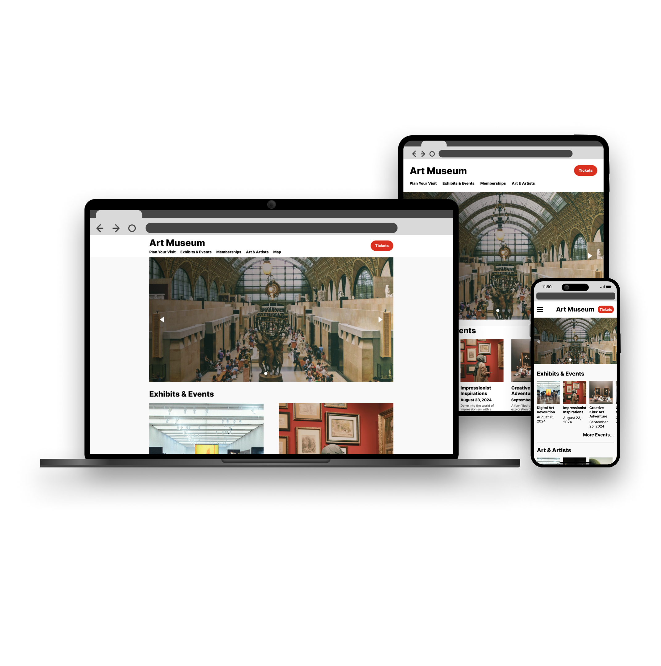
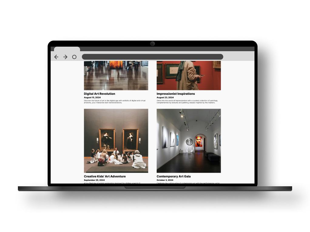
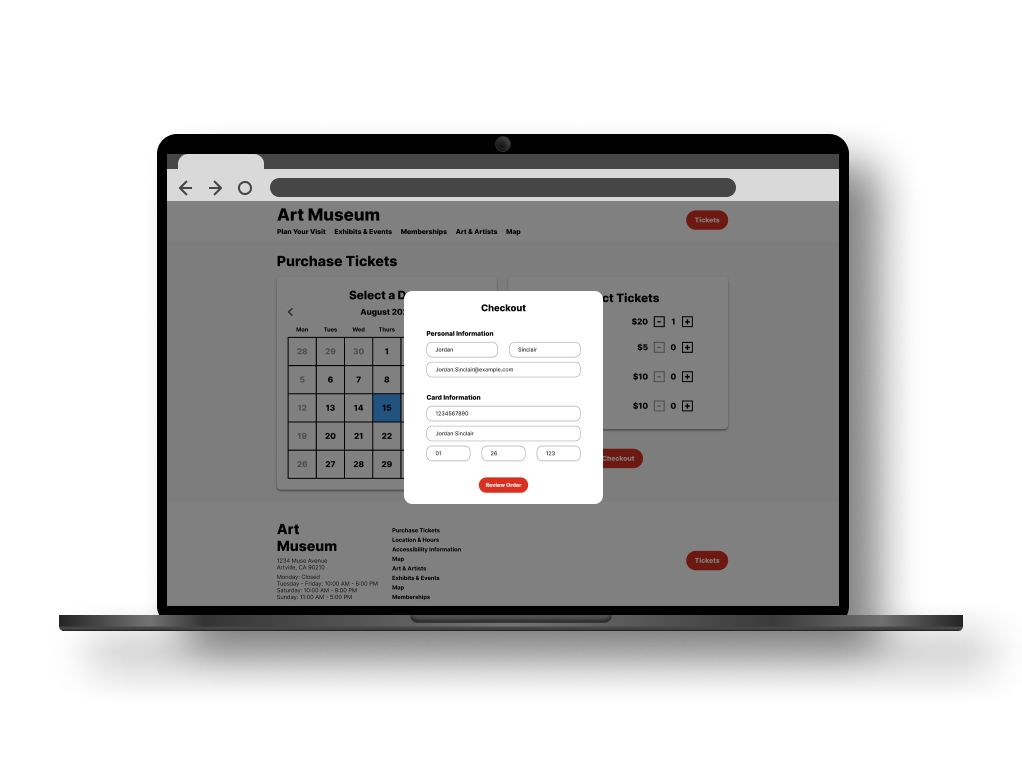
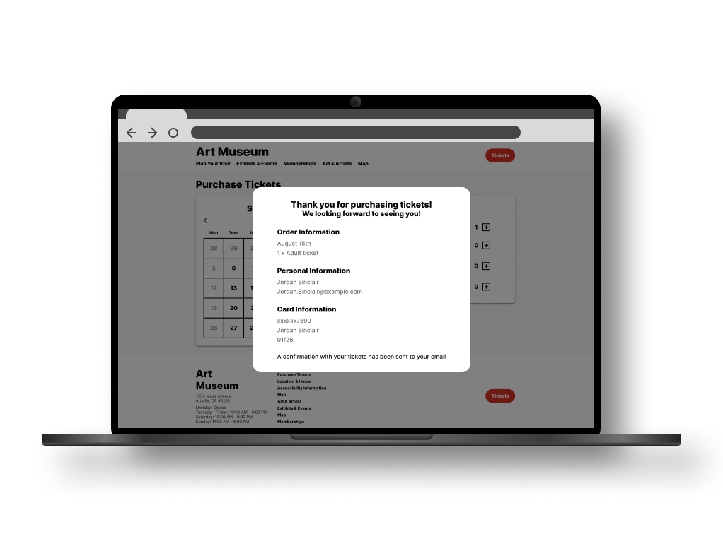
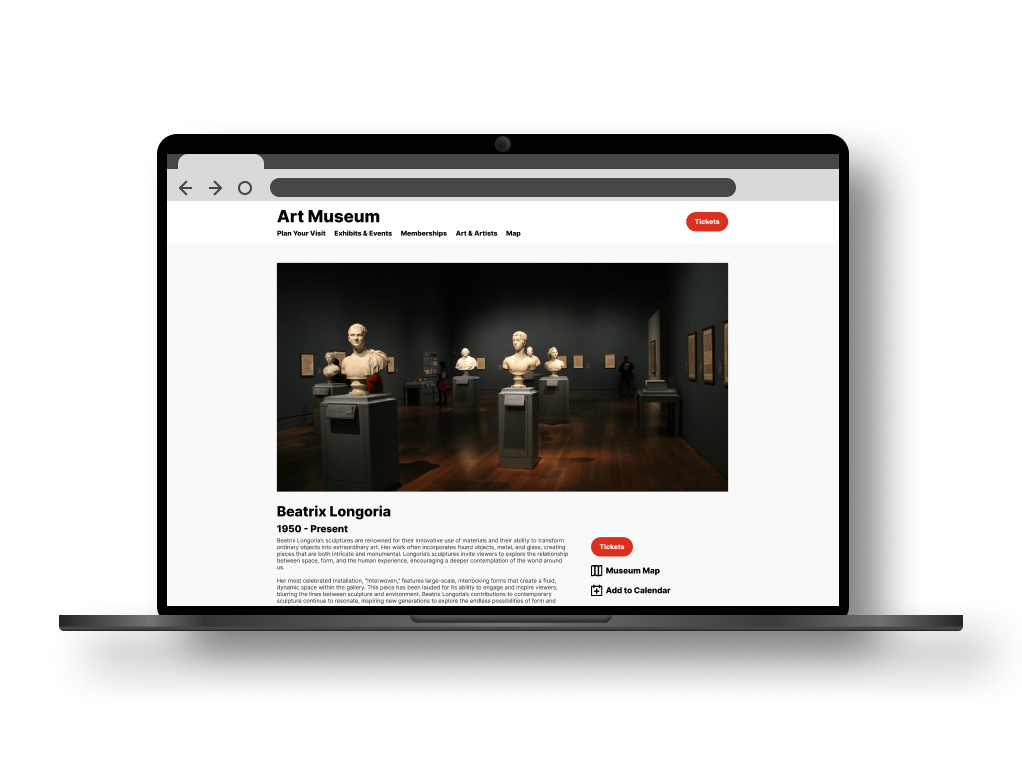
As part of Google’s UX Design Certificate program, I designed a mobile application tailored for a conceptual art museum. In addition to designing this mobile application, I also adjusted the design to be a responsive website that is suited for devices of various screen sizes.
Problem
To take the mobile application I designed for an art museum and turn it into a website that can be viewed in a web browser on devices of all screen sizes. This includes desktops, laptops, tablets, and mobile devices. Maintaining ease of use is imperative.
Solution
To take the mobile application I designed for an art museum and turn it into a website that can be viewed in a web browser on devices of all screen sizes. This includes desktops, laptops, tablets, and mobile devices. Maintaining ease of use is imperative.
Role
UX research, design, high and low fidelity prototyping, and conducting usability studies.
Deliverable
A responsive and interactive website prototype.
Timeline
Spring 2024
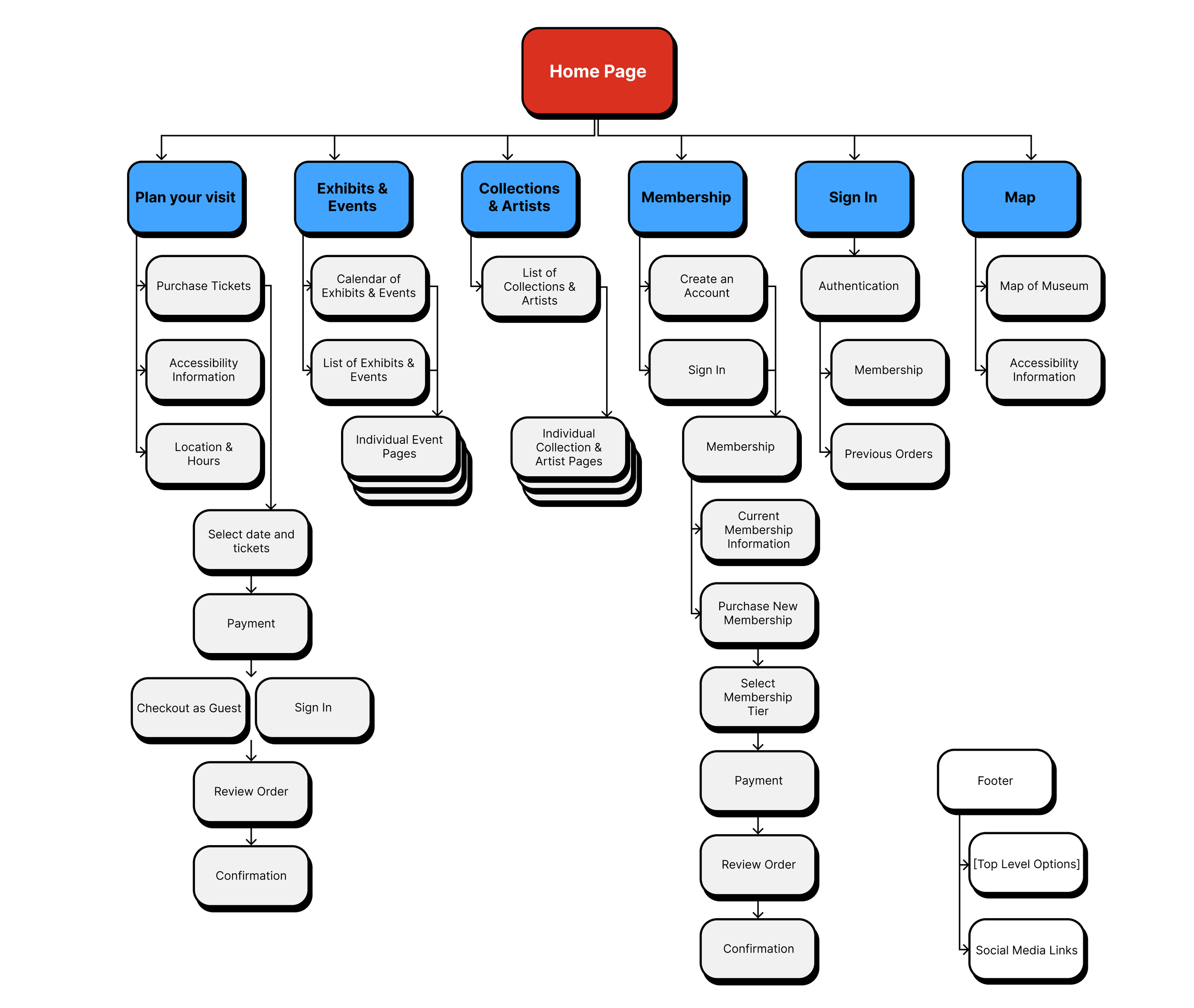
Website Information Architecture
The way that users interact with websites on different devices in a web browser varies considerably from how a mobile app is used. As a result, options for navigation through the website does not have to be as condensed, and a wider information structure can be used.
Below is the information hierarchy map I developed for the website and its various functions.
User Research
User Personas
User research conducted while designing the mobile application version of this website has been reused as the userbase is essentially the same.
Joseph
Joseph is an international college student that has recently moved to the US for his studies. English is not his primary language, and he sometimes struggles to communicate while out running errands, ordering at a restaurant, etc. He has a passion for the arts and enjoys going to museums.
Neelam
Neelam is an established education professional with 10 years of teaching experience. She is passionate about her job but sometimes has trouble managing the stress of teaching while also raising a young child. Neelam appreciates products that help her stay more organized and manage her time in the classroom and at home. She has a young daughter that she would like to expose to the arts, and wants to easily fit visits to museums in their busy schedule.
Competitive Analysis
Philadelphia and the surrounding cities have a wonderful assortment of museums that I was able to research as part of the competitive analysis for my mobile app. To the right are some key takeaways that I gathered from the research and analysis of these institutions’ online presences. They all had a blend of positive features to draw inspiration from, and drawbacks to avoid.
-
Direct Competitor
Pros:
A bold, simple, and beautifully designed website.
Intuitive navigation bar and items.
Simplified ticket purchasing process.
Cons:
No designated mobile app.
Overall thoughts:
This is an amazing example of functional and aesthetically pleasing web/UI design. The design is modern, has personality, but isn't too flashy. A great example to work with.
-
Direct Competitor
Pros:
Clean and simple web presence.
Feature-rich mobile app, including accessibility features.
Cons:
Although the mobile app is loaded with features, it seems a bit over cluttered and bloated.
The layout of the mobile app could be simplified to be more user friendly.
Overall thoughts:
While the museum has a polished web presence as well as a fully-fledged mobile app, the app itself could use some work to be more user friendly to those who aren’t as technically inclined.
-
Direct competitor
Pros:
Cleanly branded website that conveys the image of the museum.
The website overall is simple and easy to navigate.
Cons:
No mobile app.
The main user story of purchasing a ticket to the museum could be simplified. The “plan your visit” page does require a good bit of scrolling to get to the “purchase tickets” button, which could be presented more prominently as well.
Text gets lost over images in several places.
Overall thoughts:
While the presentation of the website is well done and polished, the functionality of purchasing tickets could be improved and simplified.
-
Indirect competitor
Pros:
Website has a comfortable and simple layout.
The “get tickets” button is prominently displayed on the navigation bar.
The tone of the website is fun and playful, yet professional.
Cons:
The site could use some additional accessibility information.
Overall thoughts:
This site maintains great balance of both clean design as well as intuitive functionality.
-
Indirect competitor
Pros:
Polished and well laid out website.
The “buy tickets” call to action is prominently displayed on the navigation bar.
Cons:
No mobile app.
Overall thoughts:
It appears that The Franklin Institute had redid their website while I was conducting my research. Initially the website felt outdated and clunky. However now it is polished, laid out logically, and has strong branding.
Initial Designs
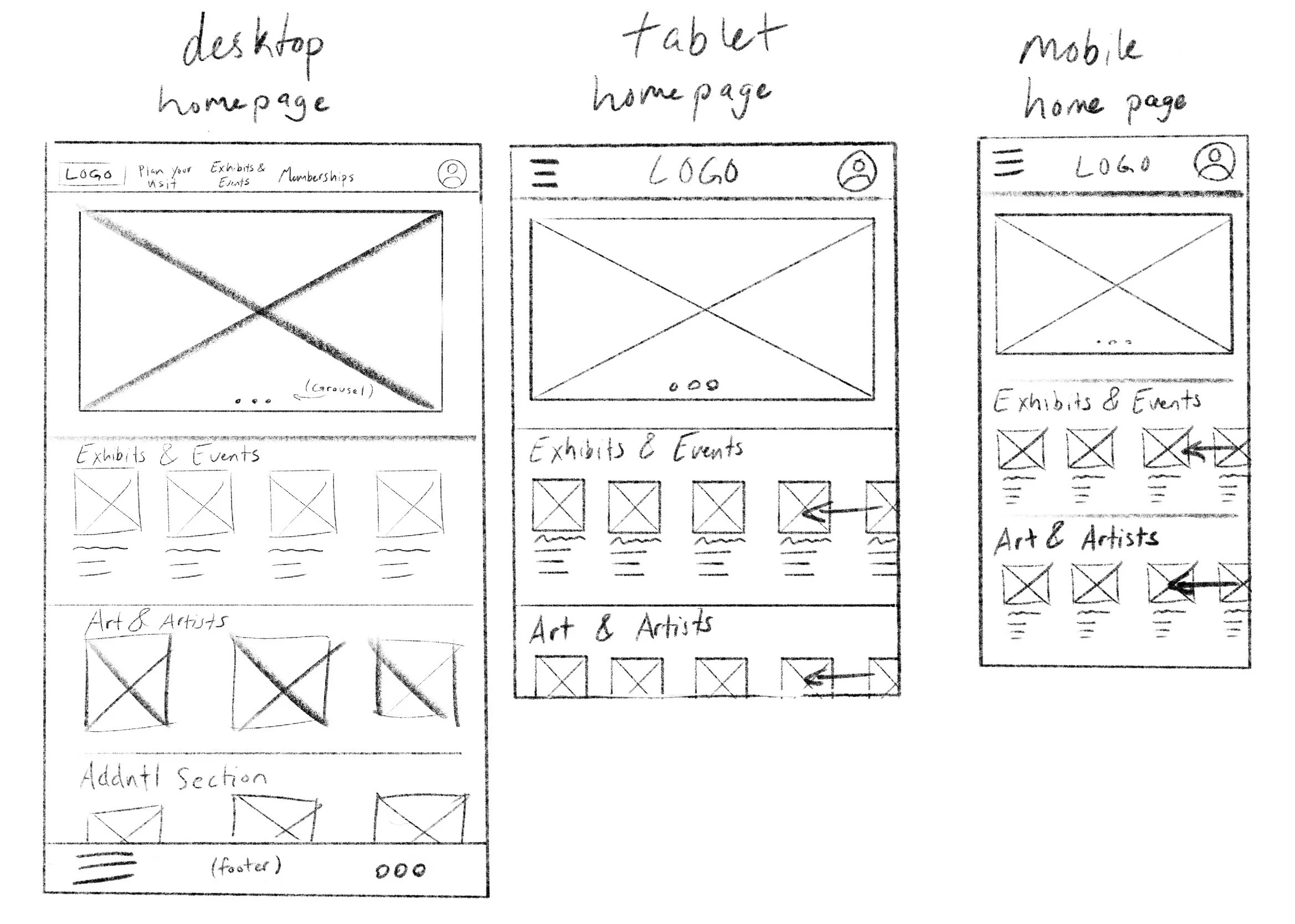
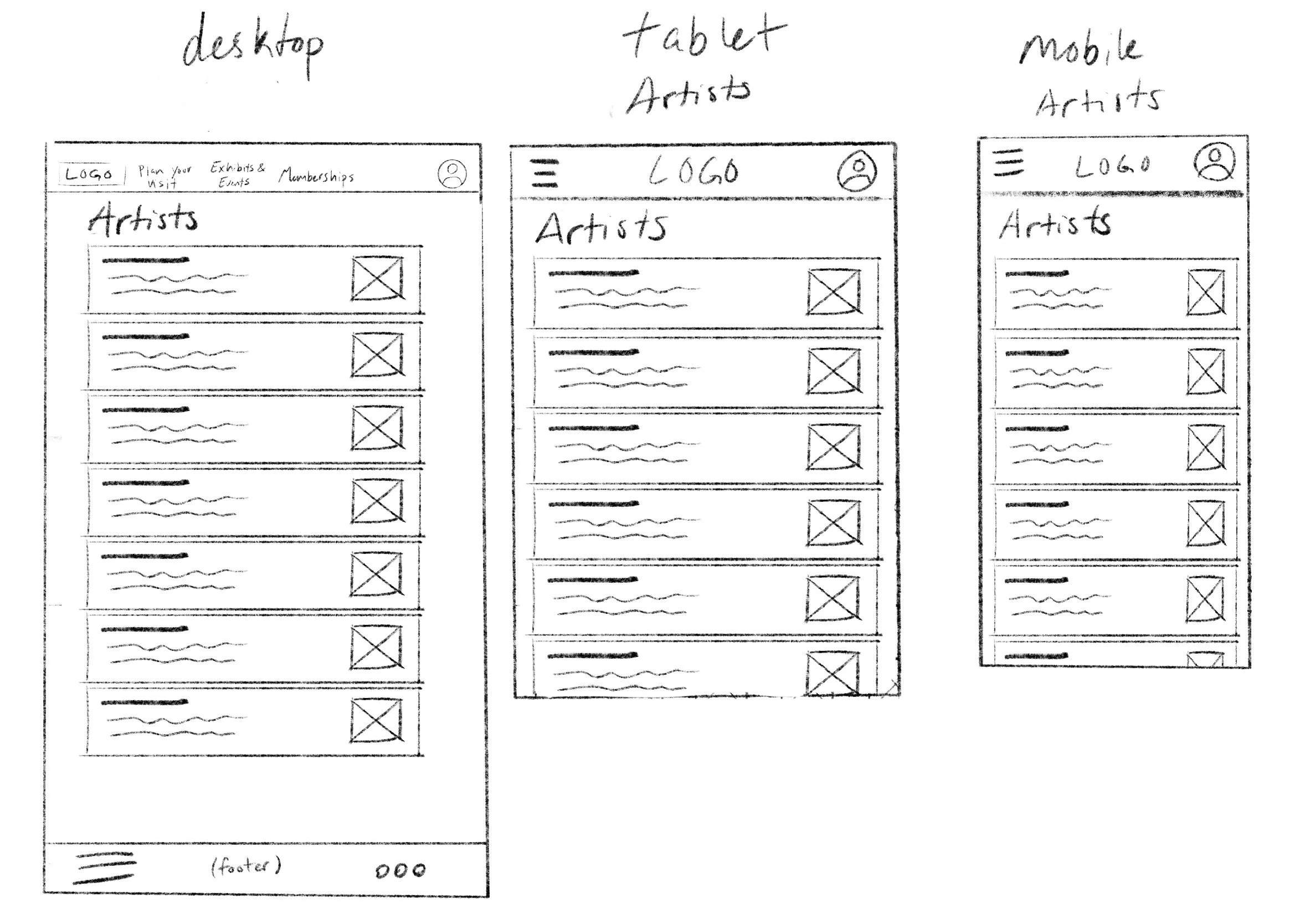
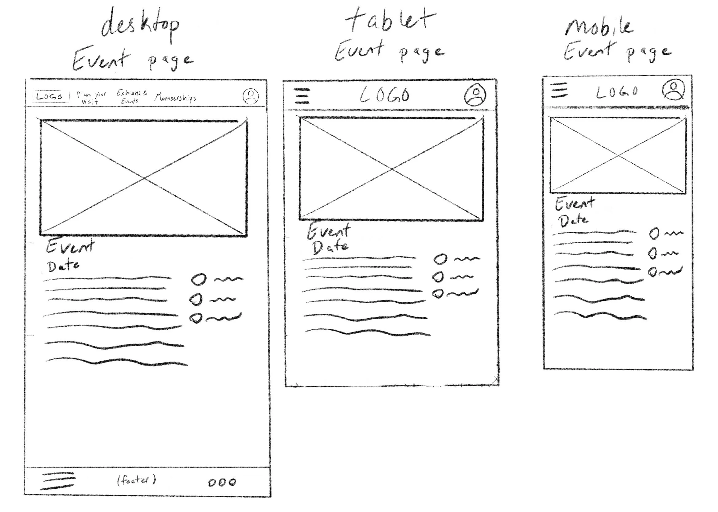
Hand Drawn Wireframes
Homepage
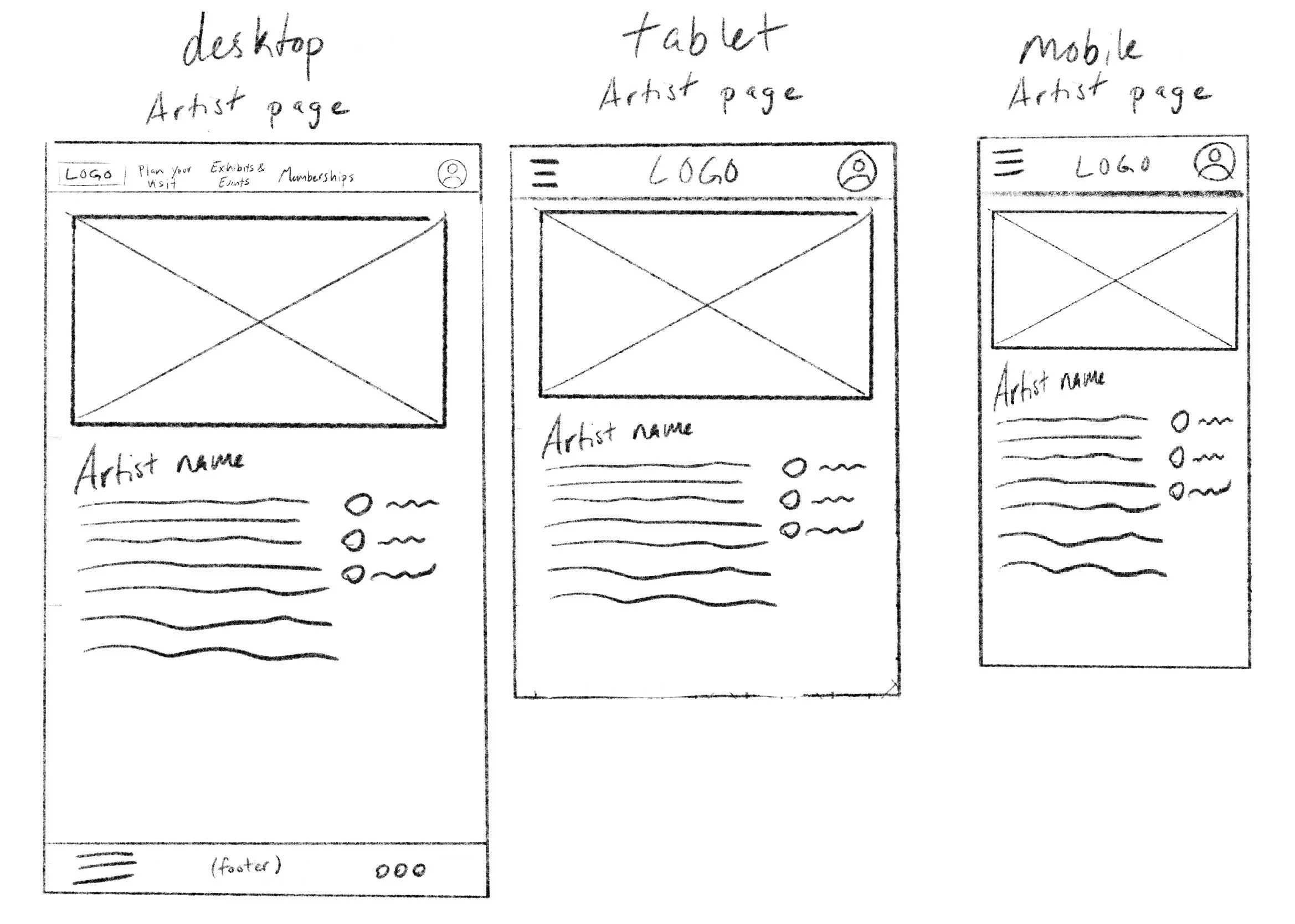
Artist list
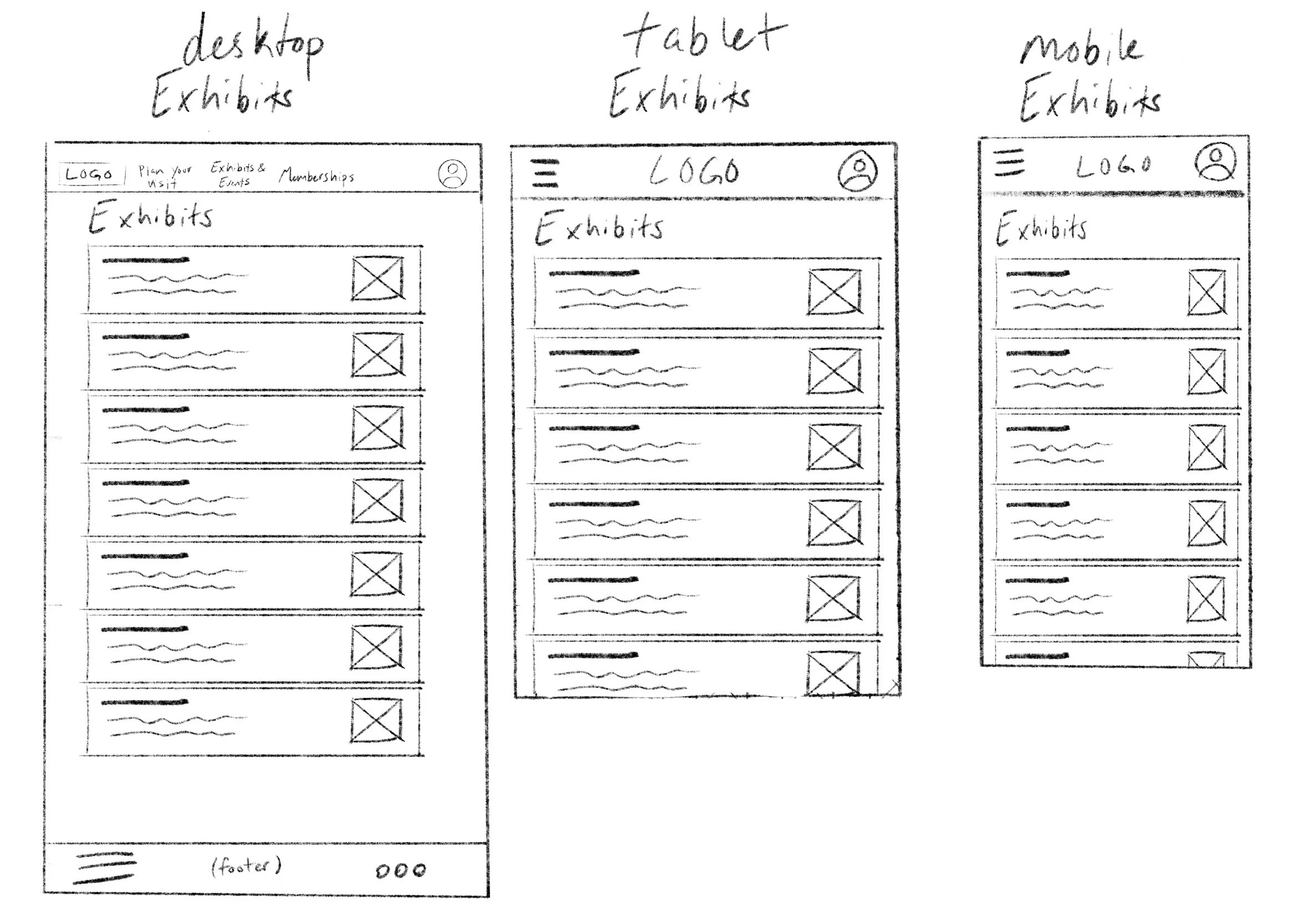
Exhibits and events list
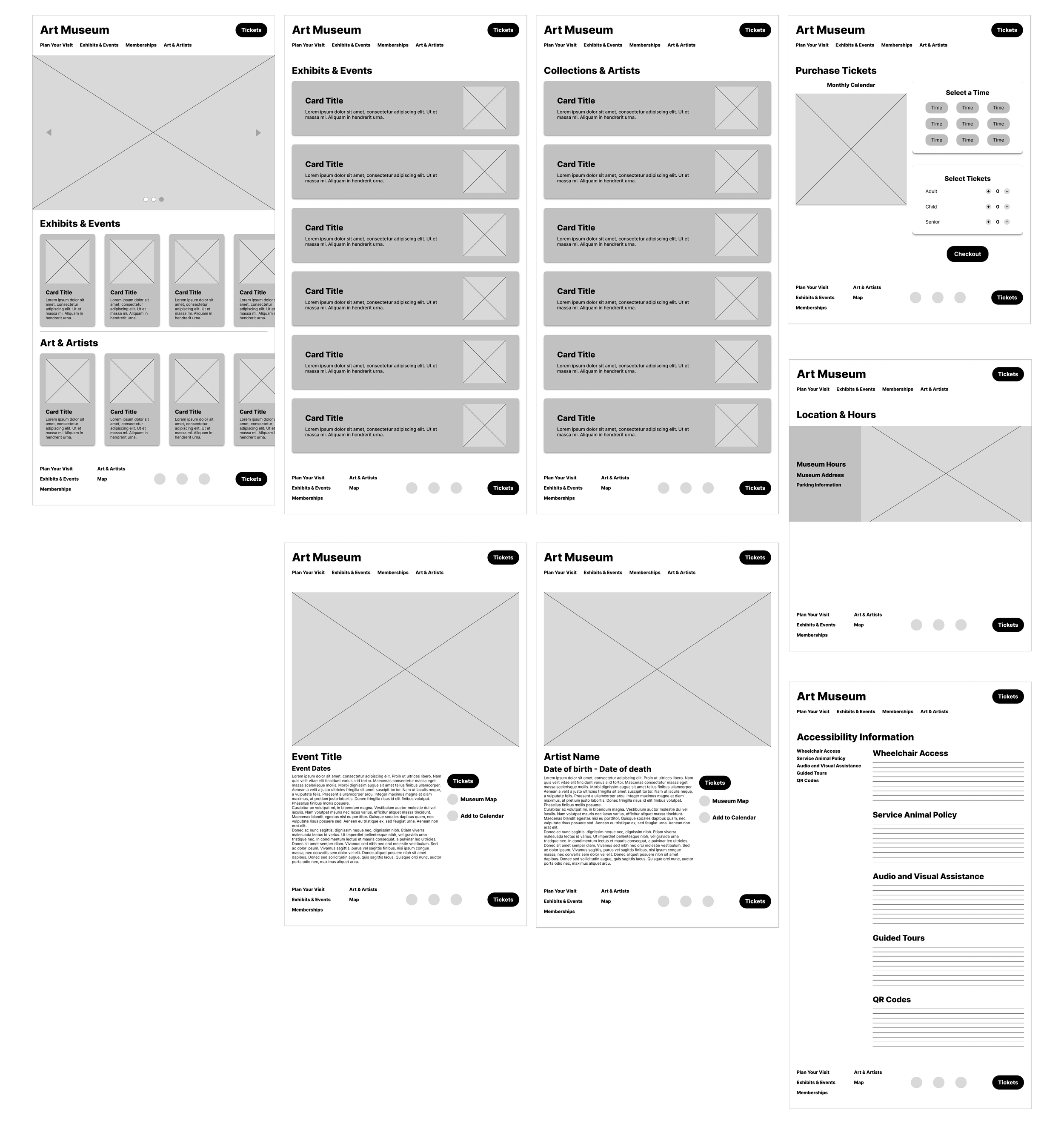
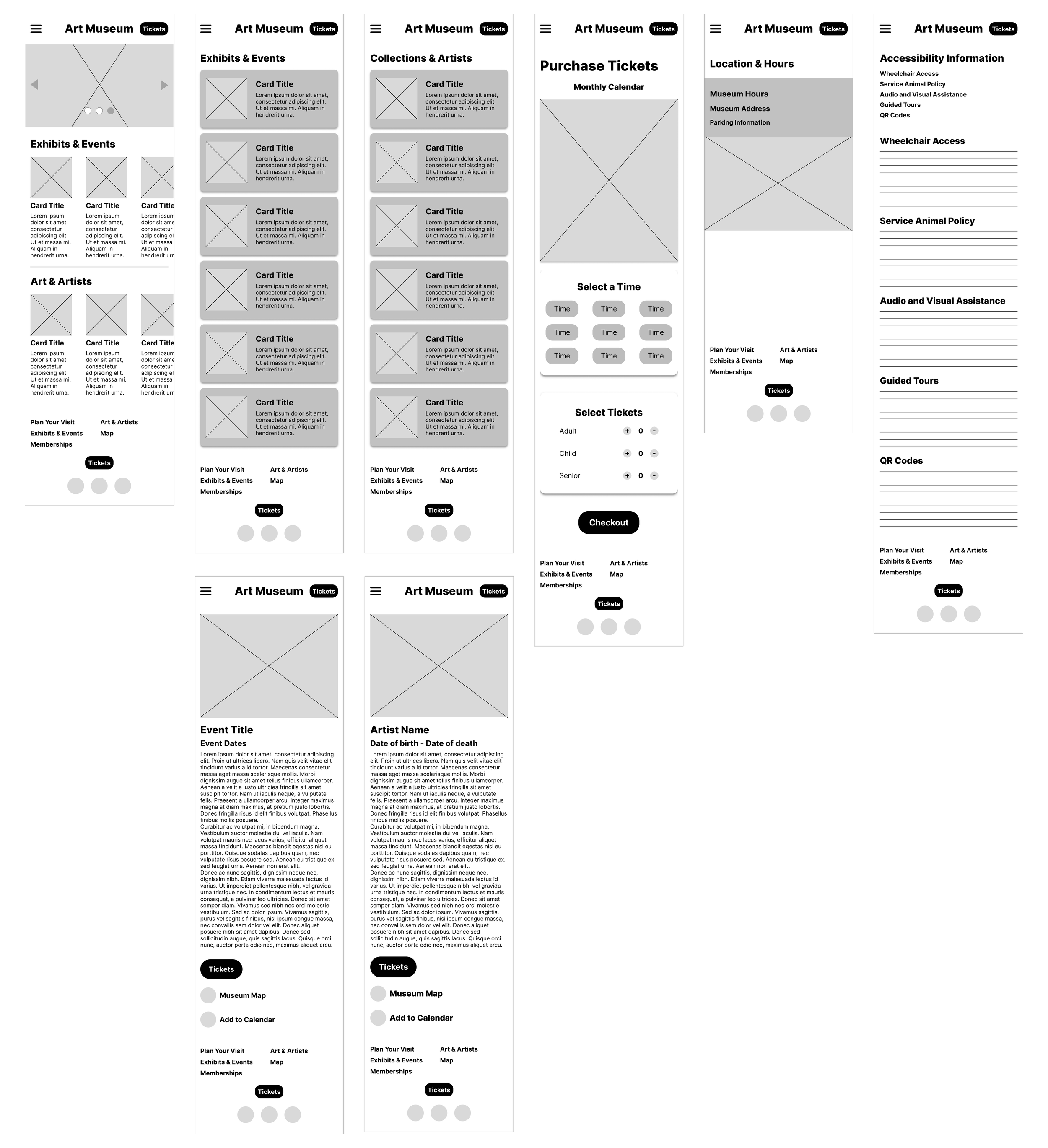
Low Fidelity Wireframes
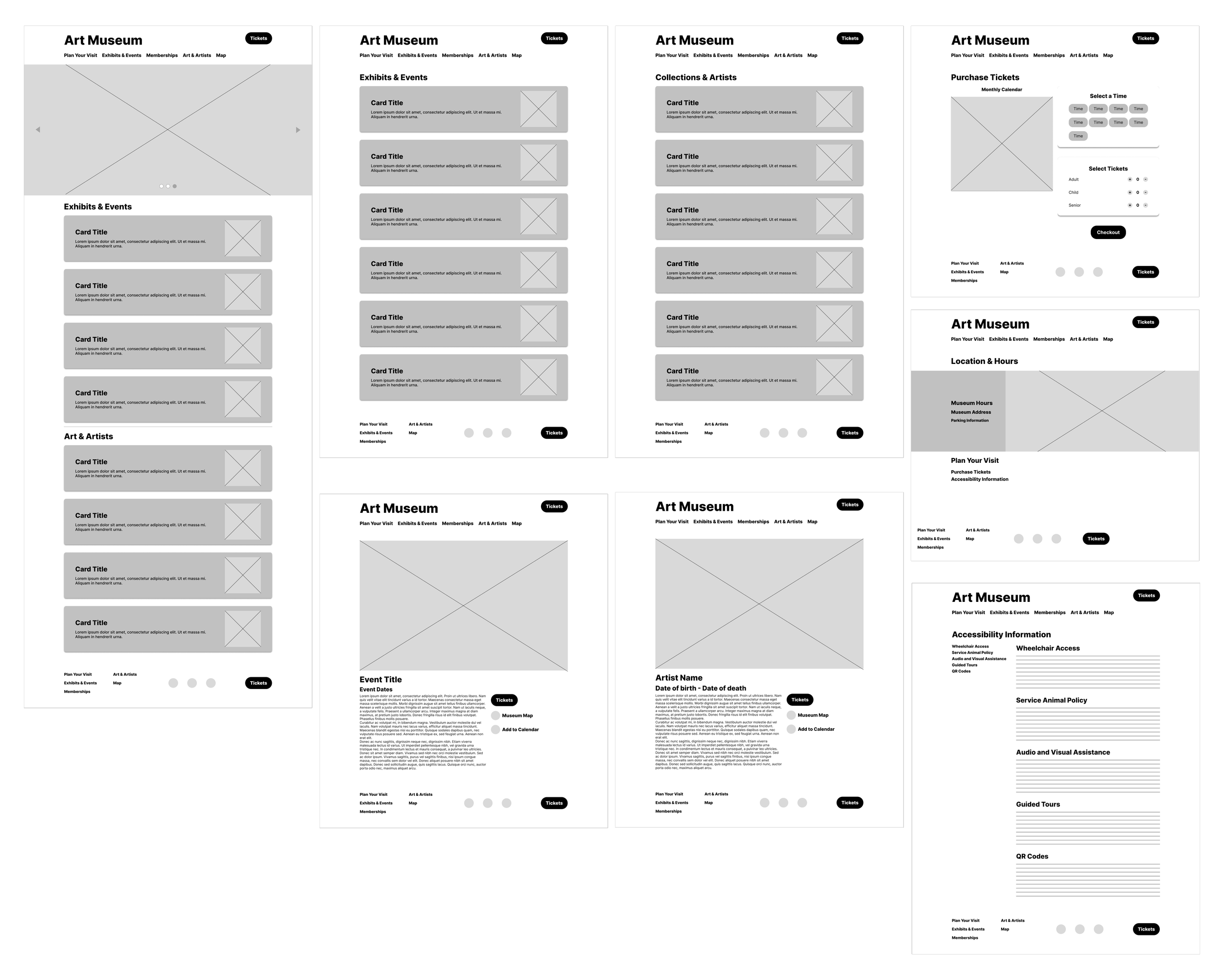
The main challenge I had while making lo-fi wireframes was figuring out the auto layout function in Figma. It took some practice, but now it's second nature for me. Once I designed one screen size with auto layout, I could quickly copy those designs and change the frame size with little extra work. This really improved my workflow for adapting frames to different device sizes.
Desktop
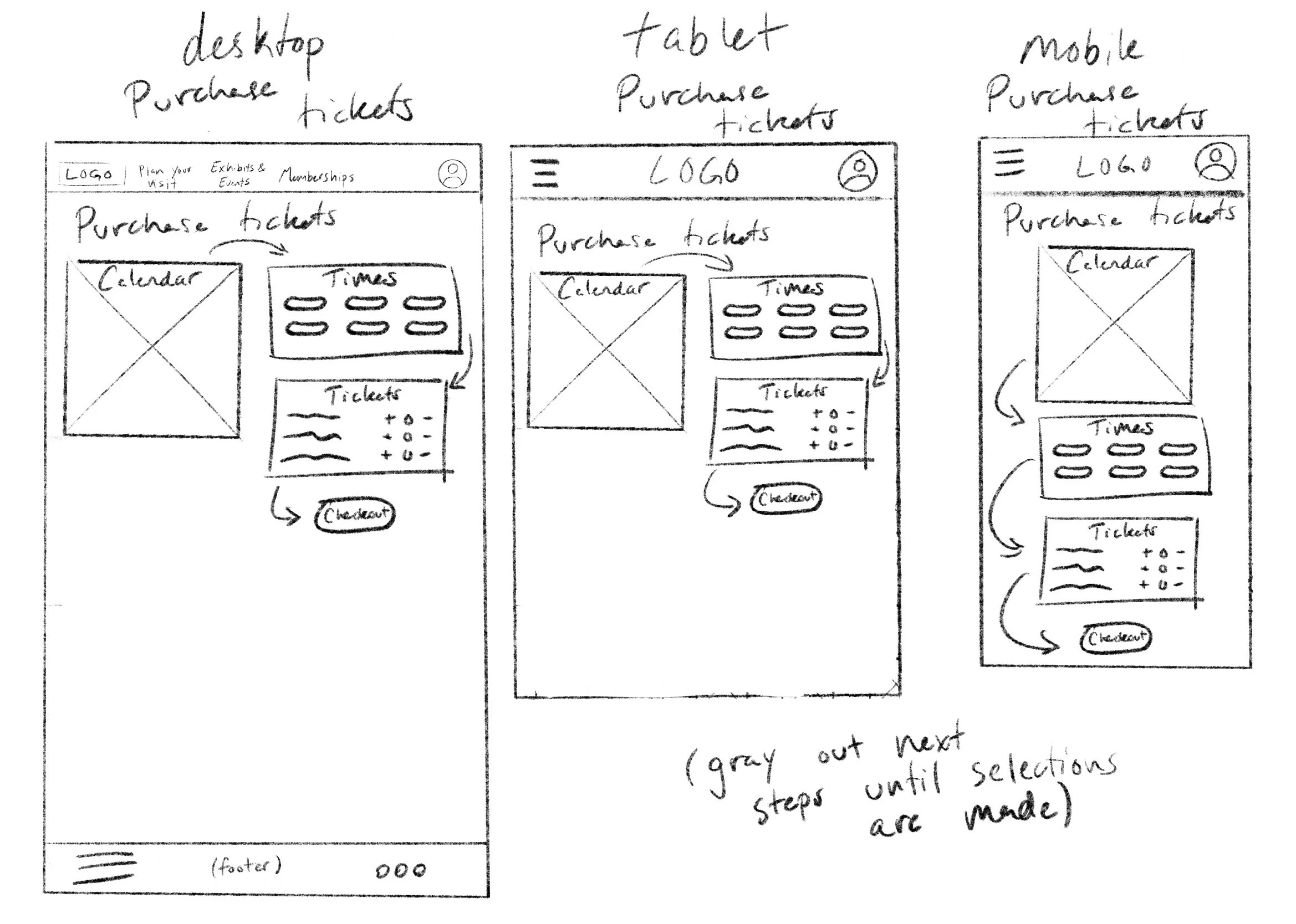
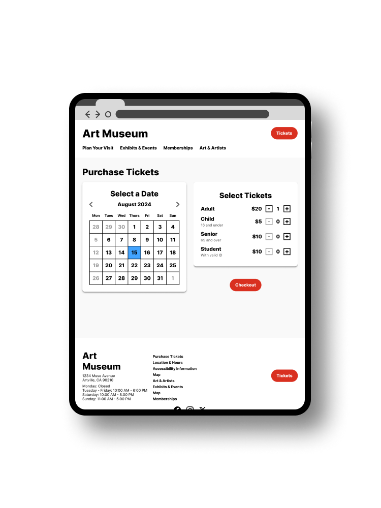
Ticket purchasing
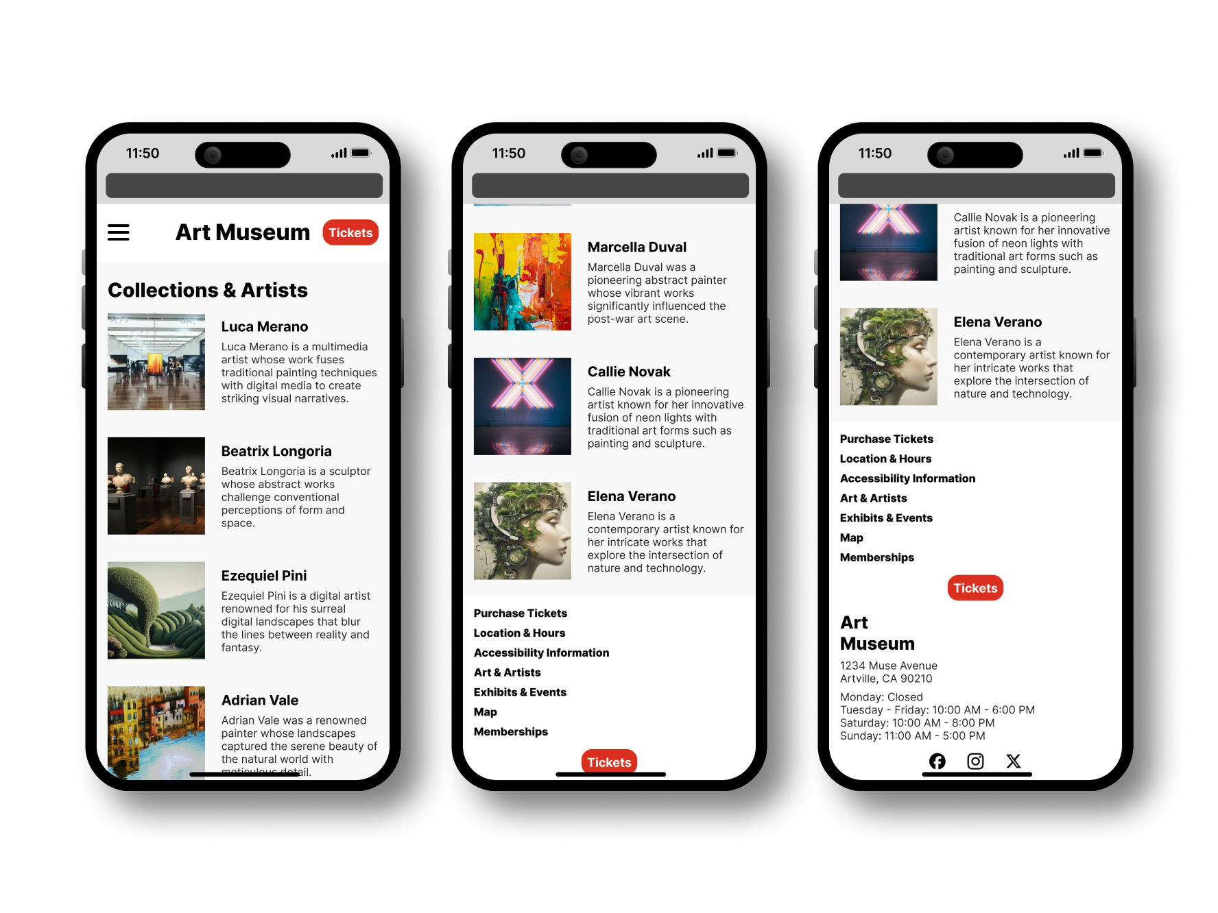
Artist detail page
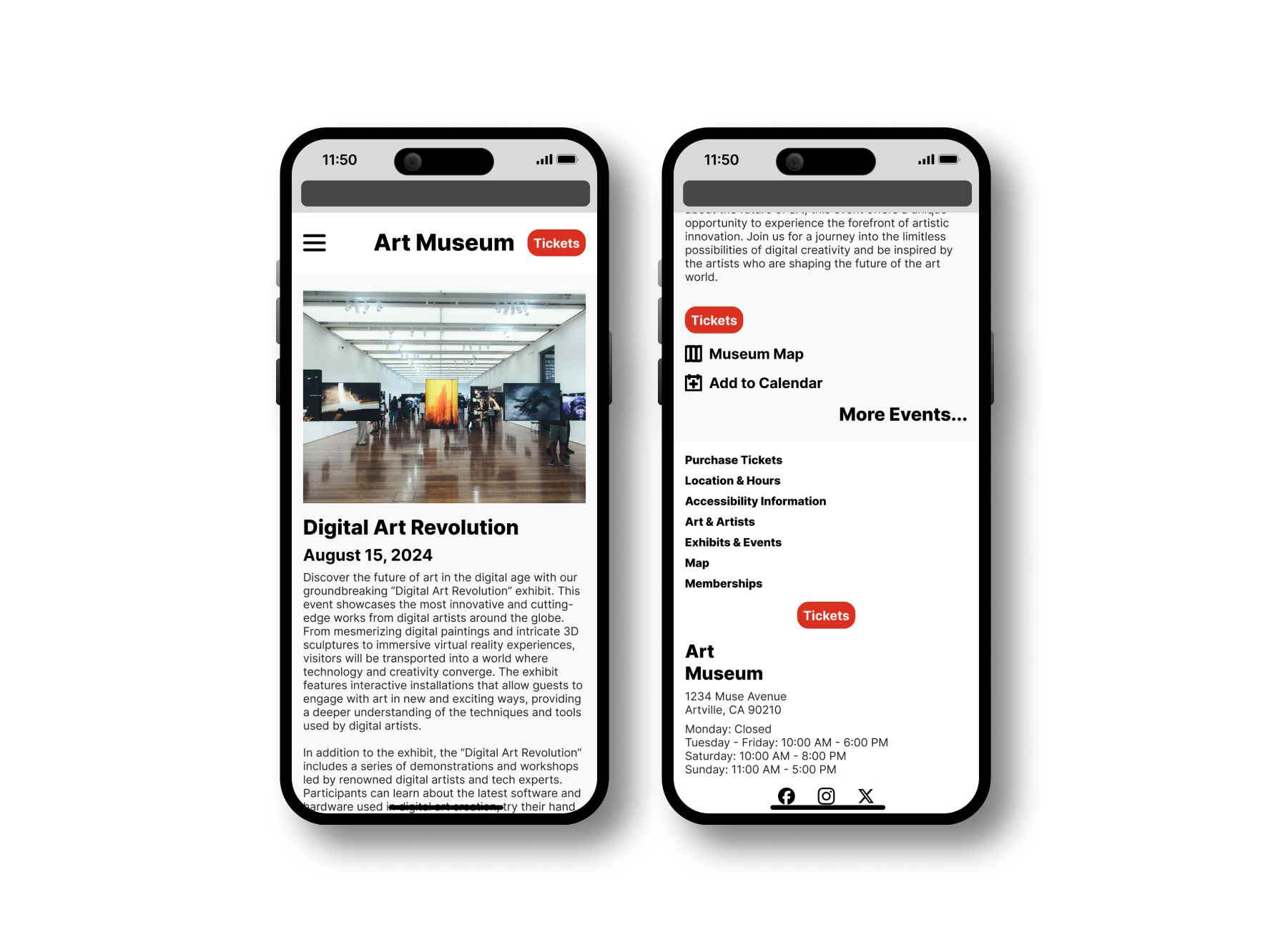
Exhibit/event detail page
Tablet
Mobile
Usability Study
Study Type: Unmoderated usability study
Participants: 5 participants
Location: United States, remote
Length: 10-20 minutes
Study Findings
Ease of Use
All participants indicated that the mockups were very easy to use
Participants indicated that call to action buttons were emphasized clearly
Overall Design
All participants indicated that the overall design of the website was very positive
QR Code Interest
Participants’ interest in a QR code system featured throughout the museum ranged from neutral to very likely. Additional questions on this topic would be helpful to better gauge the value of implementing a system like this.
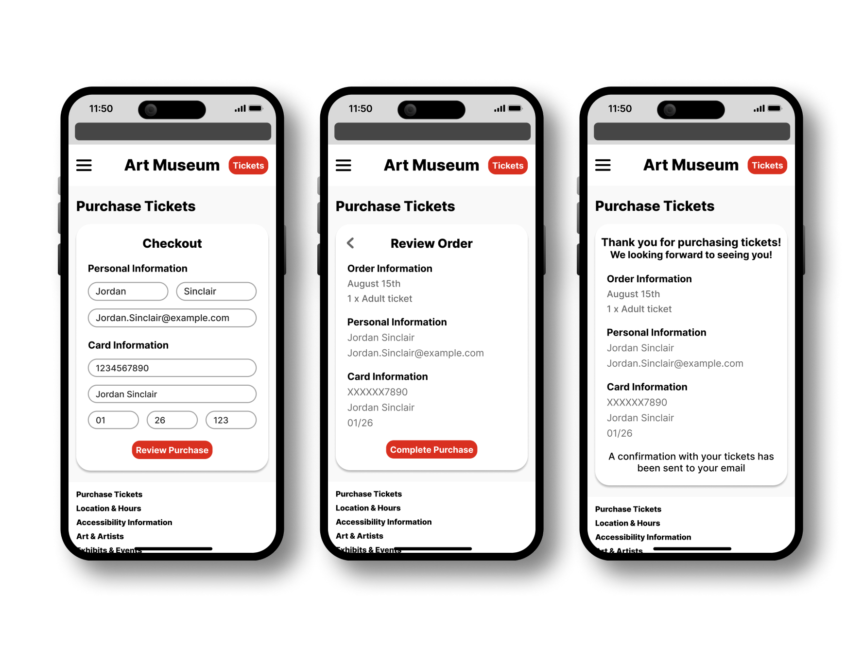
High Fidelity Mockups
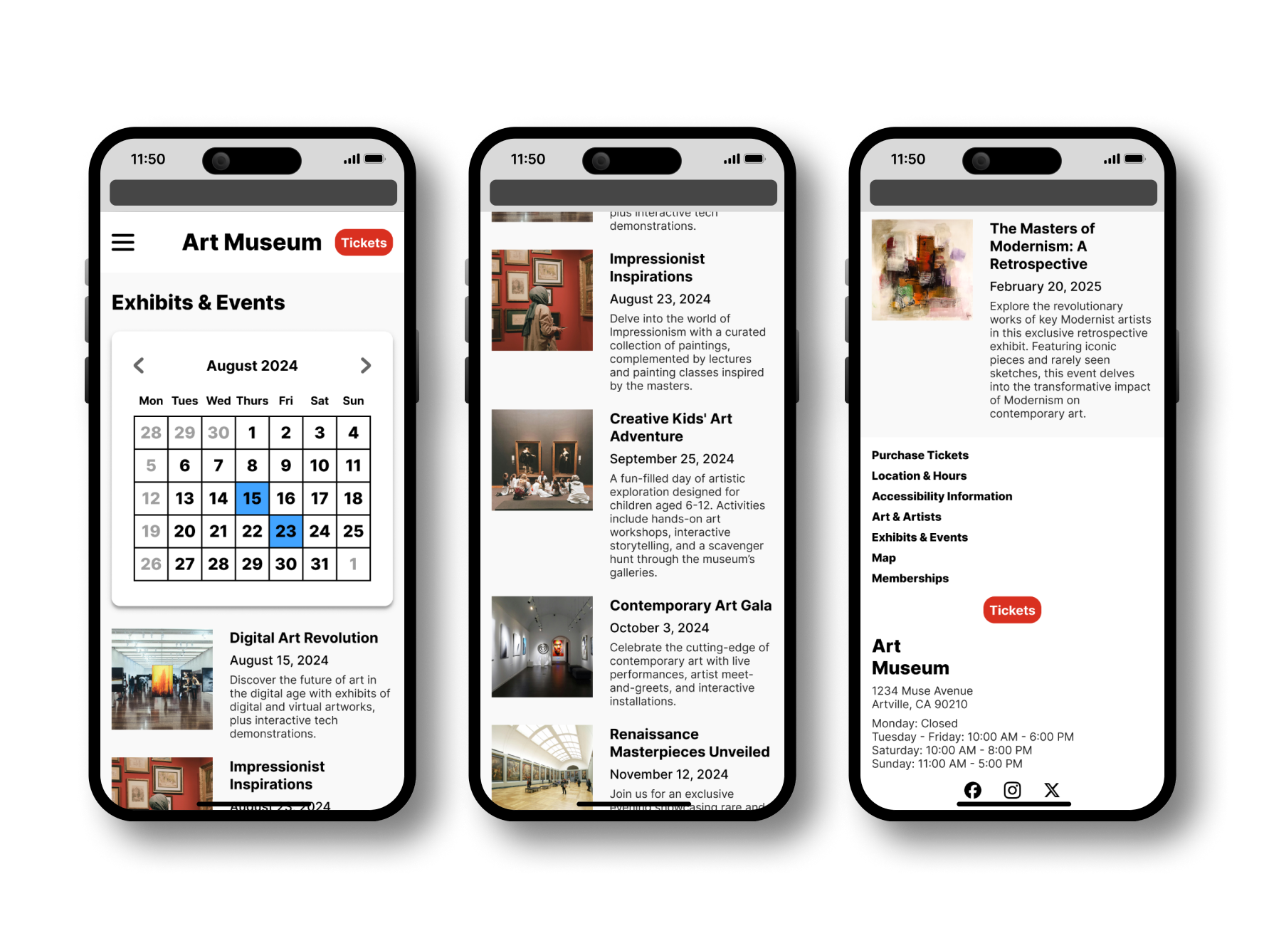
Mobile Web
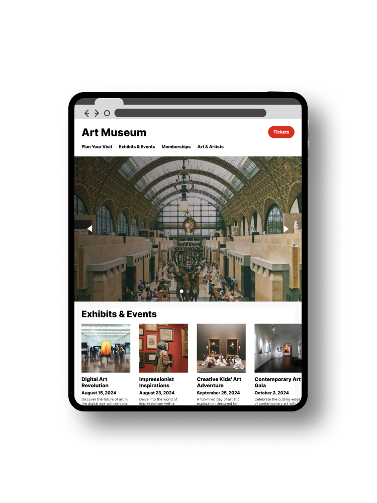
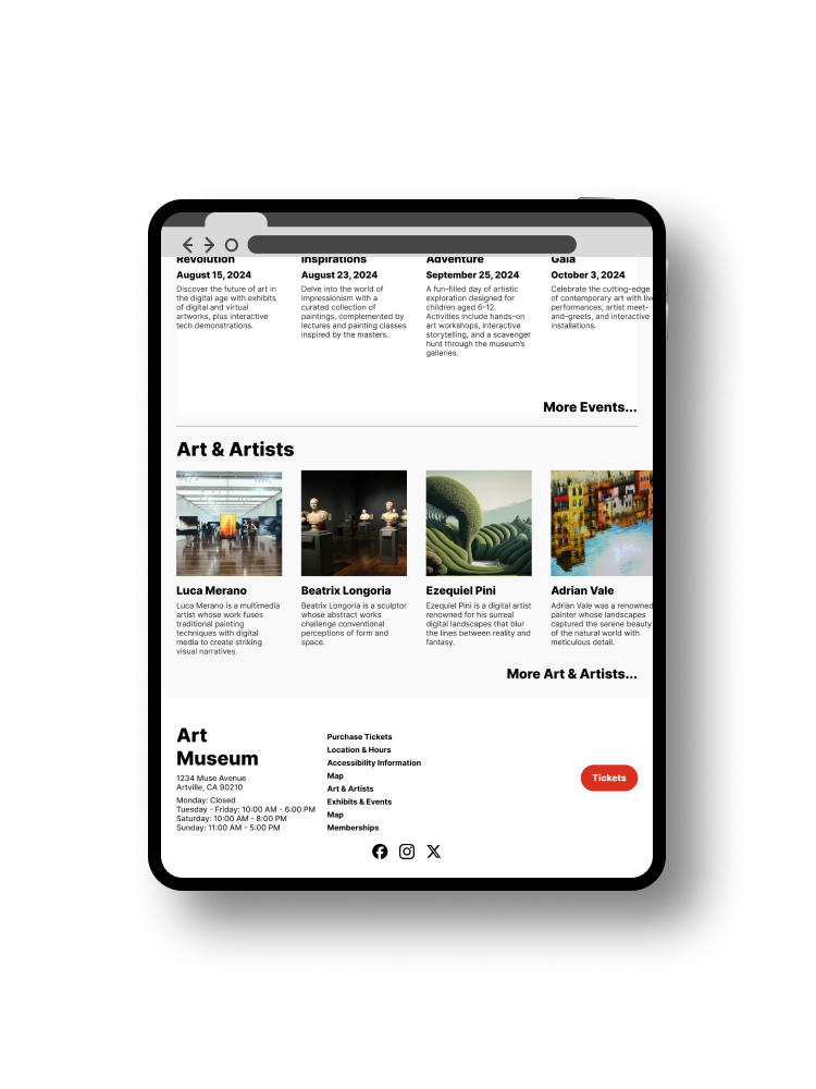
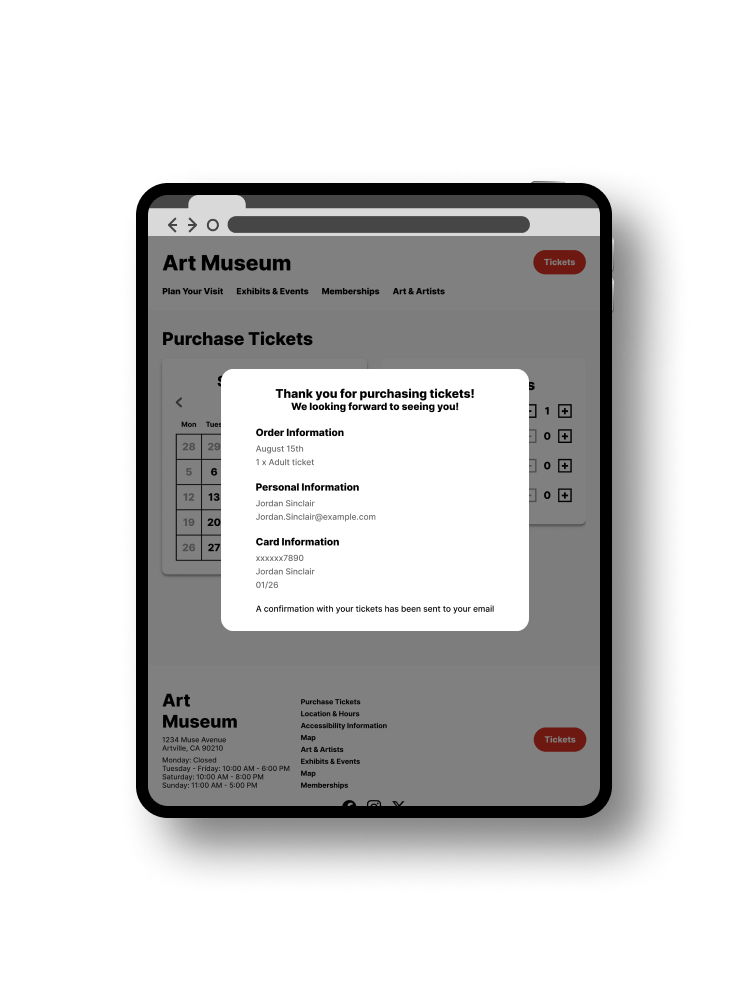
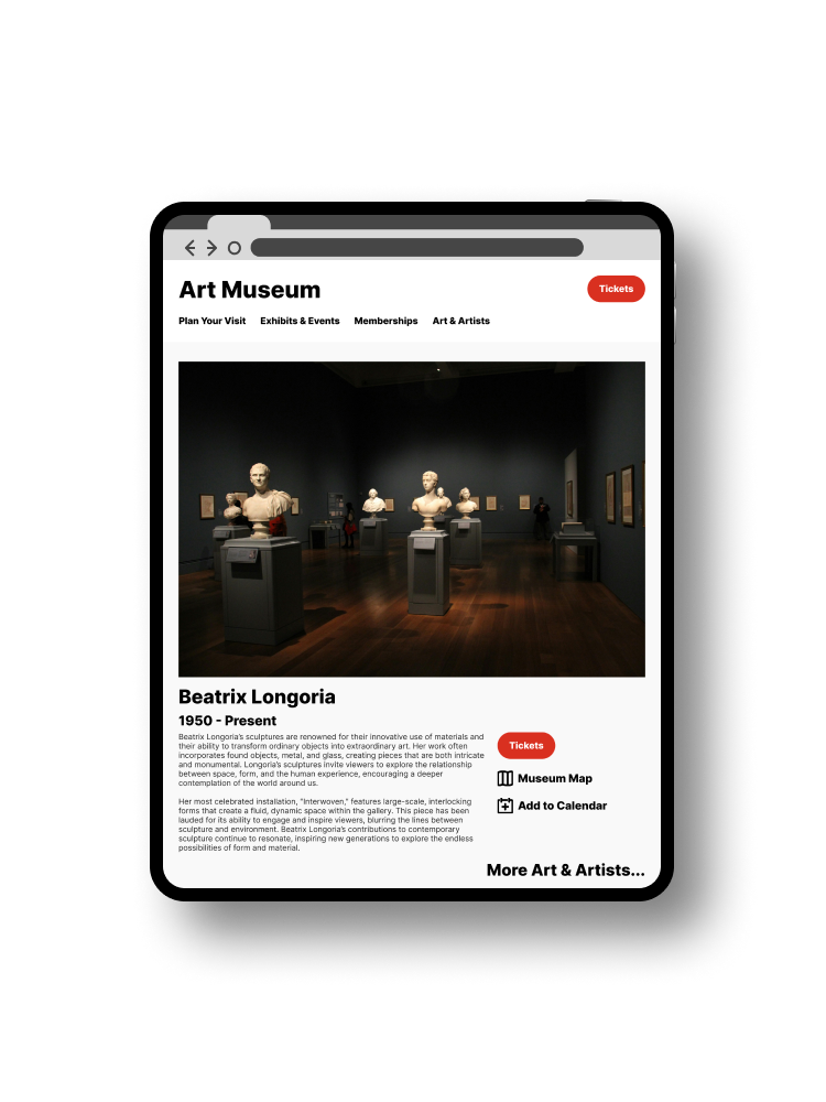
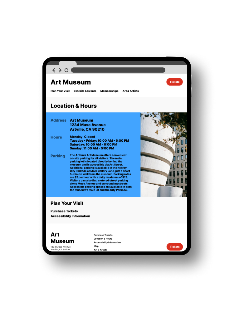
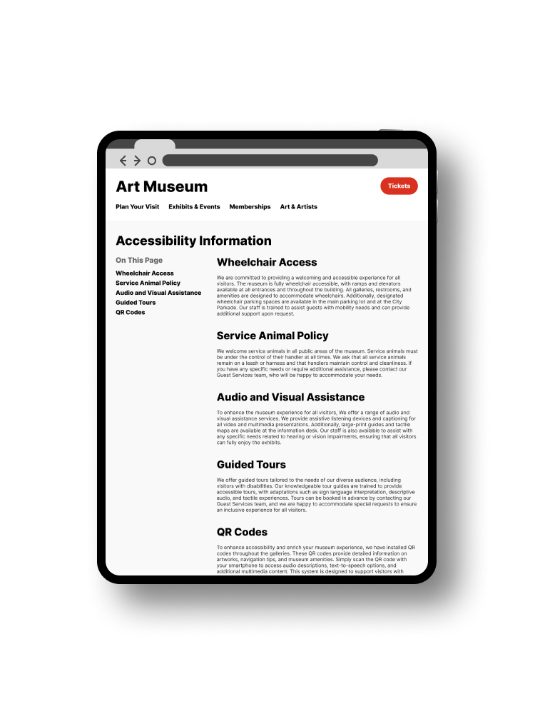
Tablet Web
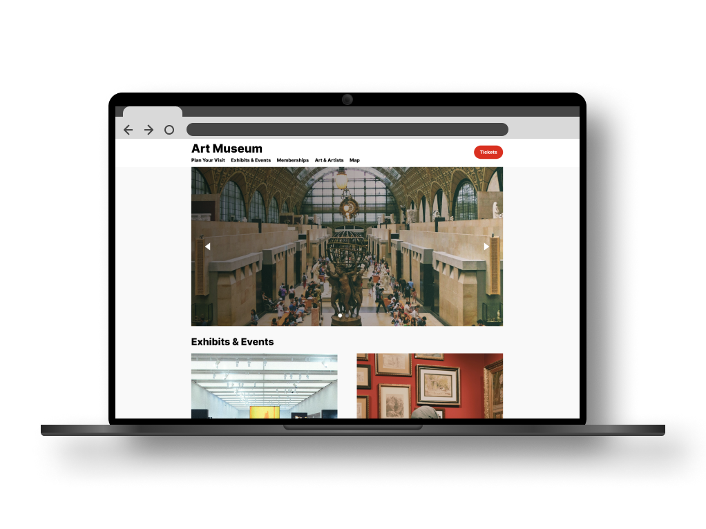
Desktop Web
Interactive Prototype
The Figma prototypes can be accessed via any of the below links depending on the device you’re using.
Accessibility Considerations and Revisions
Color Contrast
I refined the initial color palette used in the earlier version of my designs based on WCAG guidelines. The tool Coolors.co is immensely helpful in pushing existing colors in necessary directions to improve contrast.
Refined Headings
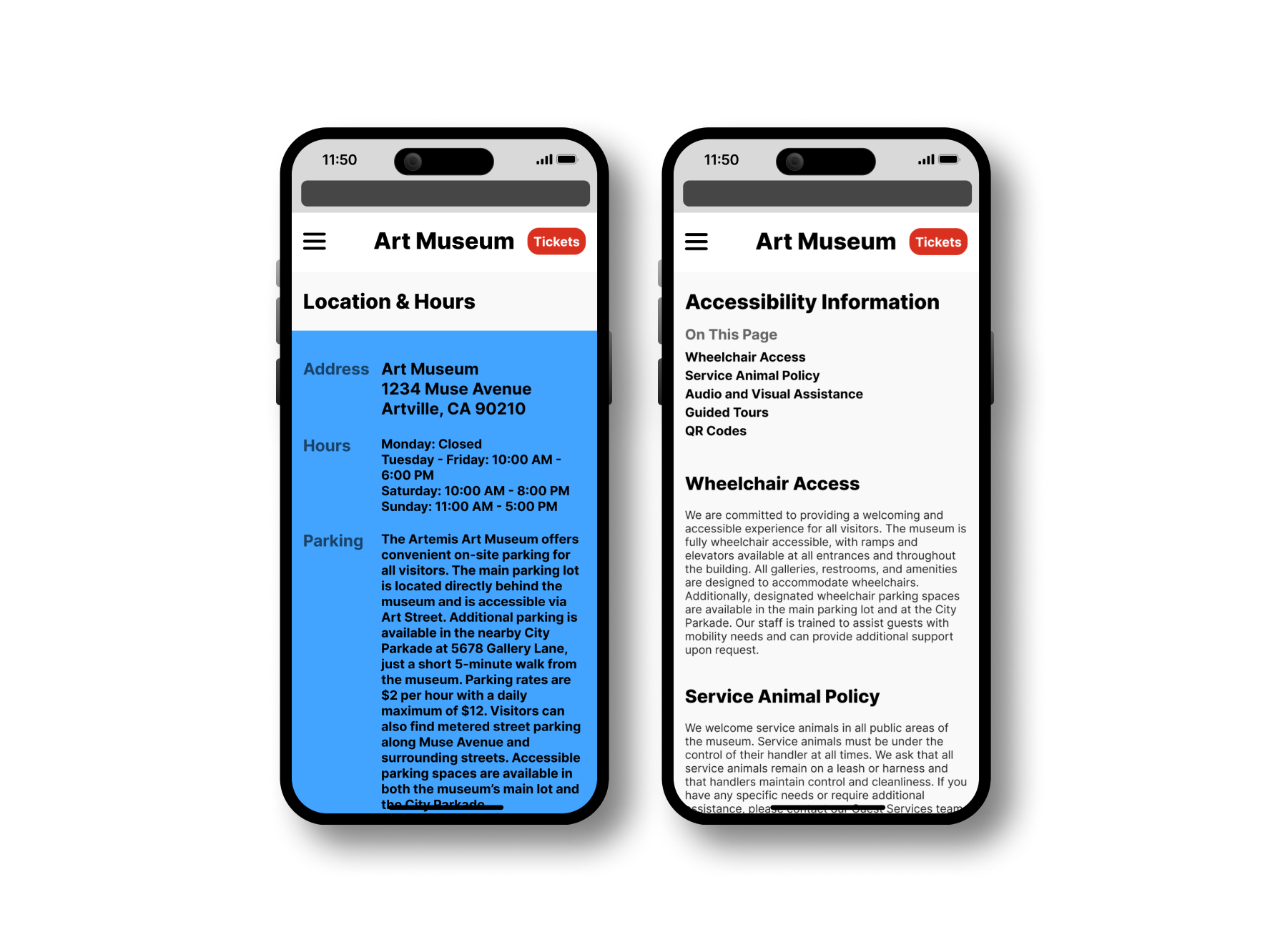
First I added headings to some pages that I had initially thought self-explanatory. While it might be obvious to some where the address and hours are on the page, it is helpful for those using screen readers to add headings to the page. Further, I improved the visual hierarchy of the headings and subheadings by changing the type size.
Figma Annotations
Although this is an academic project that will not be sent along to developers, I still wanted to take the time to add internal notes and annotations to the designs indicating the order of traversal, what sections should be read by screen readers, and semantic role of elements.
Key Takeaways
Why Responsive Web Design Matters
Initially, my focus was on designing the museum’s mobile app, but working on the responsive website revealed a crucial insight: many visitors won’t download an app just to visit an exhibit. Most users will engage with the museum through its website—often on their phones—while planning their visit. Ensuring the website is functional, user-friendly, and accessible across devices is just as important, if not more, than the app itself.
General design best practices
A challenge that I overcame during this project has been forming a solid understanding of appropriate scaling of assets in my UI designs. New designers such as myself stereotypically make type, images, buttons, and other assets take up too much of the design frames. And I was no exception to that. After leveraging existing design frameworks and tools such as Google’s Material Design and Typscale, I was able to form a better understanding of appropriate scaling of spacing, typography, and images for various screen sizes. This is demonstrated by the difference in scaling between my lo-fi wireframes and refined hi-fi mockups above.
