SEPTA Redesign
Designing an intuitive and user-friendly transit system for Philadelphia.
Overview
The Southeastern Pennsylvania Transportation Authority (SEPTA) is the public transit system serving the Philadelphia metropolitan area. It is one of the largest transit systems in the United States, both in terms of the number of riders and the size of the area it covers. However, the complexity of the transit system and its online tools have considerable room for improvement for transit goers.
This project was pursued as part of the Google UX Design Professional Certificate program, and not affiliated with SEPTA.
Responsibilities
UX Research, UX Design, Usability study and testing
Tools
Figma, Qualtrics, Procreate
Role
Solo UX/UI Designer
Timeline
Fall/Winter 2024
Problem
Philadelphia transit riders need a user-friendly tool to help them navigate SEPTA, enabling them to plan routes, access schedules, and reach their destinations quickly and efficiently.
Solution
To design an intuitive, all-in-one transit tool that streamlines route planning, schedule access, and navigation within the SEPTA system, empowering riders to travel confidently and efficiently across Philadelphia.
Jump to…
Research goals
Understand user needs and pain points with the existing app and website
Analyze similar solutions to draw inspiration from
Research
Methods used
User surveys
Second hand research
Analysis of SEPTA’s current app and design
Competitor analysis
Public Survey
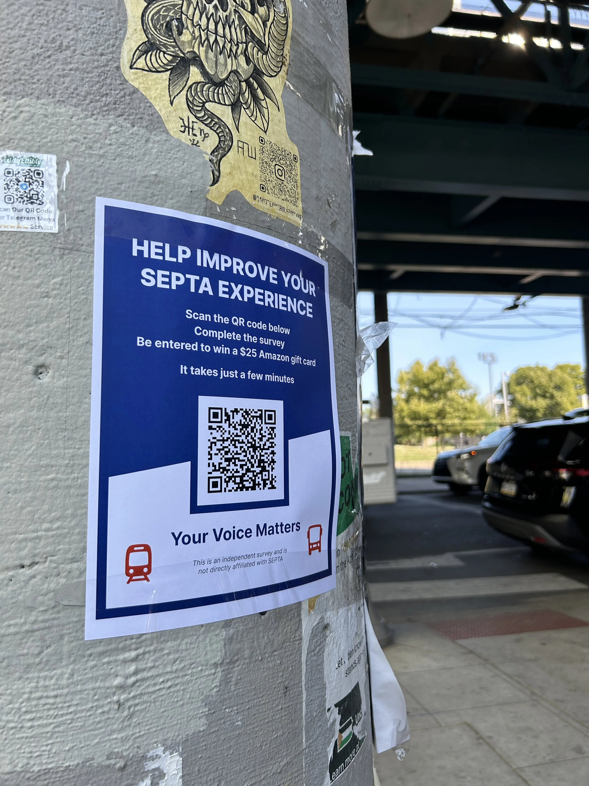
In order to make informed design decisions based on public opinion, I wrote a Qualtrics survey and posted fliers featuring a QR code leading to the survey in various neighborhoods throughout Philadelphia.
The main questions I wanted answered via this study were:
What do users find both useful and troublesome about the current site and app?
What features would people like to see added or improved?
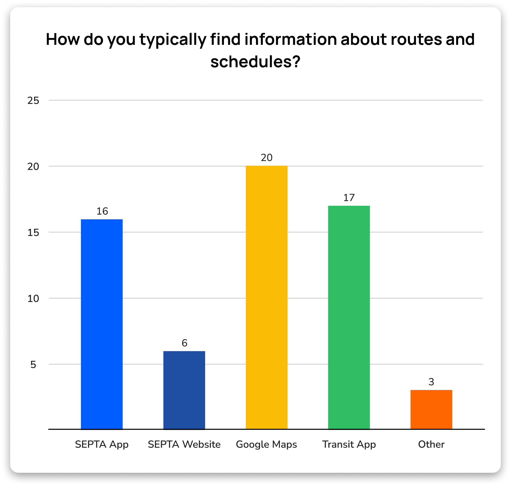
What other services or apps, if any, do people use to navigate SEPTA?
Quantitative Findings
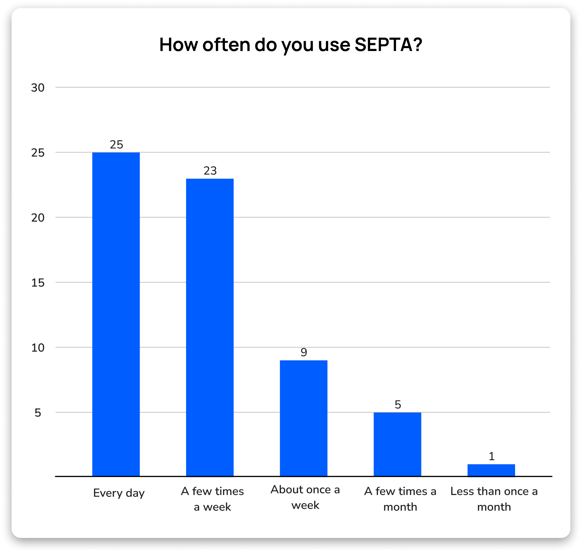
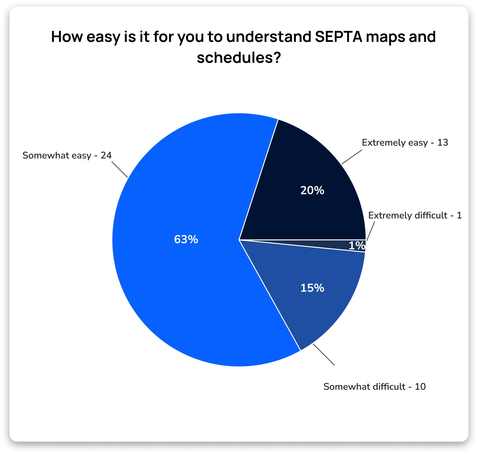
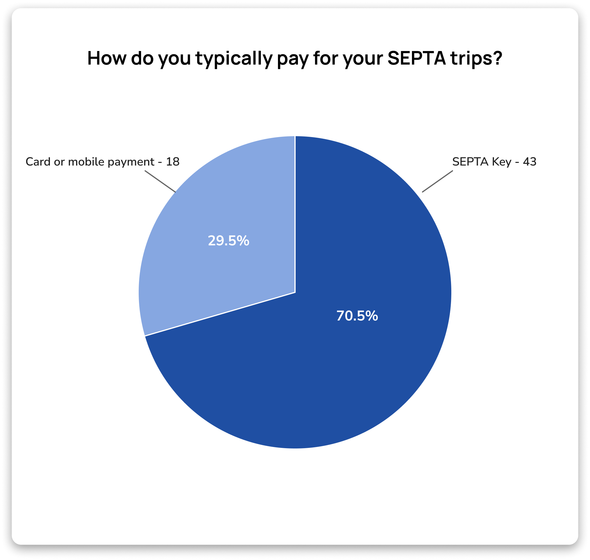
I am fortunate to have received nearly 70 survey responses. Here are some key findings.
Qualitative Findings
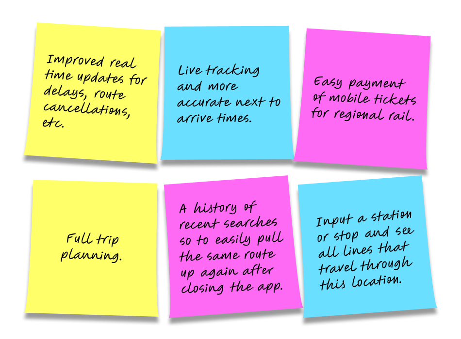
What features would users like to see implemented?
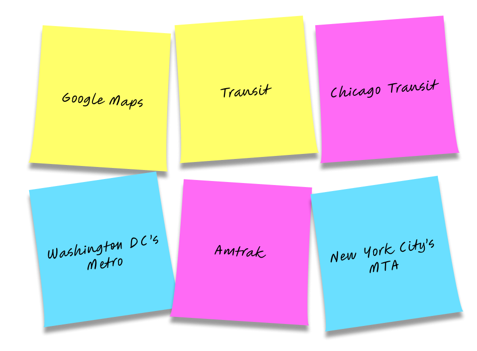
Are there any other transit and/or navigation systems you’ve used that you think SEPTA could learn from?
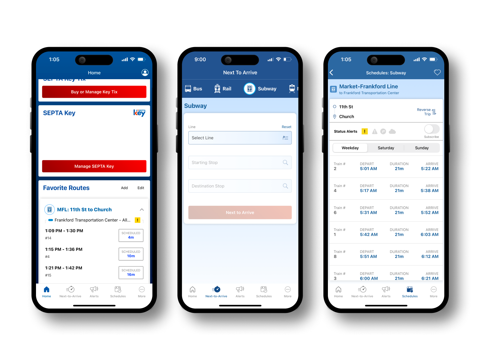
Analysis of SEPTA’s Existing App
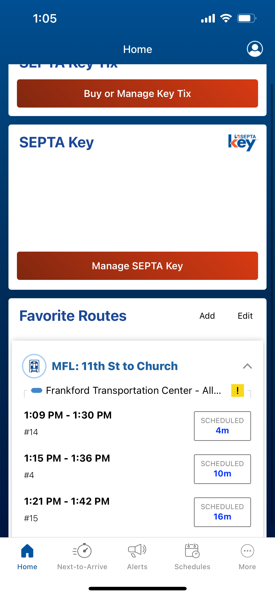
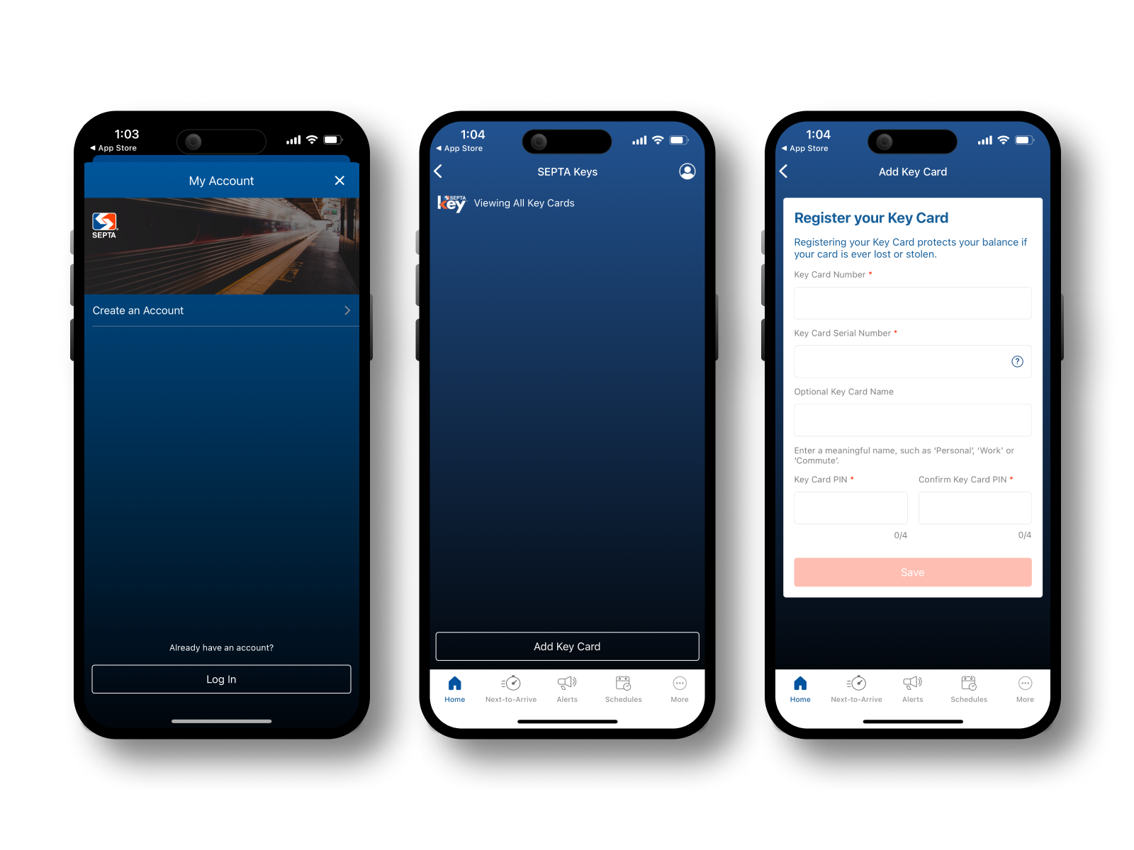
SEPTA offers a mobile app and website for schedules, service disruptions, and payments. The mobile app is clearly dated and lacks key functionality to make it useful for users. However, the website appears to be recently updated, feature-rich, and will require less redesign.
Note: during the completion of this project, SEPTA rolled out a complete overhaul of their old app. My analysis and design decisions are based on the old version of the app.
Complex Navigation
The homepage lacks clear hierarchy.
A large portion of the screen is unused, pushing favorite routes towards the bottom of the screen.
The favorite routes section only displays a single route at a time.
Payment System
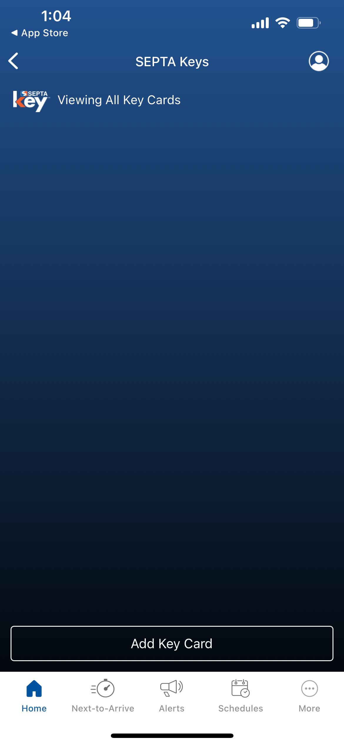
The SEPTA Key page is largely empty, and doesn’t convey the features that are available.
The “Add Key Card” button does not strong emphasis indicating a call to action.
Real-Time Information
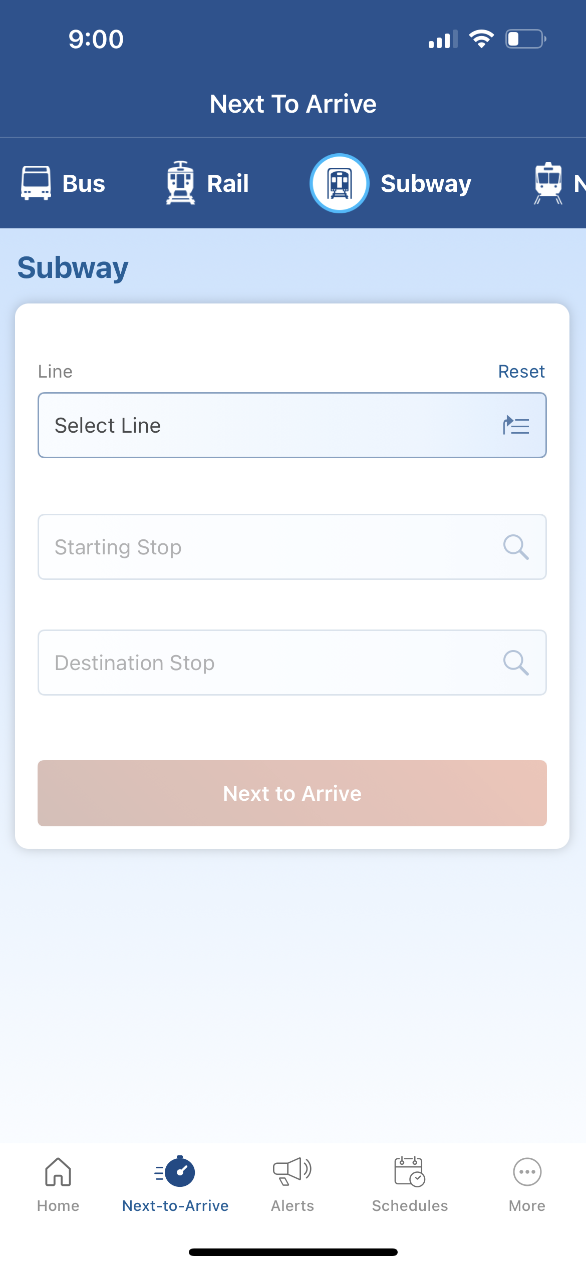
The app possesses no way to search a destination, requiring users to already know which mode of transportation and stops to use.
Competitive Analysis
Public transit in a metro area doesn't have direct "competitors" to SEPTA. Therefore, I will explore transit apps from other cities and popular navigation apps for inspiration in my design choices.
-
Strengths:
Simple and intuitive navigation flow
Handles transit navigation surprisingly well
Weaknesses:
It isn’t intended for transit specifically. Which is no issue, just worth taking from it what I find most useful
-
Strengths:
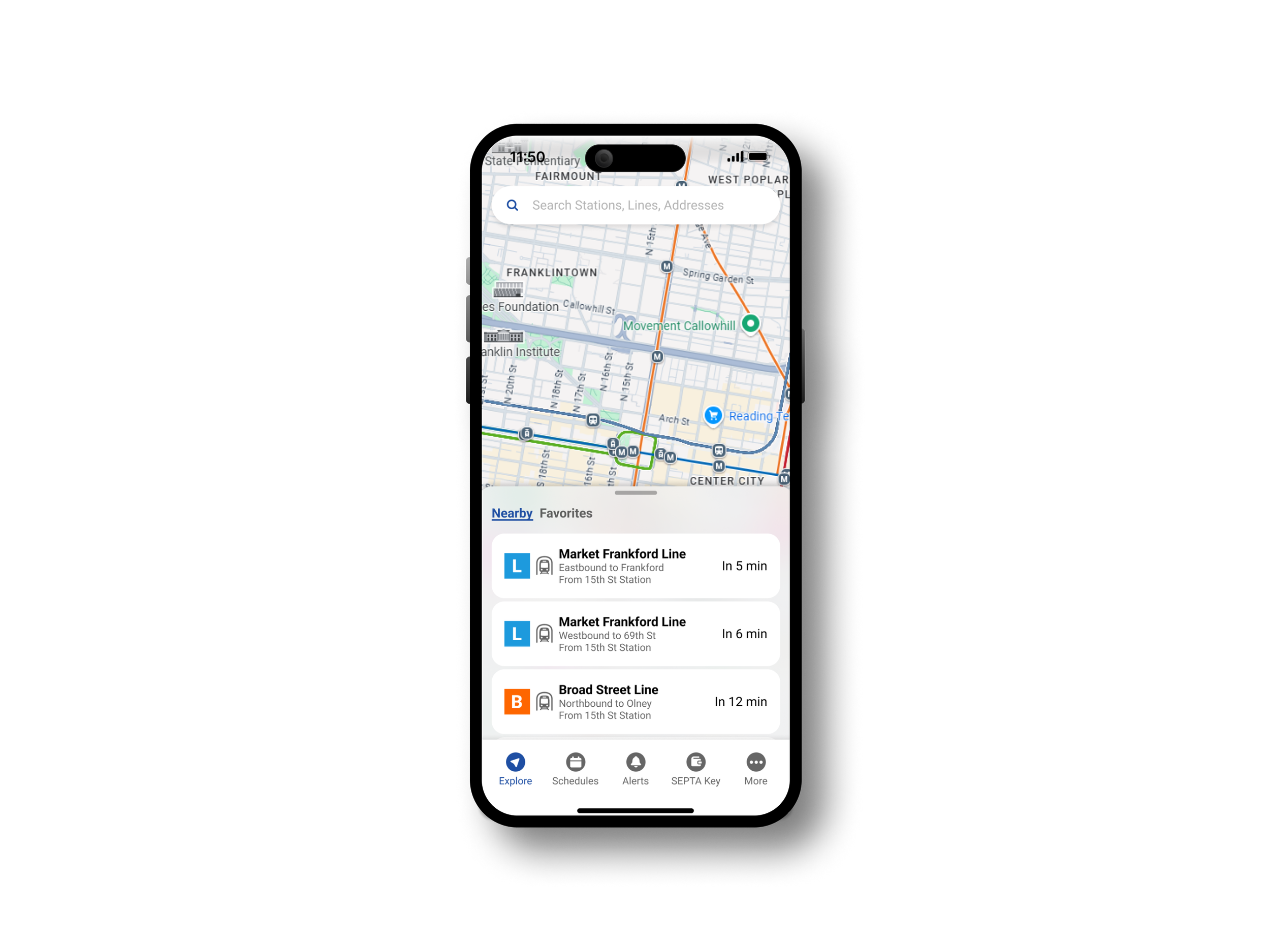
The home screen displays real-time overviews of the nearest routes at a glance
The home screen also emphasizes a live map, clearly indicating the GPS navigation capability
Weaknesses:
I don’t care for the placement of the search bar on the home screen
The app overall feels a bit too “Freemium” focused advertising paid features
There are a few “pull to dismiss” indicators in some areas that could easily be replaced with an arrow or some sort of icon
The proposed routes screen isn’t particularly intuitive
-
Strengths:
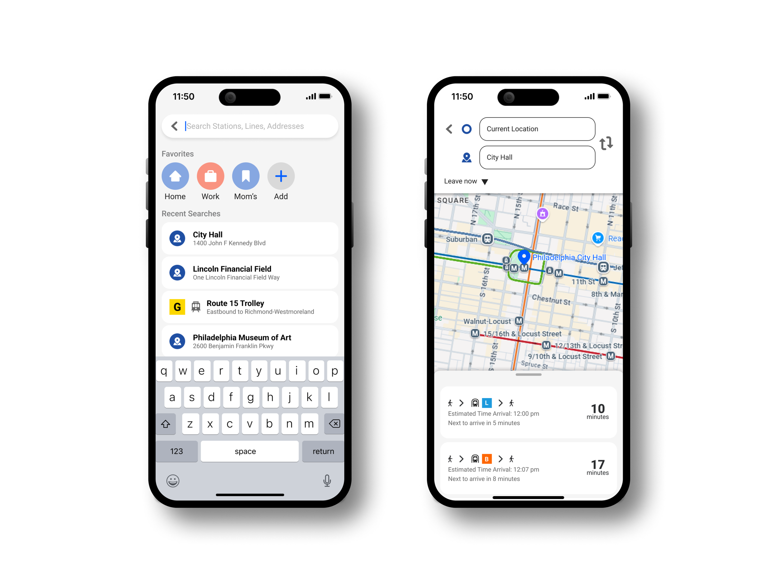
Allows for dynamic searching of addresses, stations, and lines for users to navigate to destinations
The alerts dashboard and schedule selection features are intuitive
Their website is very clean and will be a good reference to use
Weaknesses:
They could benefit from having a schedule selection feature directly on the homepage
Research Takeaways
User Behavior and Insights
Most survey respondents ride SEPTA daily or multiple times a week, emphasizing the app's importance to frequent riders.
The top user request is real-time updates and notifications, followed closely by better management of favorite routes.
Issues with SEPTA's Existing App
Visual Design: The app is visually unappealing.
Navigation: No end-to-end trip navigation.
Manual Input: Users must know their exact route to find schedules or next-to-arrive service.
Favorites: Favorited routes are not displayed clearly on the homepage.
SEPTA Key: Managing the SEPTA Key card is clunky and unintuitive.
Competitive Analysis and Inspiration
Google Maps: Provides intuitive real-time navigation, including options for SEPTA transit.
Transit App: Features a strong home screen design with easy access to GPS features and nearby transit service.
NYC MTA App: Displays transit schedules and alerts effectively.
Key Issues to Solve
Real-Time Updates & Notifications: Users want accurate and timely information about transit services.
Simplified Favorite Routes: Managing and receiving notifications for favorite routes needs to be easier.
End-to-End Navigation: Users need guidance for trip planning, eliminating guesswork about routes.
Improved Visual Design: The current app lacks a user-friendly and appealing design.
SEPTA Key Usability: Managing SEPTA Key cards and payments feels clunky and unintuitive.
Ideation Process
Design Decisions
Maintain SEPTA’s current branding
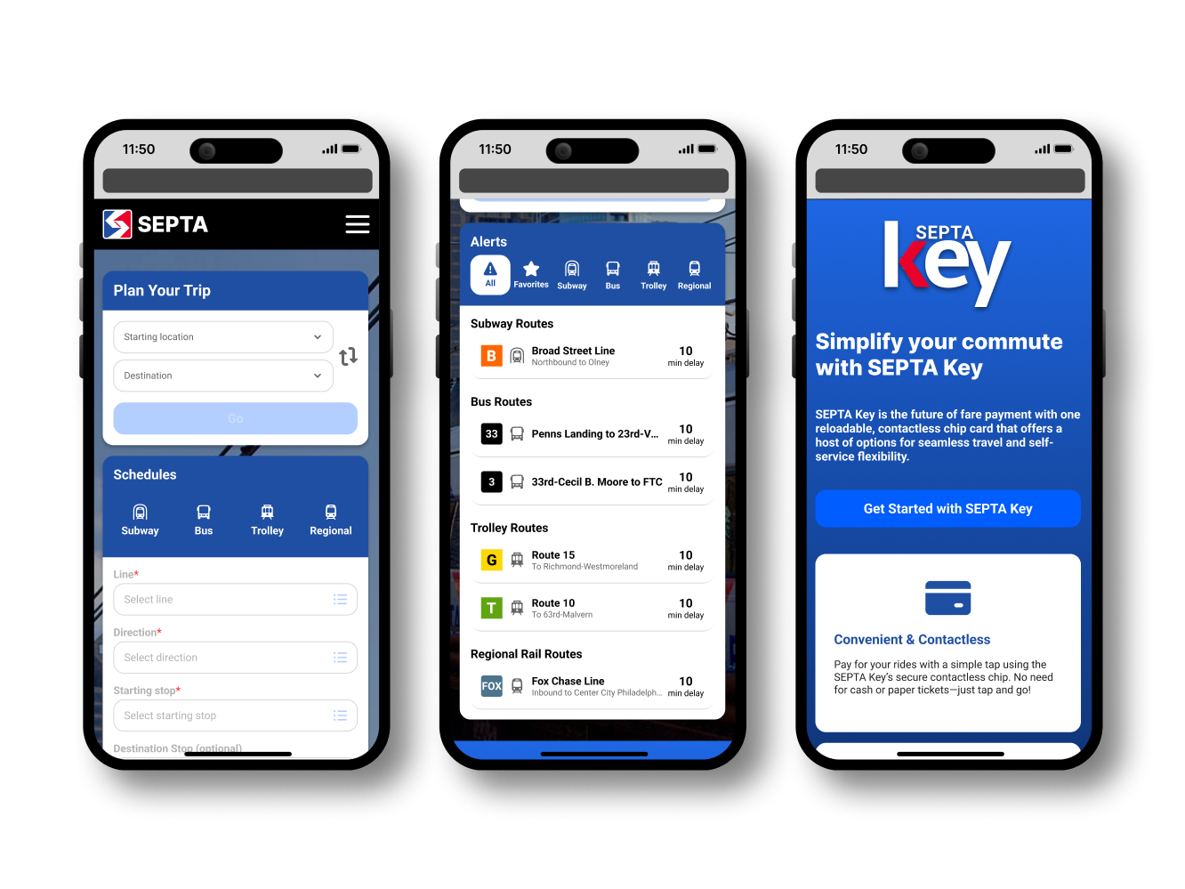
This UX overhaul leverages SEPTA’s existing branding, typography, and colorways. I’ve also incorporated their new “SEPTA Metro” design campaign, which simplifies signage and iconography across the system.
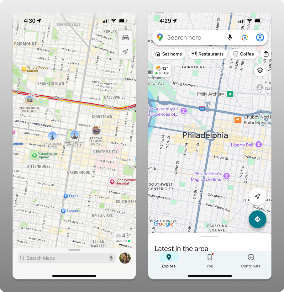
Design GPS functionality similarly to Google and Apple Maps
Familiar systems like Google and Apple Maps served as inspiration, ensuring a user-friendly and intuitive GPS experience without reinventing the wheel.
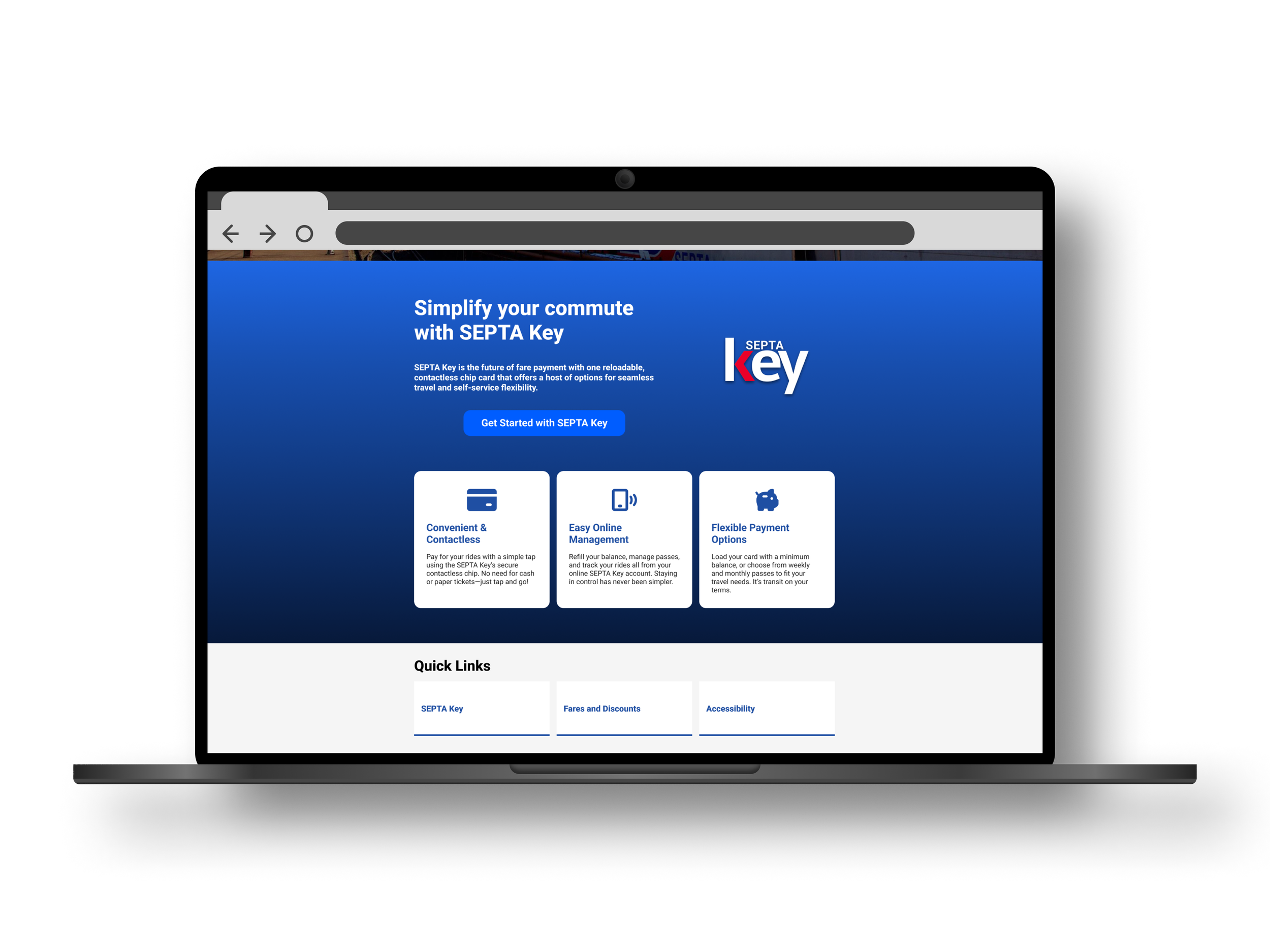
Treat SEPTA Key like a mobile wallet
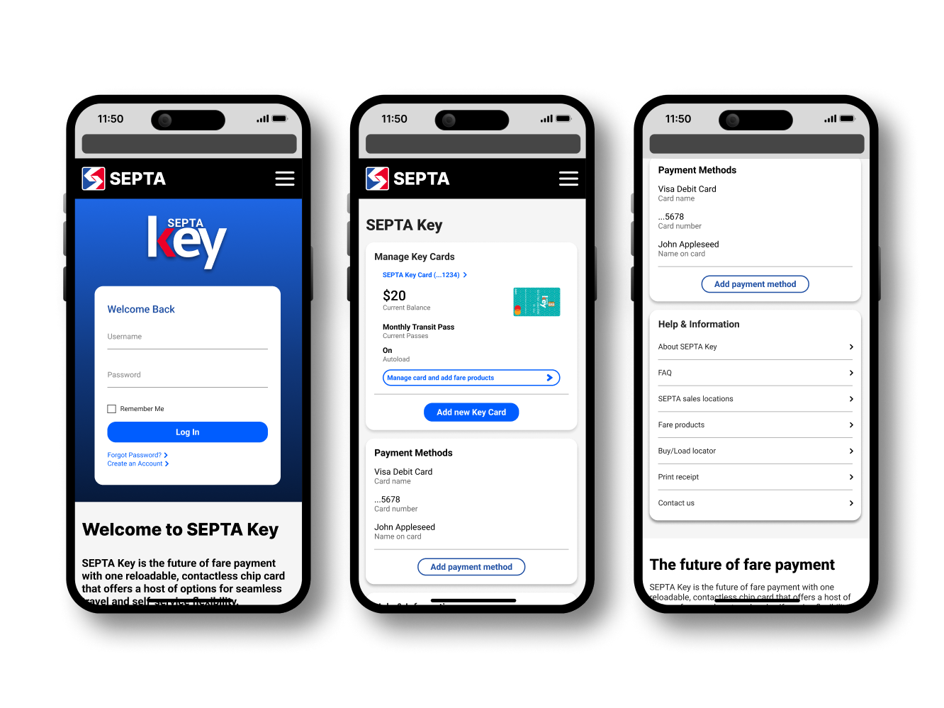
The old app redirected users to a website for SEPTA Key management, treating the card less like a reloadable debit card and more like an afterthought. My redesign models SEPTA Key after digital wallet apps for a seamless UX.
Reuse mobile assets in the web designs
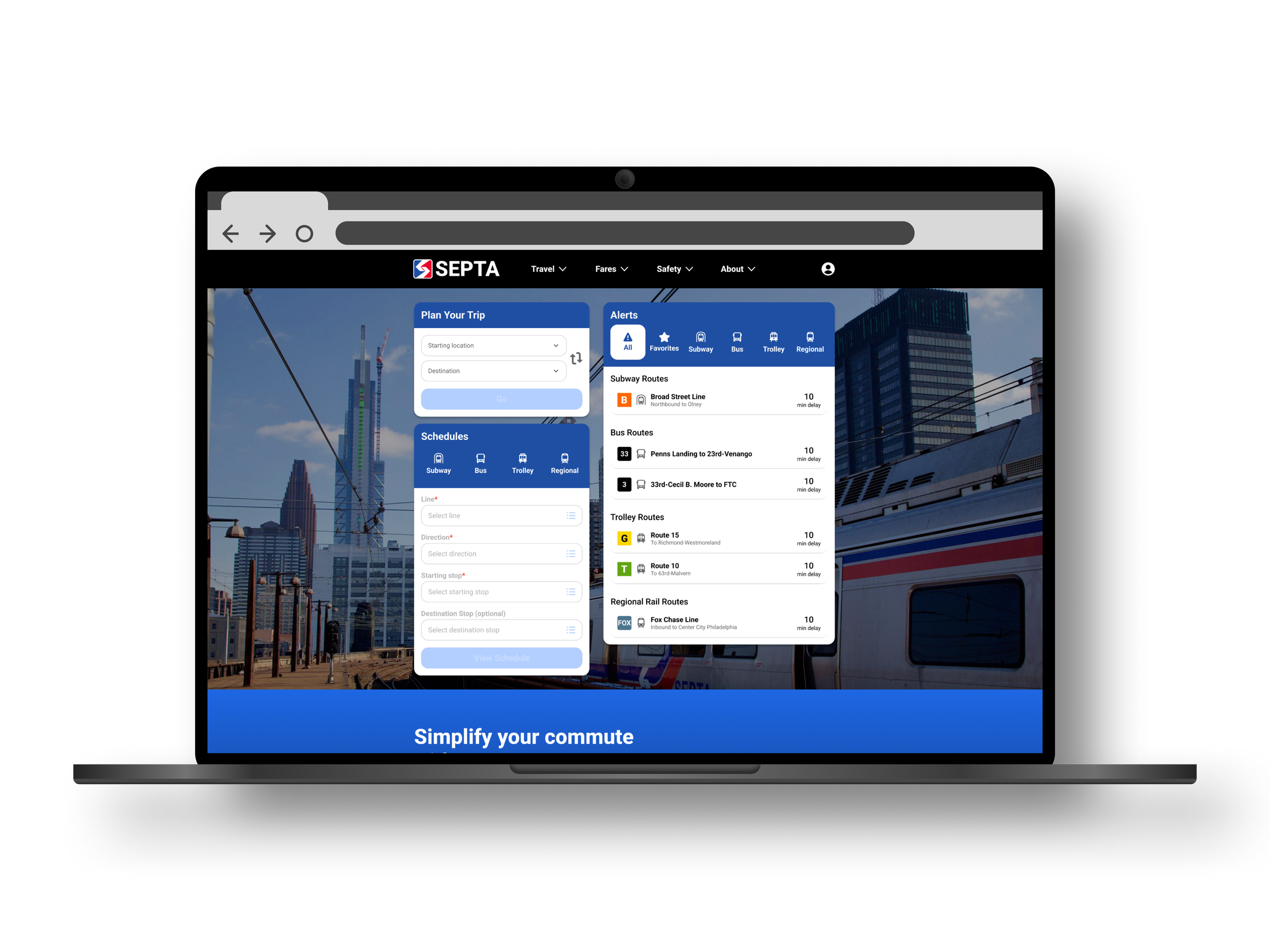
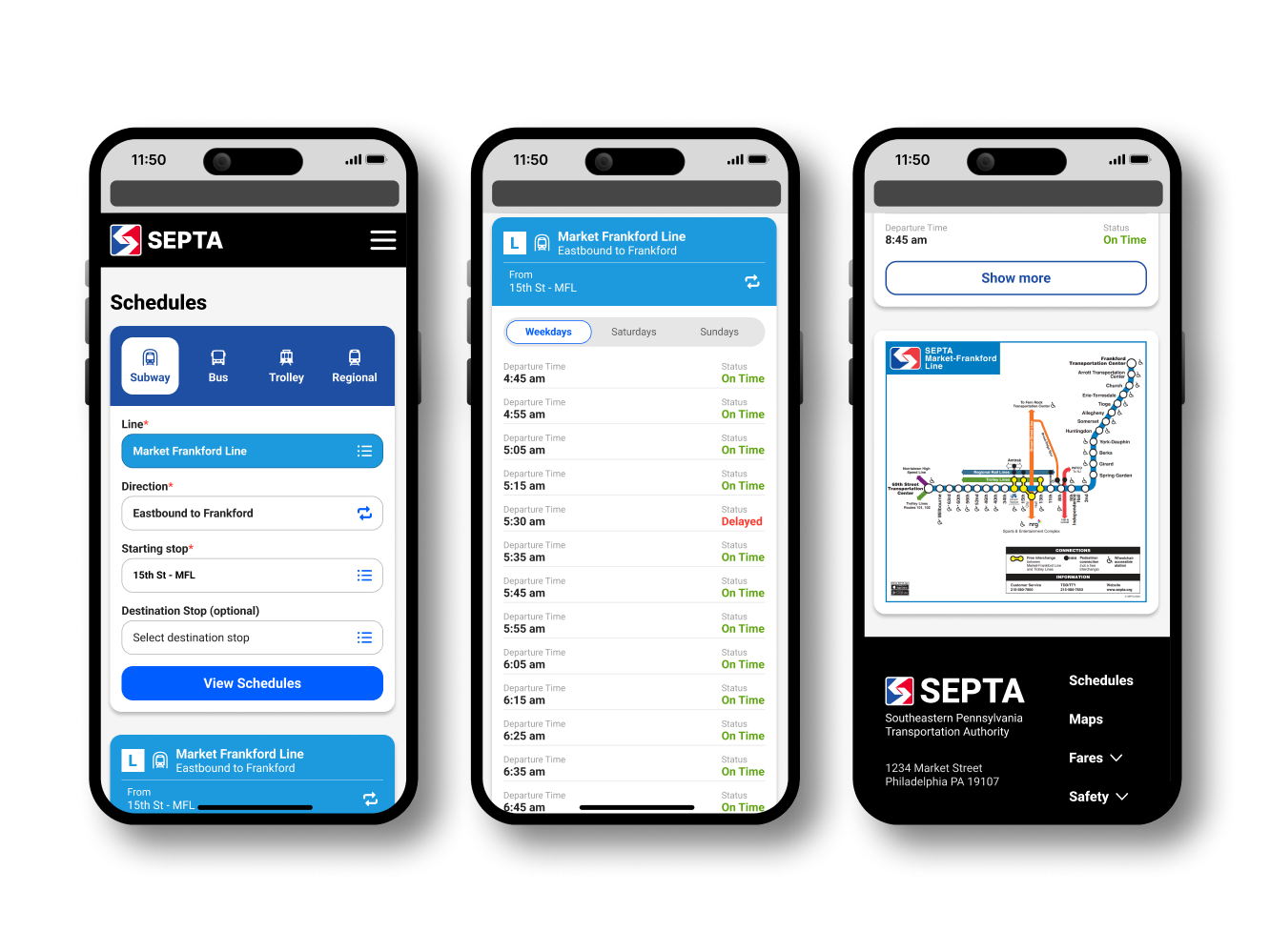
To maintain consistency and efficiency, I reused mobile app UI elements in the web designs. Figma’s auto layout streamlined this process, ensuring consistent functionality across platforms.
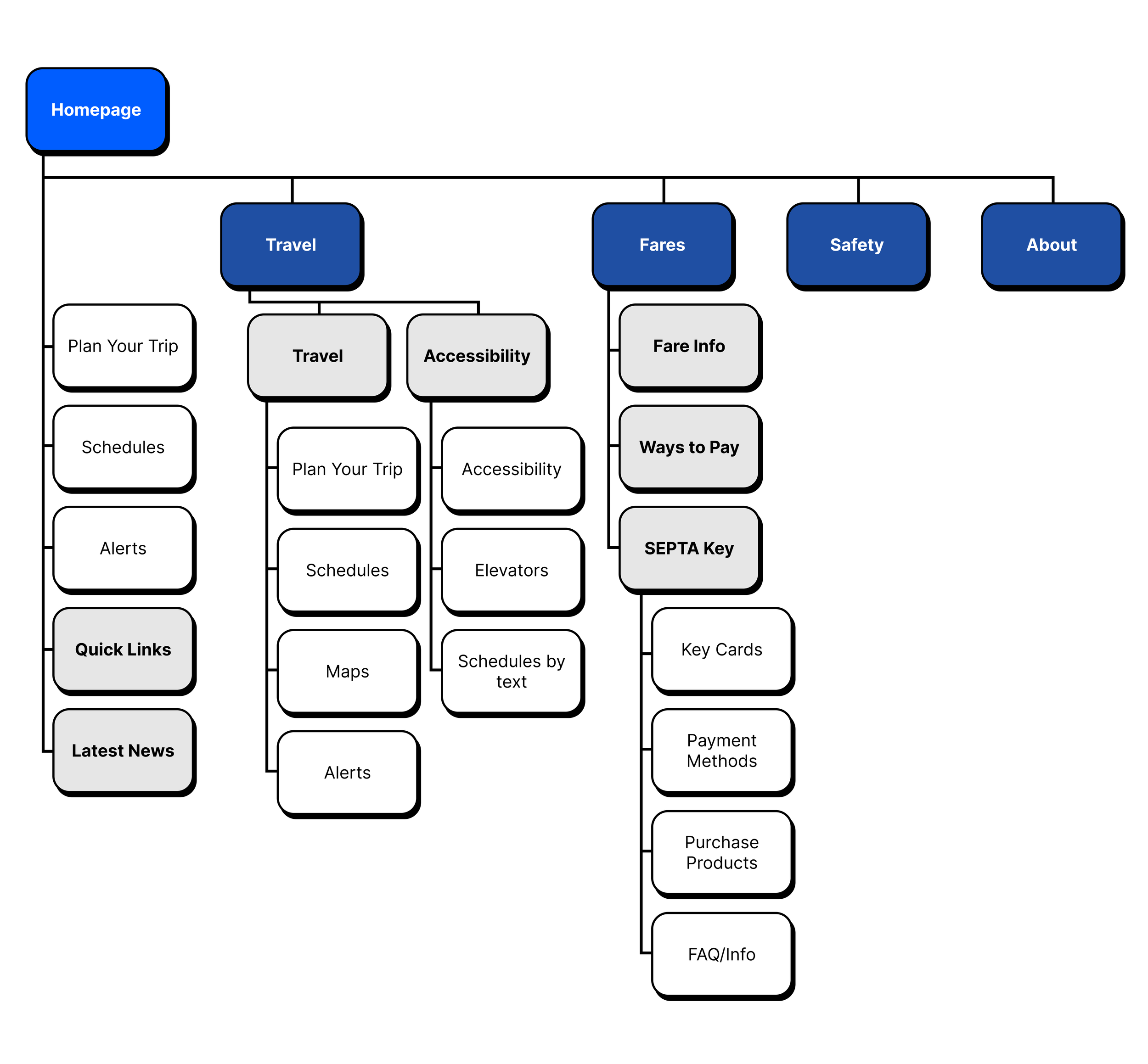
Mobile App Sitemap
Web Sitemap
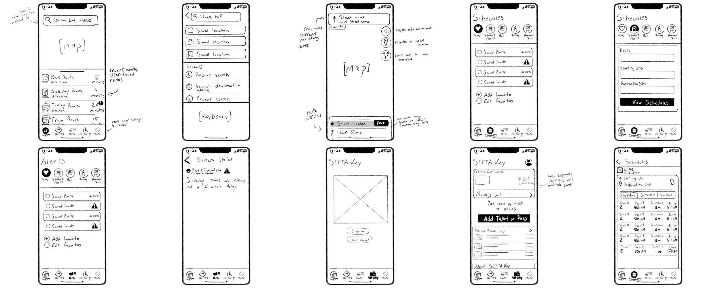
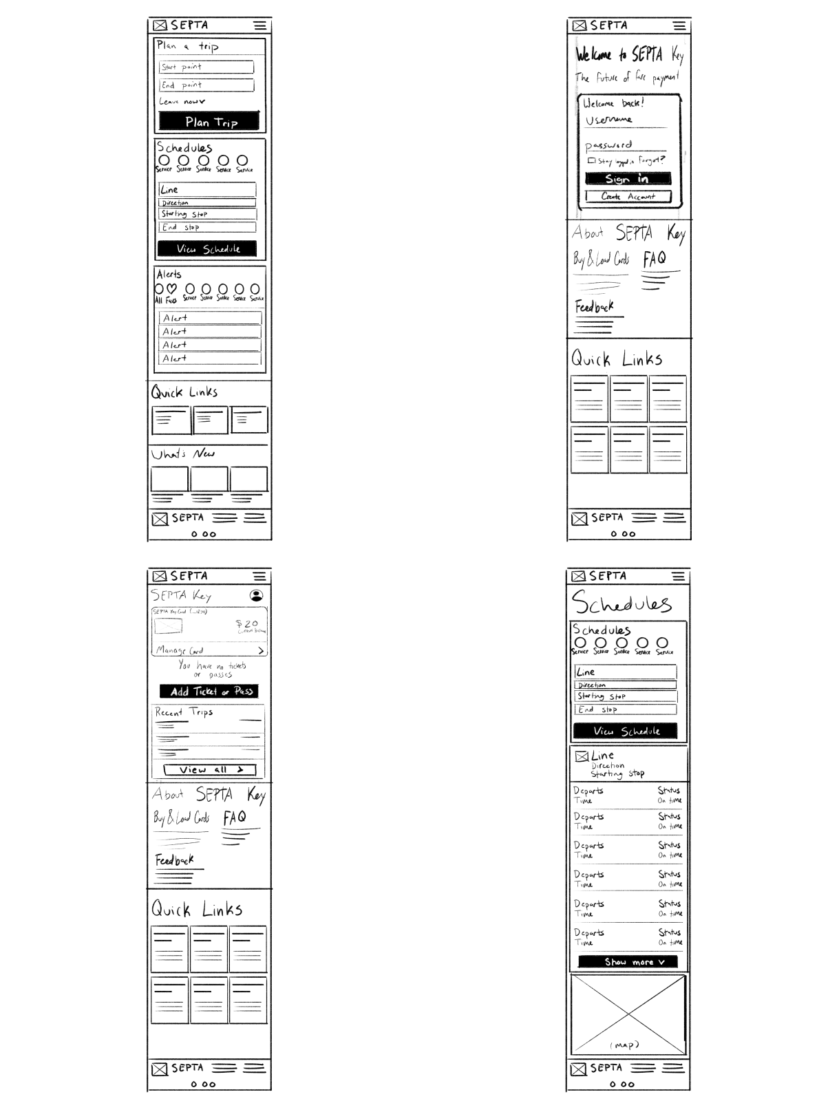
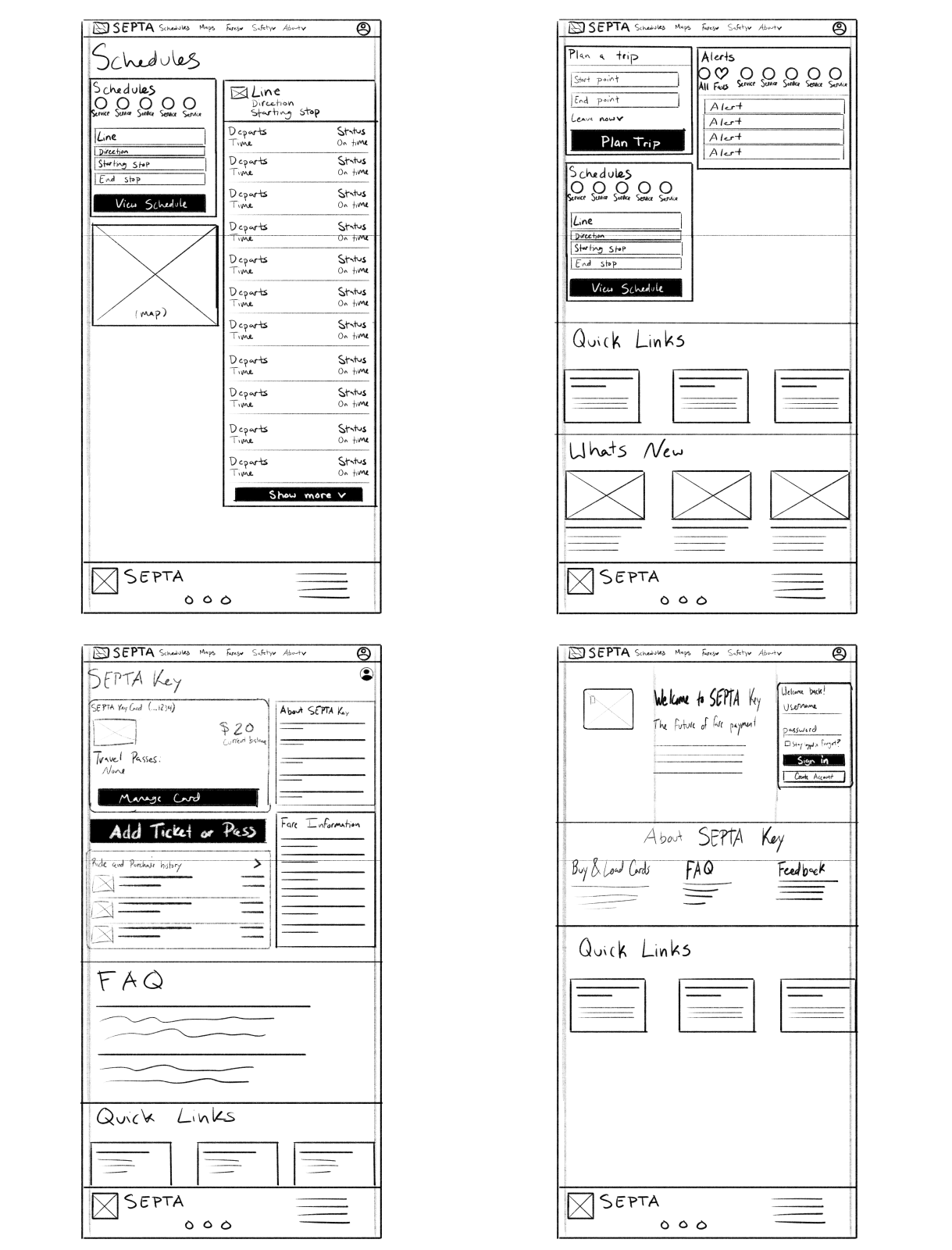
Hand Drawn Wireframes
Mobile App
Mobile Web
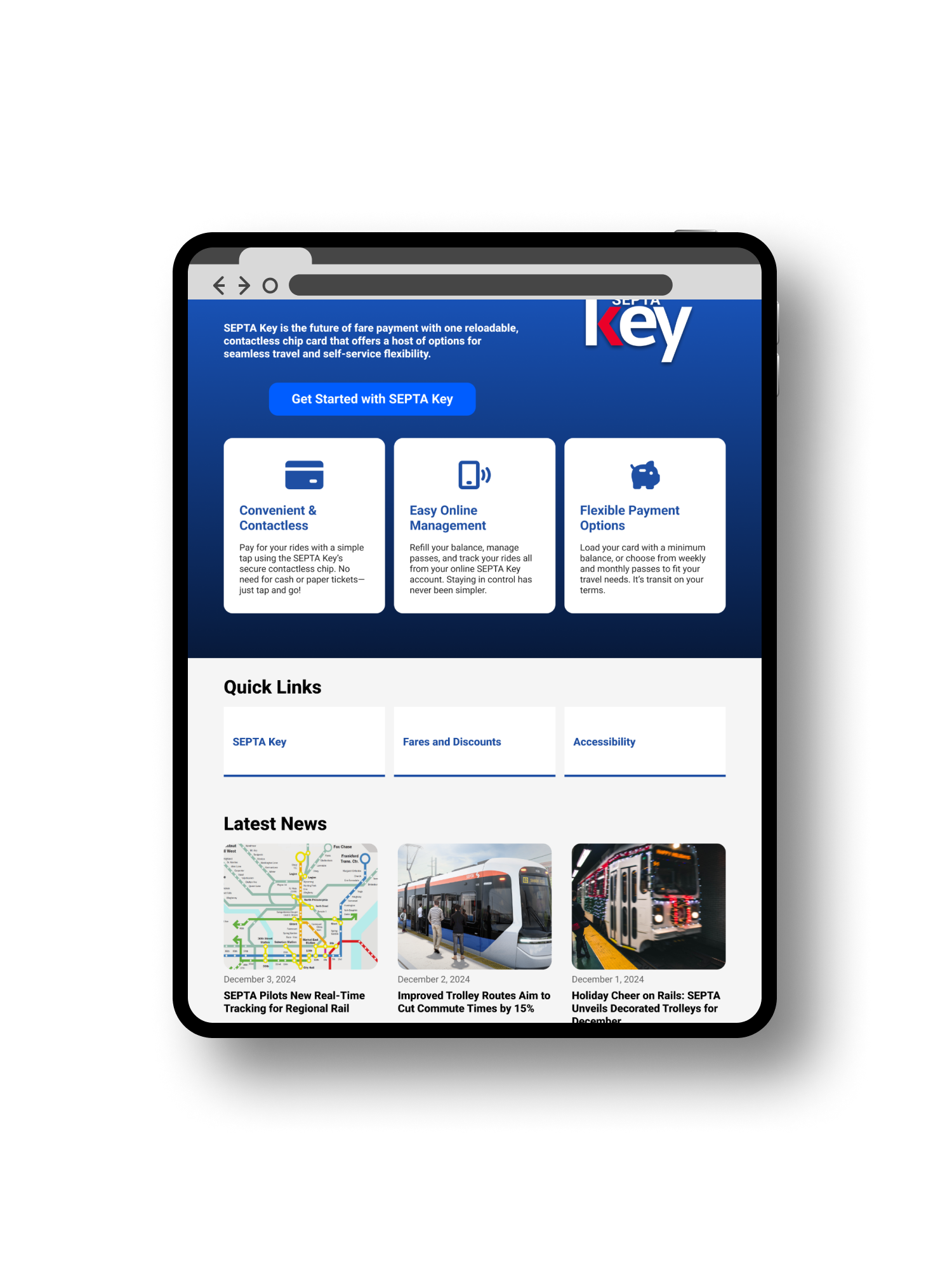
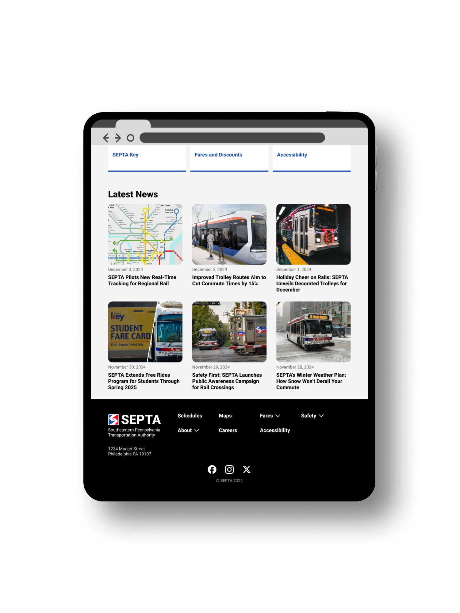
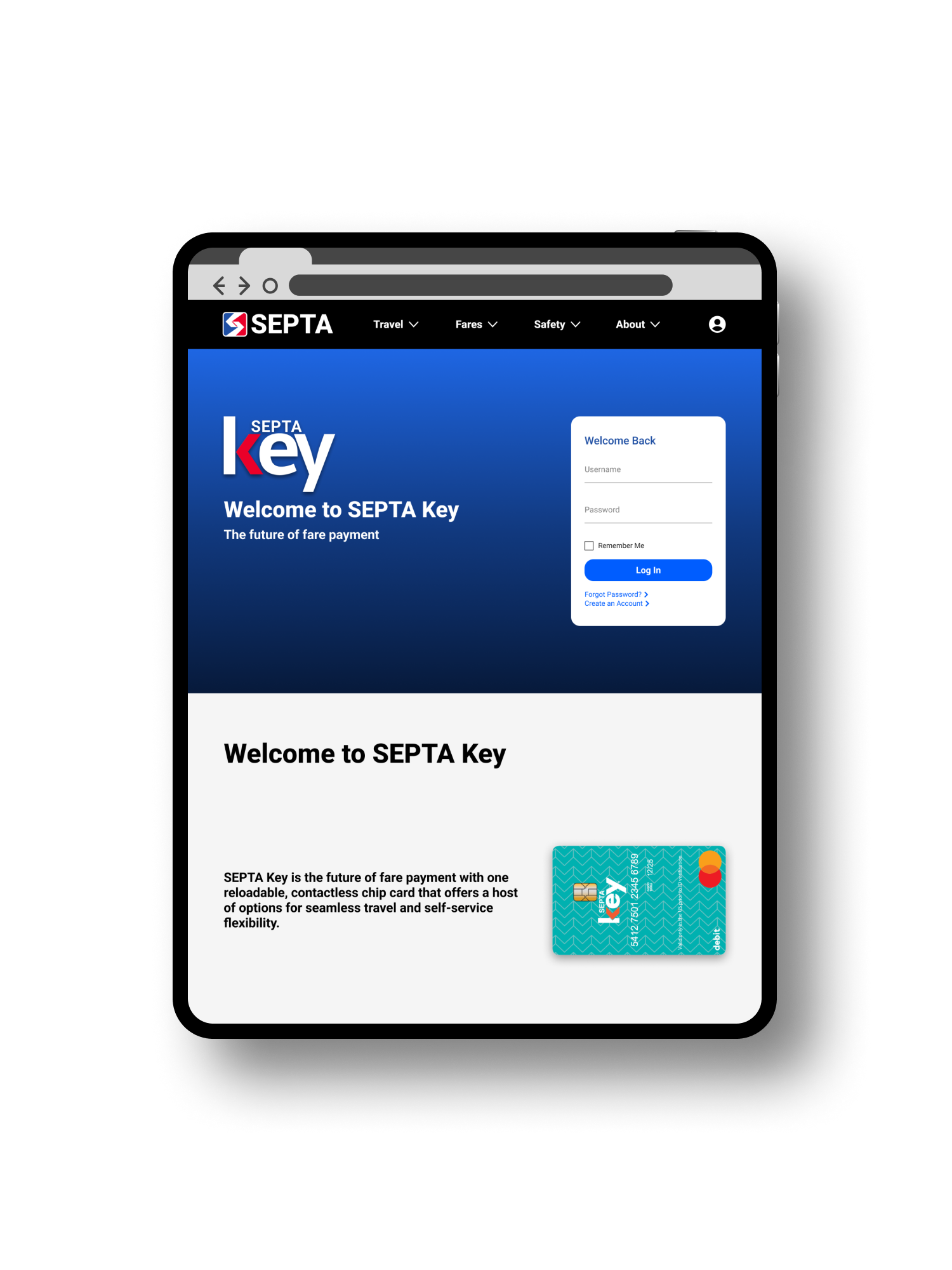
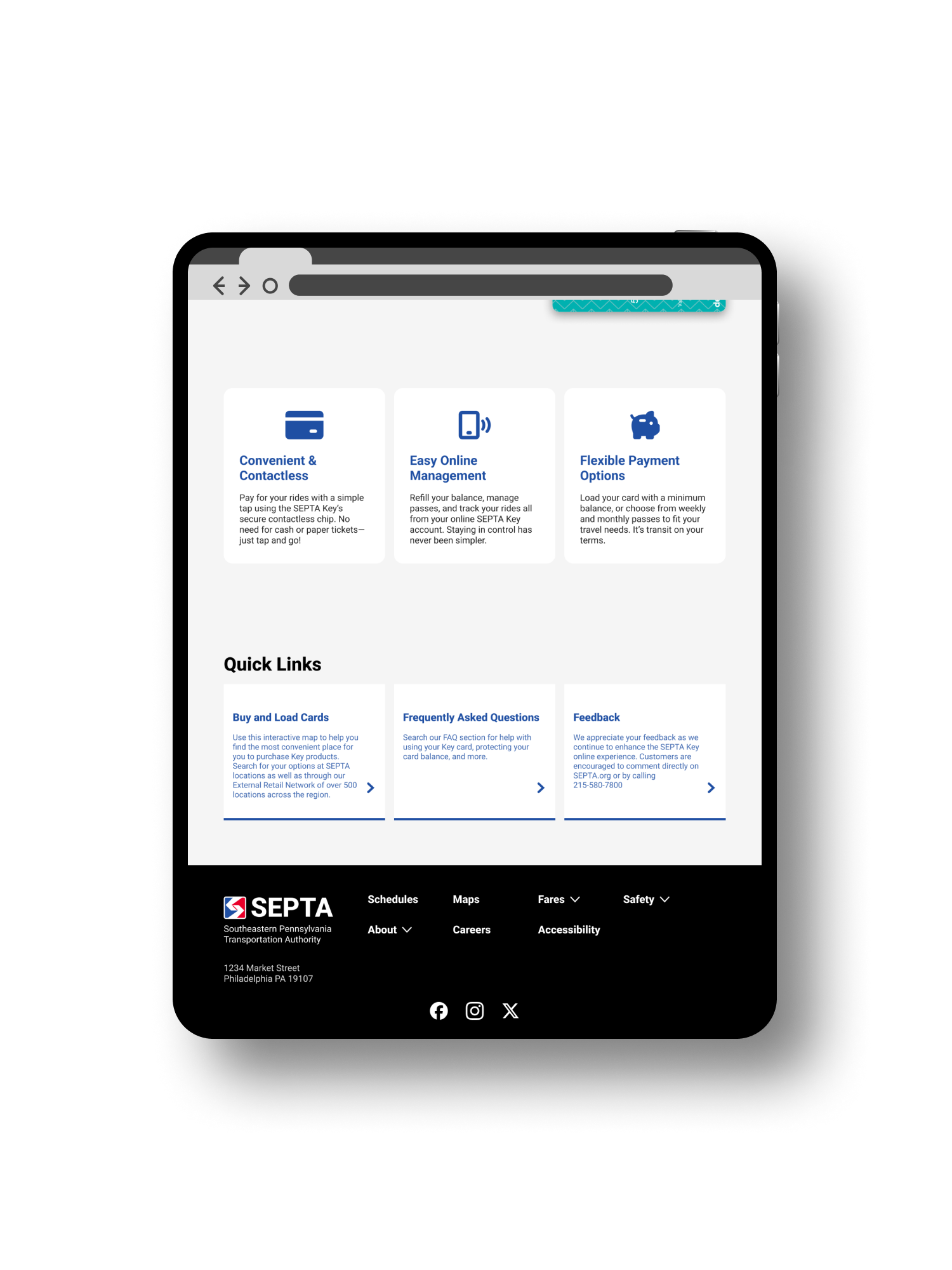
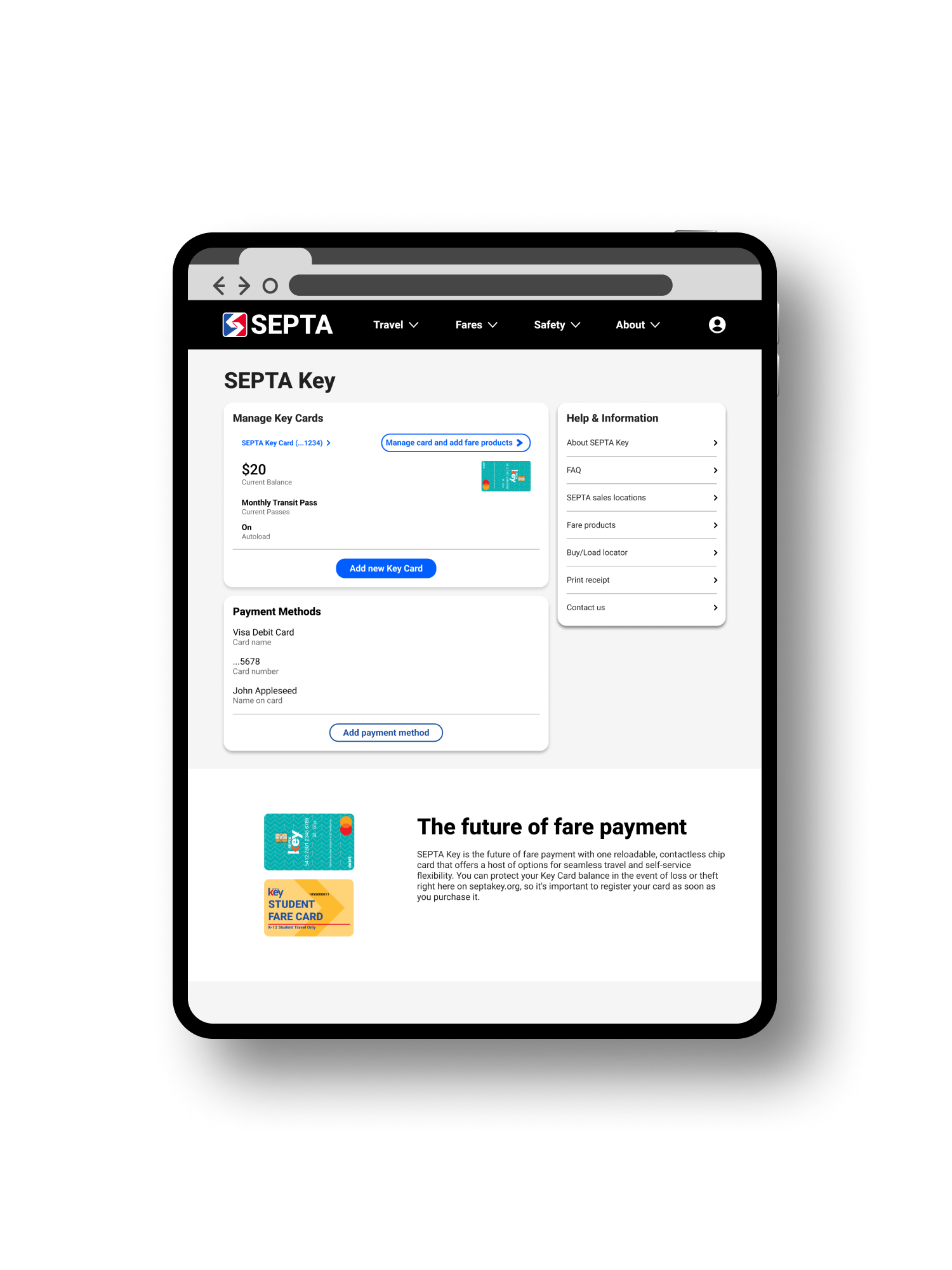
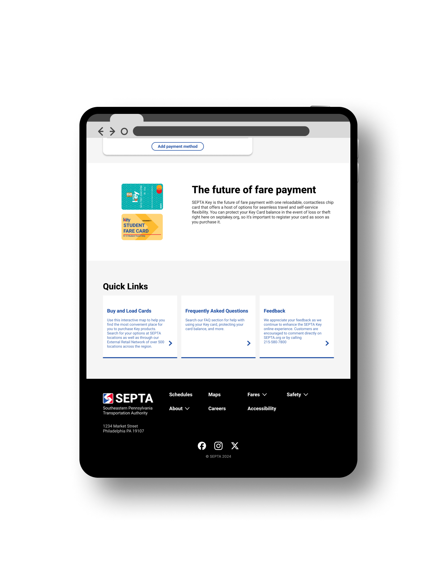
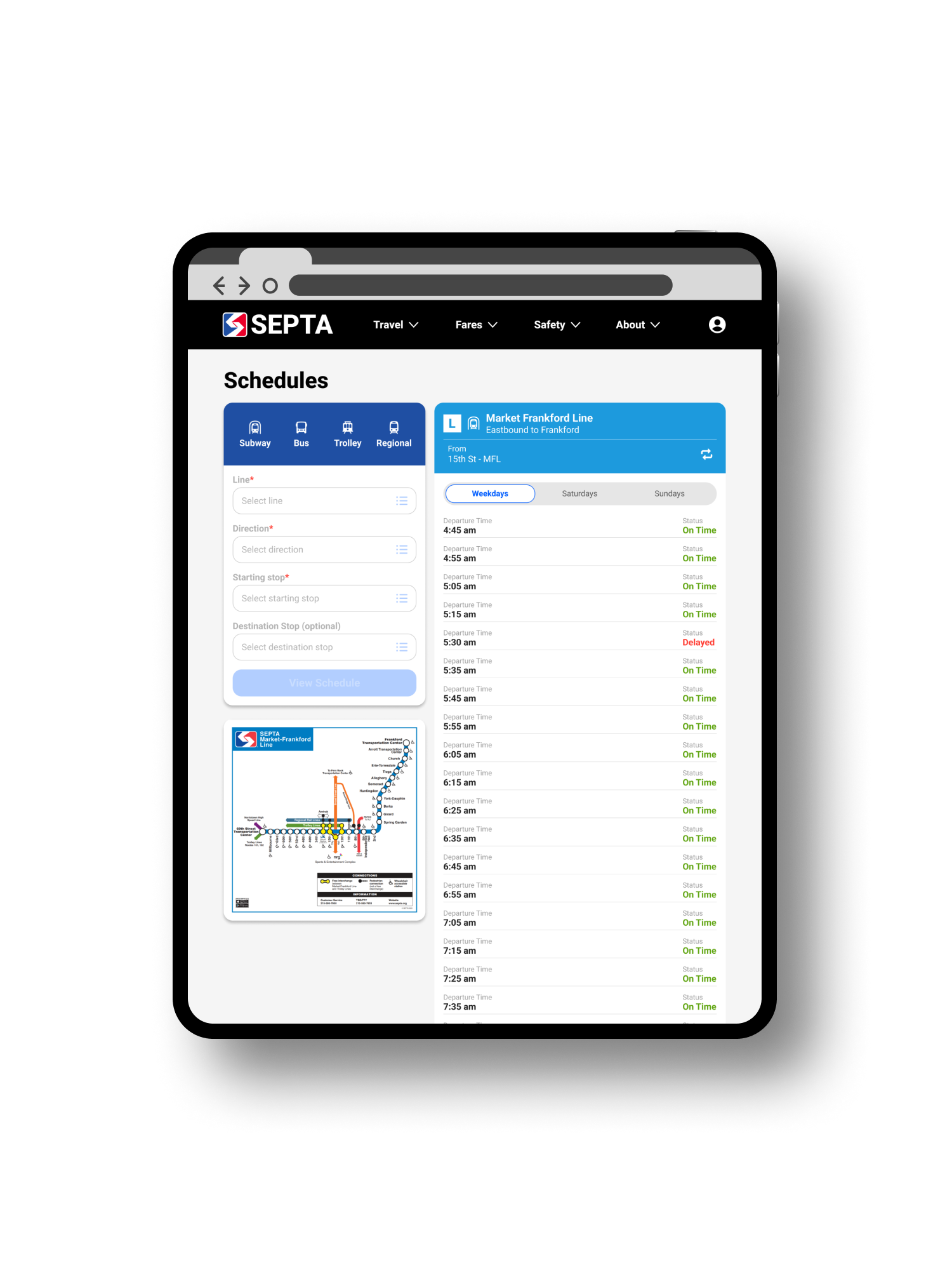
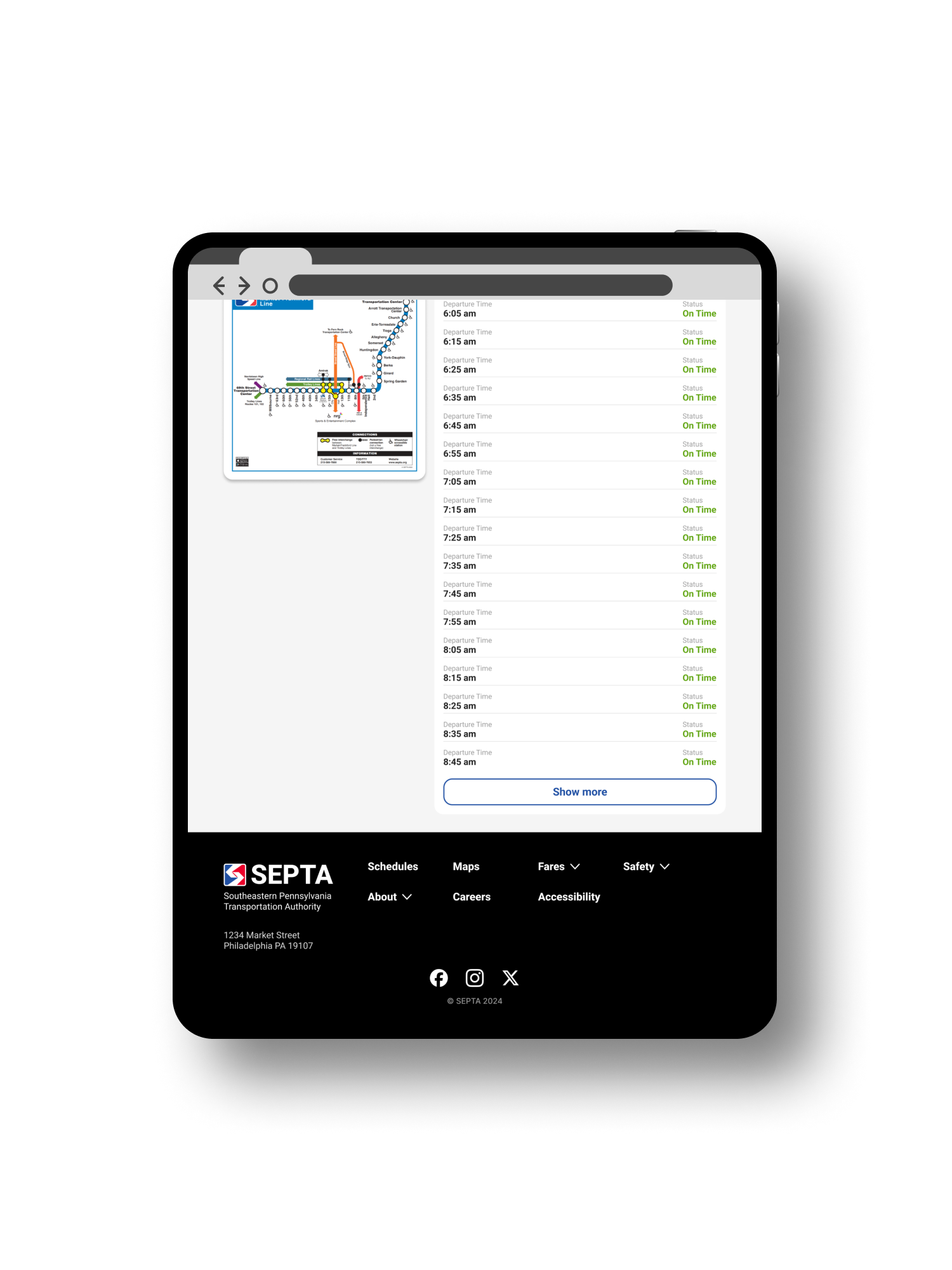
Tablet Web
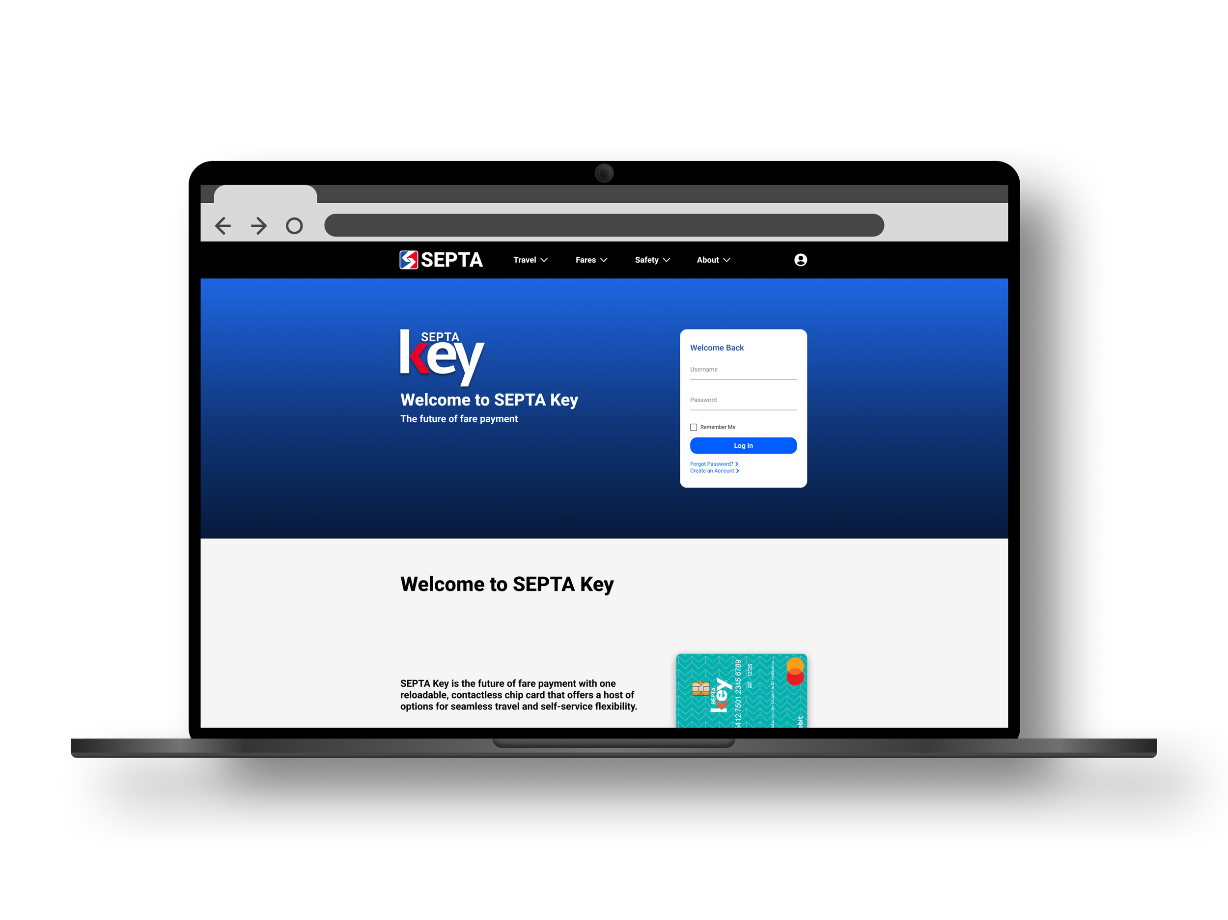
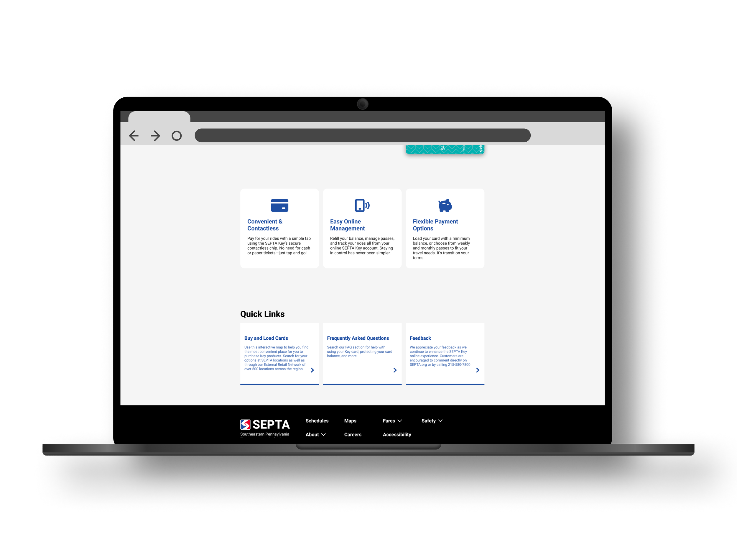
Desktop Web
Low Fidelity Wireframes
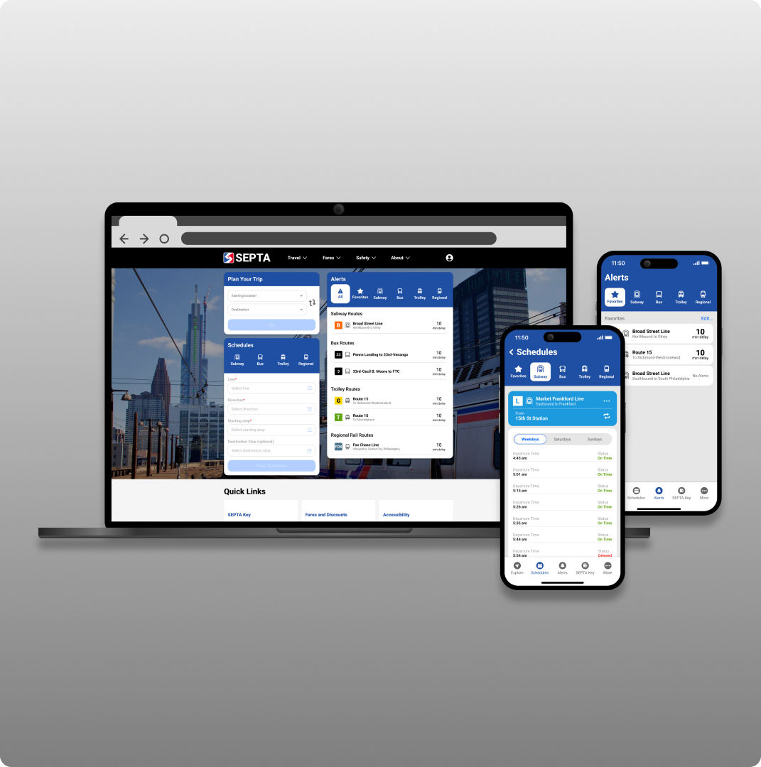
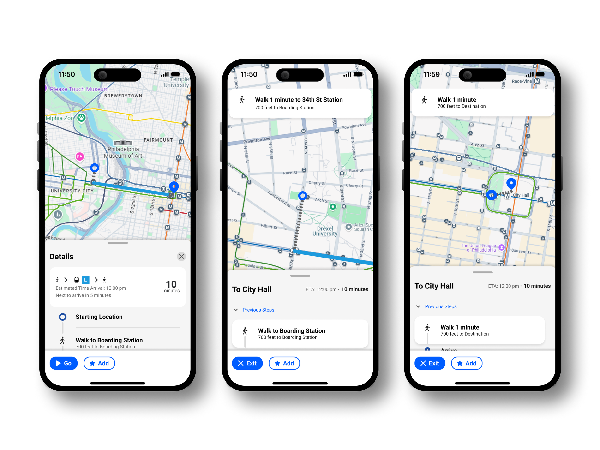
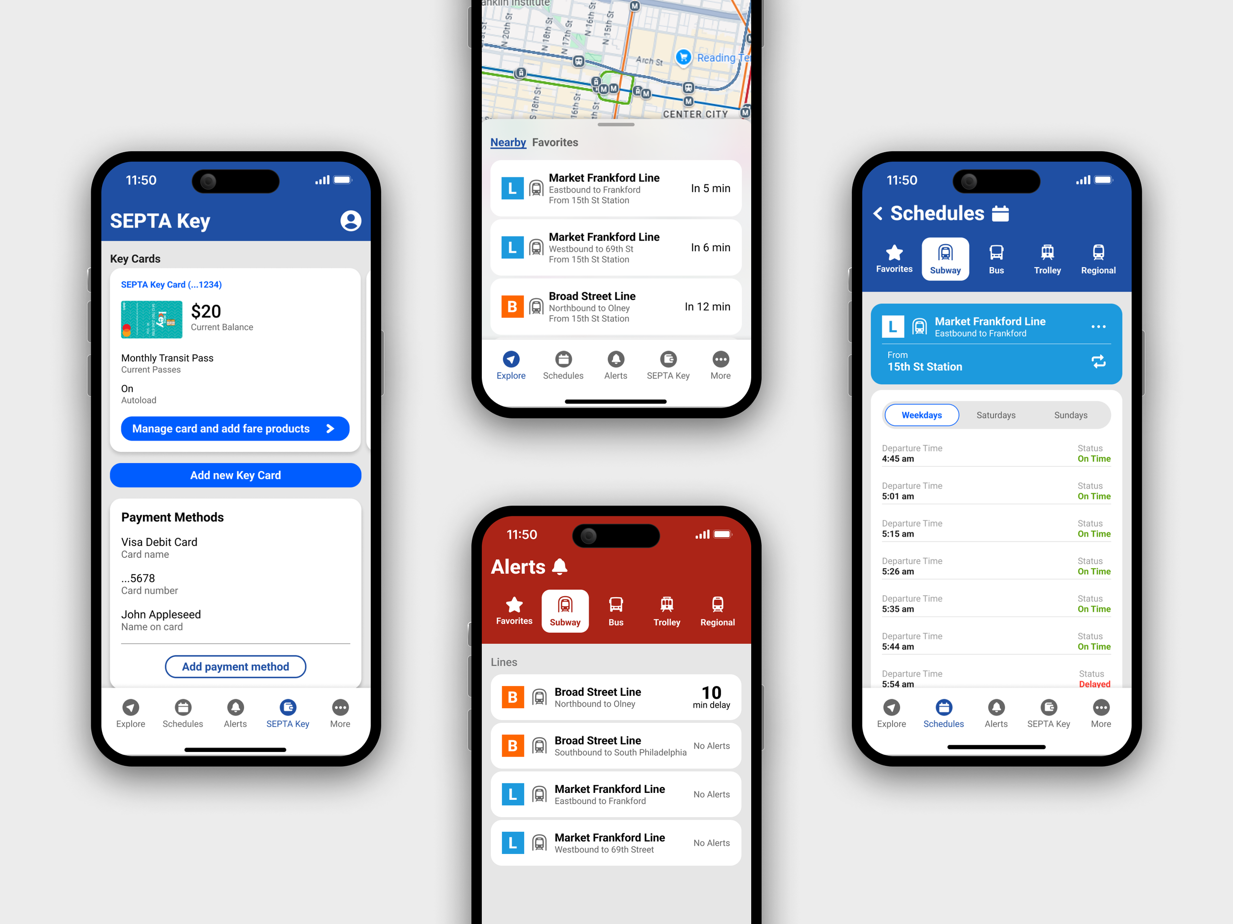
High Fidelity Mockups
Mobile App
Desktop Web
Tablet Web
Mobile Web
Usability Study
Study Overview
Study Type: Unmoderated usability study
Participants: 5 participants
Location: United States, remote
Length: 10-20 minutes
Study Goals
Gauge ease of use of core user flows
Determine if app is visually appealing to testers
Garner suggestions and feedback from testers
Testing Insights and Revisions
Below are the key insights gathered from testing and revisions to address these issues
Clarify the ETA and starting point
Before
After
Differentiate the Schedules and Alerts screens
Before
After
Interactive Prototypes
The corresponding Figma prototypes can be found via the below links
Impact
How my design addresses users’ needs
Added Real-Time Navigation
Original app
My redesign
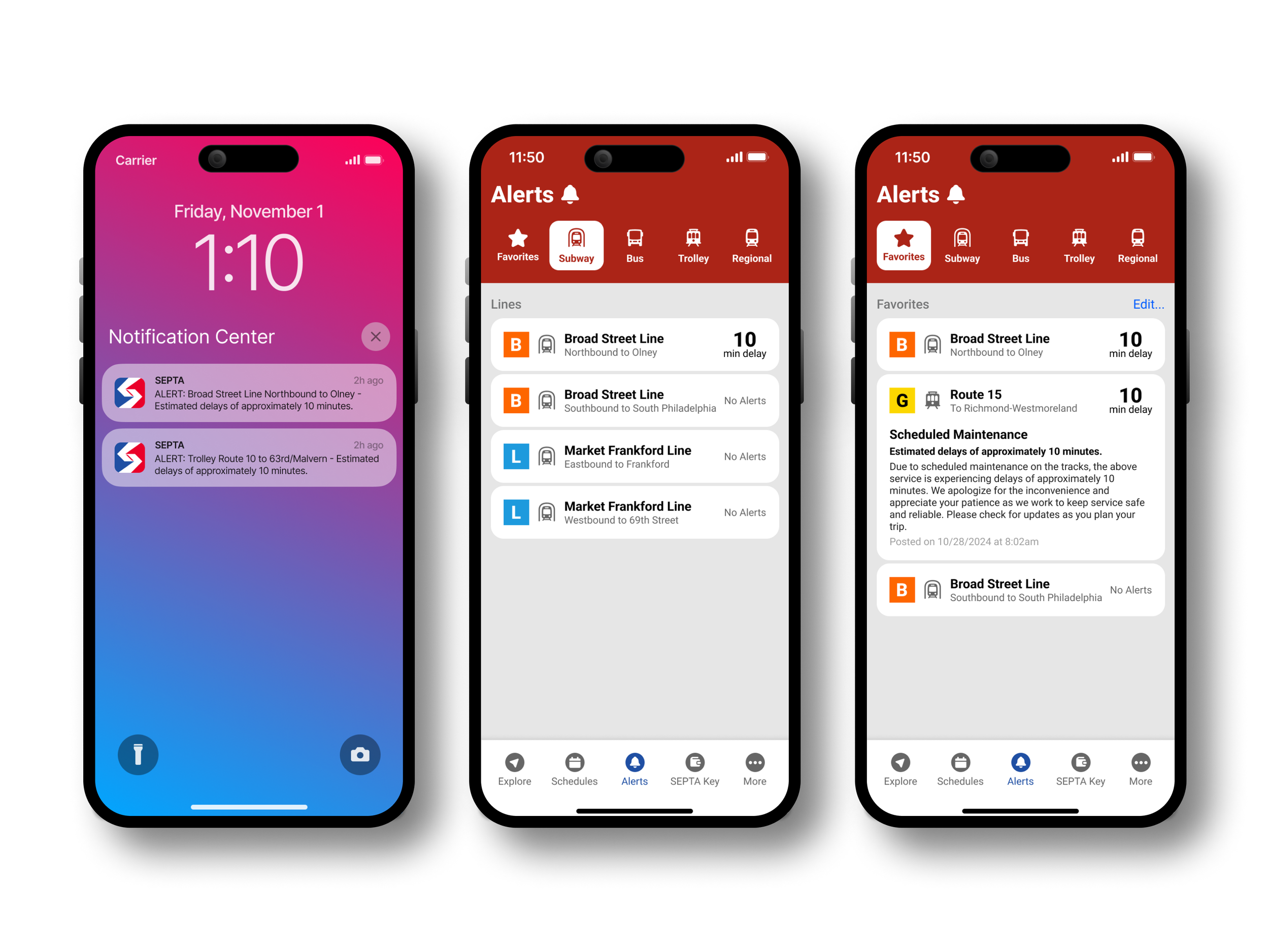
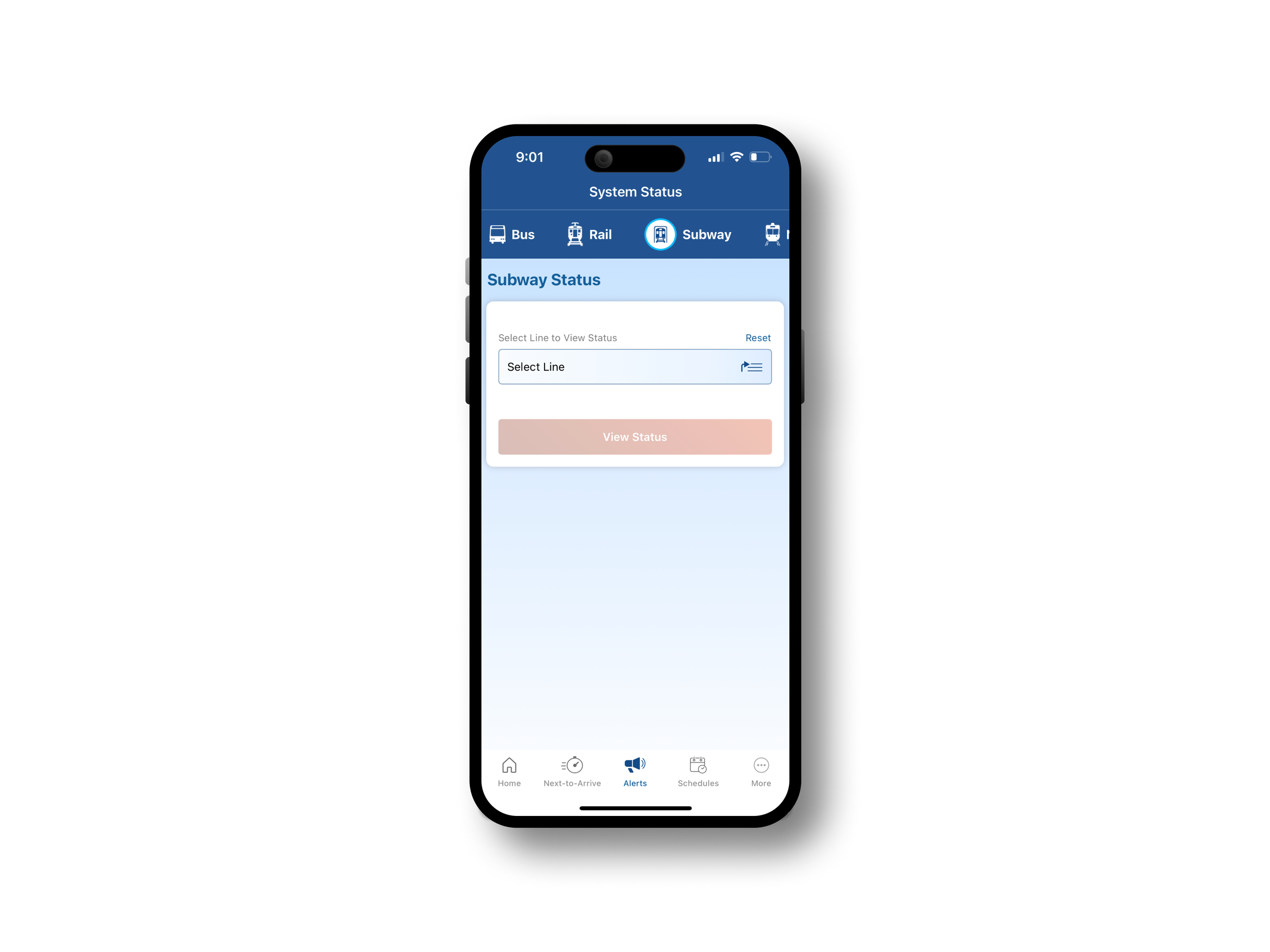
Improved Alerts Dashboard
Original app
My redesign
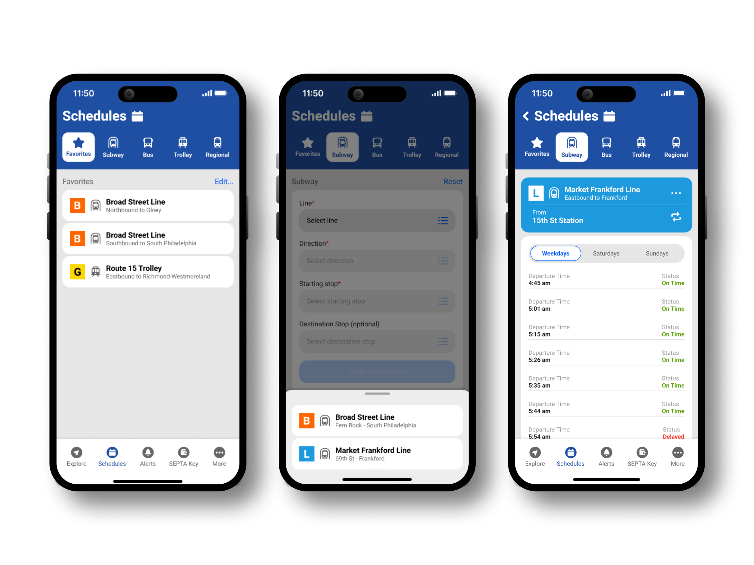
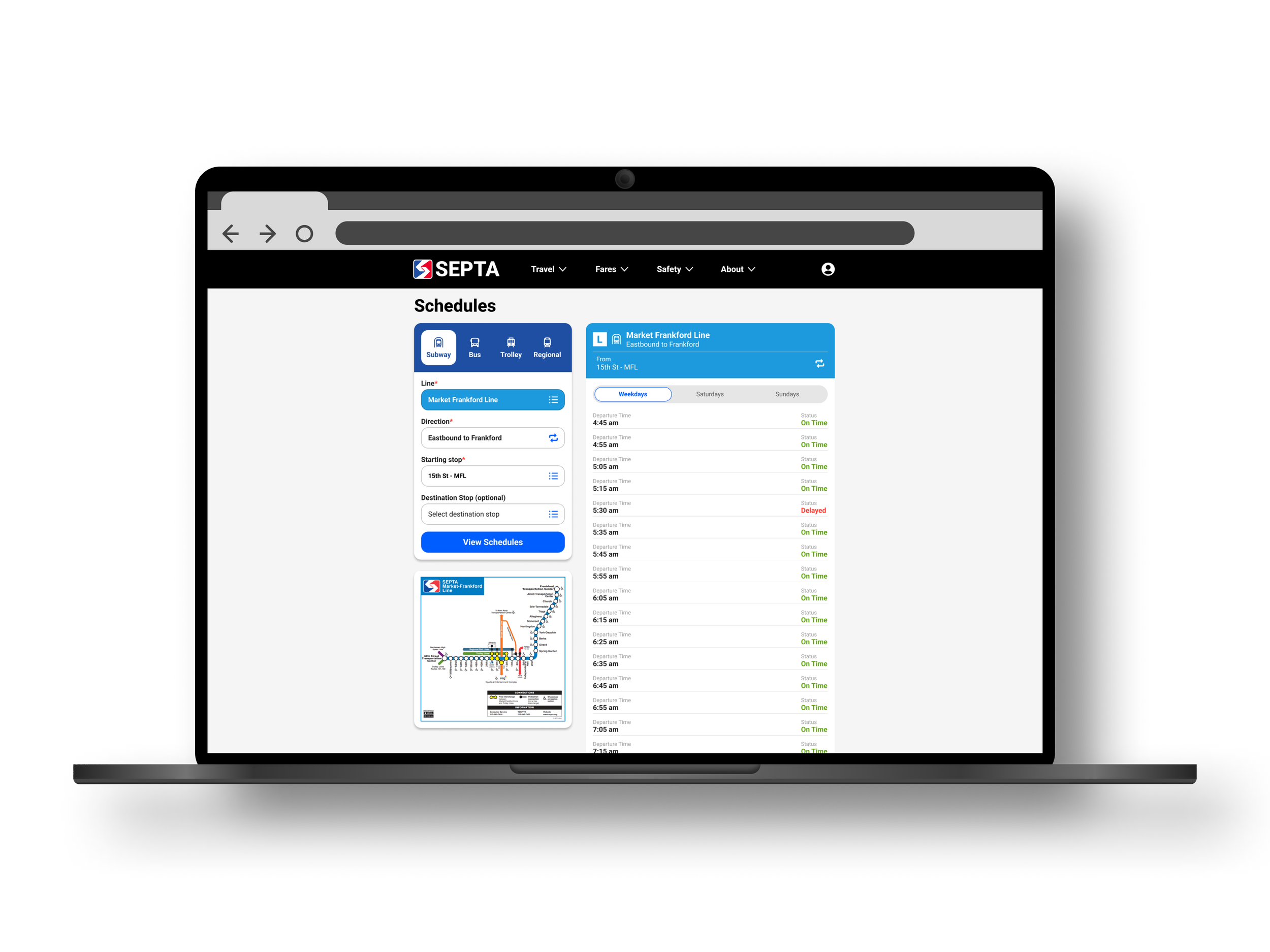
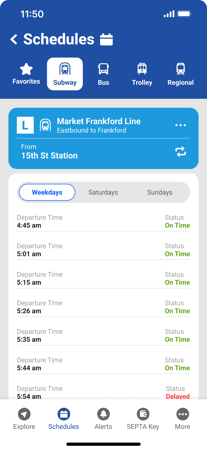
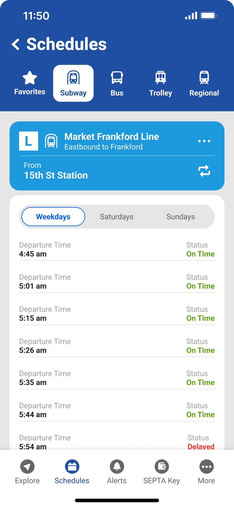
Streamlined Schedule Selection
Original app
My redesign
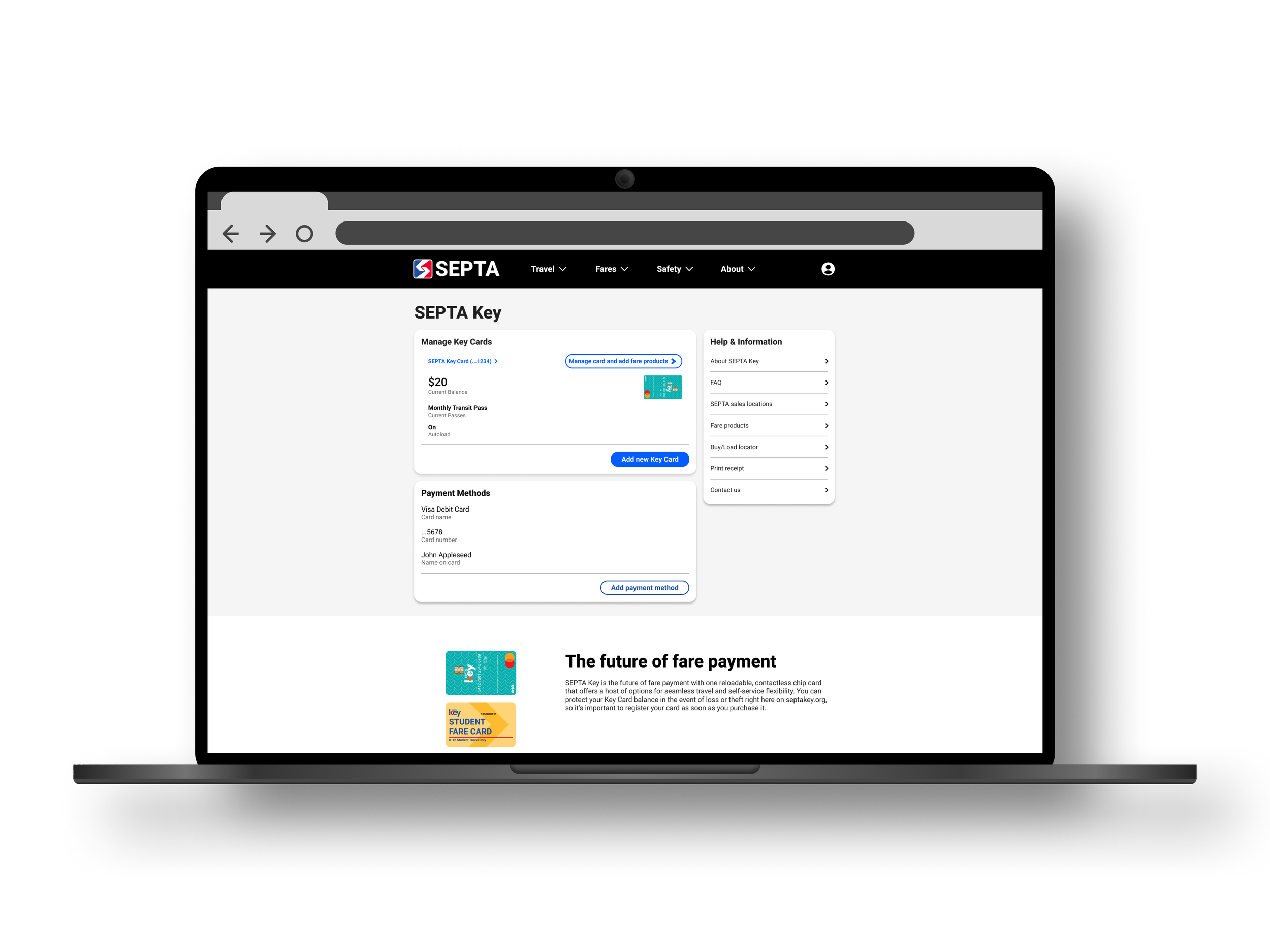
SEPTA Key management
Original app
My redesign
Key Takeaways
Scope
This project excited me from the start of the Google UX Design Certificate program. I was eager to overhaul SEPTA’s app and website but soon realized the scope was too large for one designer. Understanding that such work requires a full team, I narrowed my focus to core user flows, making the project more manageable and impactful.
Planning and workflow
Starting with the mobile app design helped establish a strong foundation for UI elements and functionality. This streamlined the website design, allowing me to efficiently adapt components using Figma’s auto layout. By reusing assets, I maintained consistency across platforms and focused on refining the user experience.
Balancing user needs with technical feasibility
A key lesson from this project was balancing user needs with technical feasibility. While users prioritized real-time updates, I recognized that implementation depended on SEPTA’s backend reliability. This underscored the importance of designing with technical constraints in mind and collaborating with engineers for realistic, user-centered solutions.

