Penn Treaty Park Website
Bringing nature and history to the digital space
Overview
Penn Treaty Park is a beautiful and historic park located along the Delaware River in the Fishtown neighborhood of Philadelphia. I worked with the Friends of Penn Treaty Park organization to design and build a new website for the park.
Problem
Upon the inception of this project, Penn Treaty Park did not have a website at all. The park’s only web presence was through a combination of Instagram posts and manual email newsletters.
Solution
Plain and simple: the park needed a website. Furthermore, as parks are spaces open to the general public, my goal was to make the website as simple and accessible as possible for people of all abilities.
Deliverables
Website prototype, logo, and live website
Role
Solo UX/UI/Web Designer
Tools
Figma, Google Sites, MailerLite, Givebutter
Timeframe
2024-2025
Project Requirements
After meeting with Friends of Penn Treaty Park to assess their goals and requirements for the website, I was happy to learn that both their ideas and my ideas for the website were in alignment.
Below is a summary of some of the requirements that we determined together:
A simple, “no frills”, design.
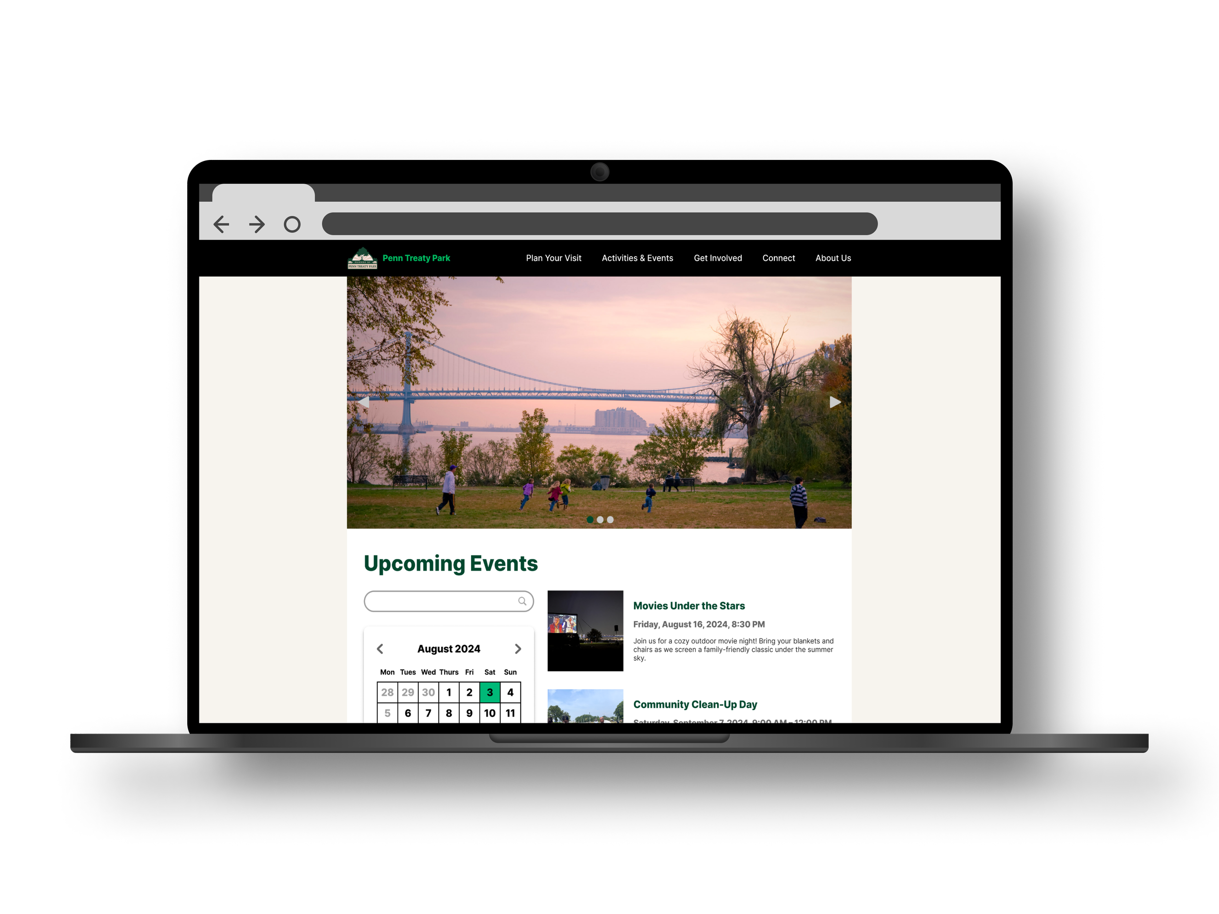
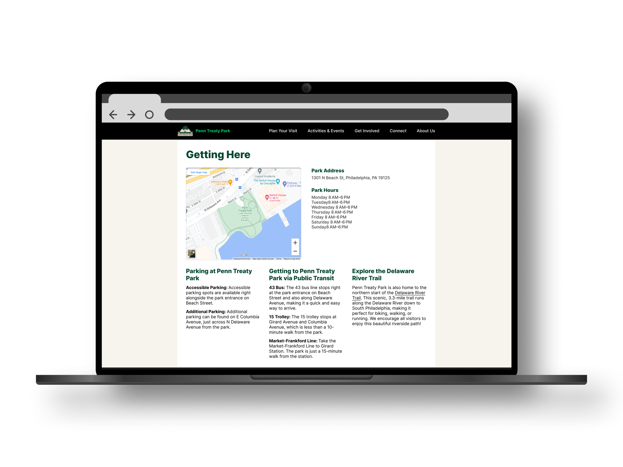
A hero carousel on the homepage, followed by clear instructions on the park’s location and hours. The main focus on the website is to provide the public with the basic information about the park.
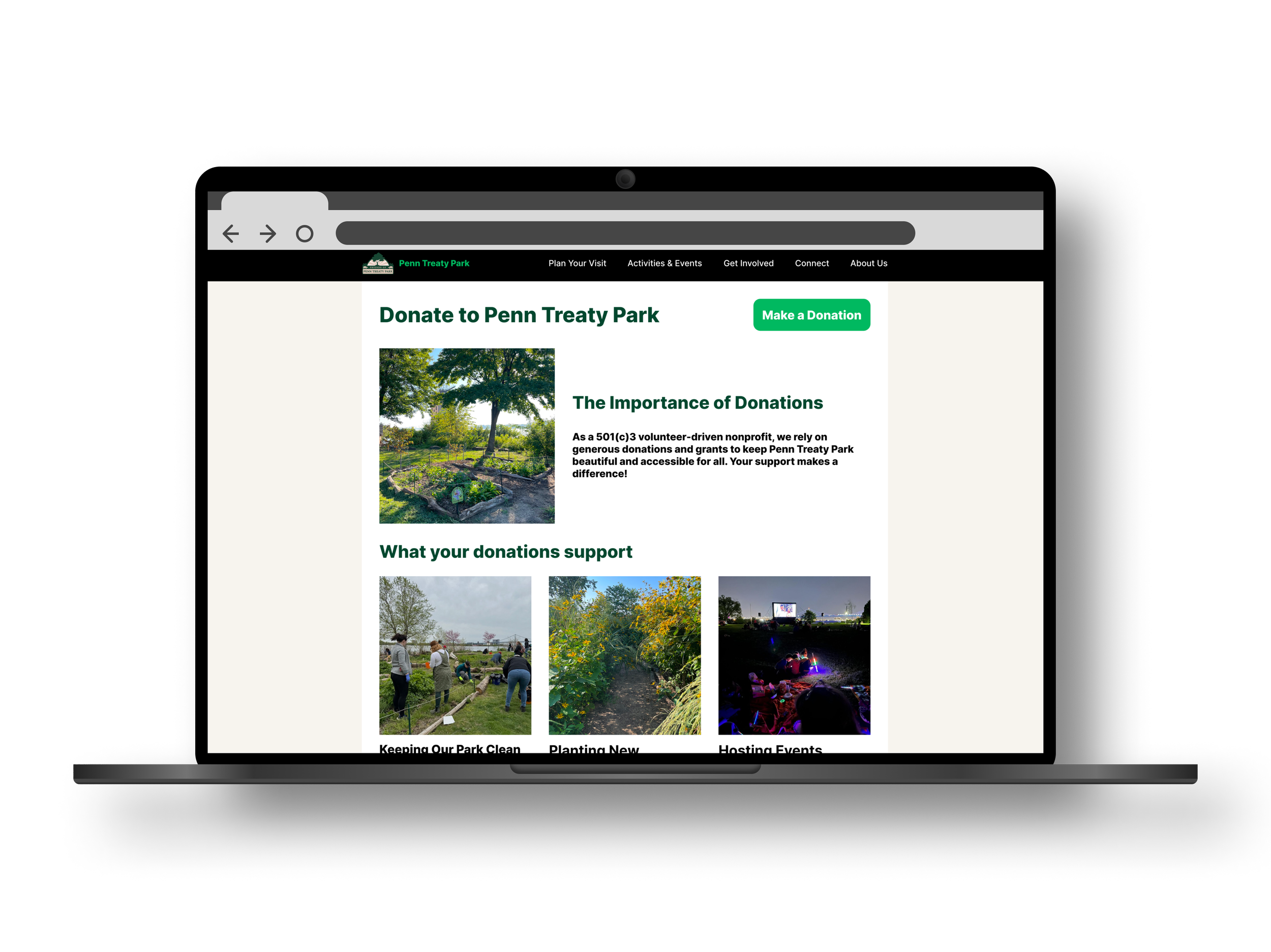
A way to accept donations.
Sign up form for the email newsletter.
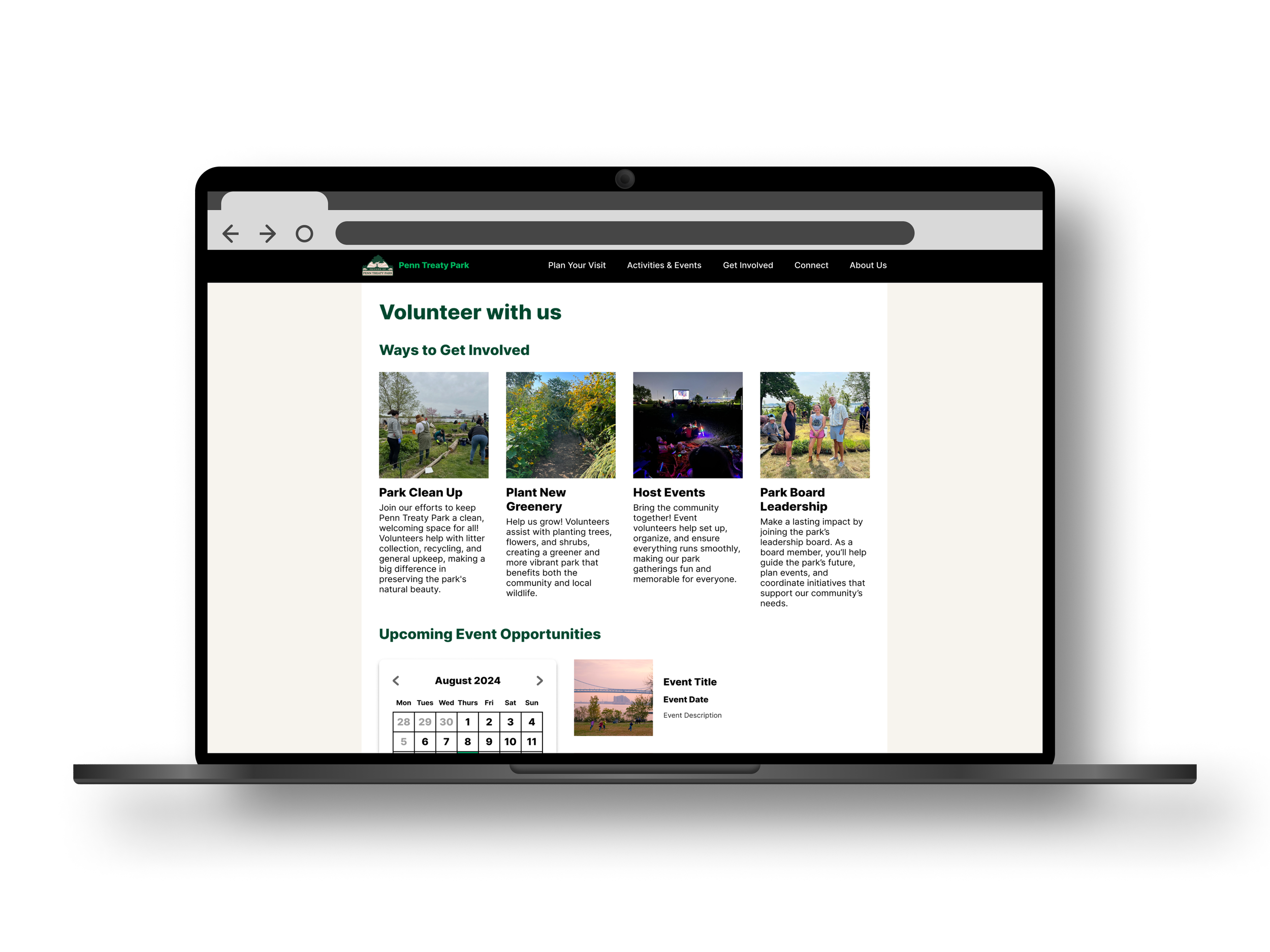
Functionality for Friends of Penn Treaty Park to maintain a calendar for public display.
A section to display the history of the park.
Use the park’s existing logo, branding, colorways, etc.
“Competitive” Analysis
Although parks are a public good and not for-profit businesses, it is still crucial to research and analyze the web presence of other parks for inspiration and direction. To conduct this research, I chose a combination of direct and indirect “competitors” that range from other Philadelphia parks, visitor center websites, to parks in other cities.
-
Direct Competitor
Pros:
Clean and simple web presence.
Logical and clear navigation of the website.
Adjusts to window resizing fairly responsively.
Cons:
A full screen pop up soliciting donations appears after a few seconds on the site.
The main type for the website is too stylized and could be more legible.
Sections of text are right aligned but should be left aligned.
Color contrast between type and background could be stronger in some areas.
Overall thoughts:
Despite my critique points outweighing the pros, I feel that the simplicity of this website provides a good foundation of inspiration for designing the Penn Treaty Park website.
-
Direct Competitor
Pros:
Bold, clean, and modern design.
Type is bold, clear, and easy to read.
Formatting and structure of webpages is well done and easy to follow.
Format of website adjusts responsively to screen resizing.
Cons:
Could be beneficial to have location information directly on the landing page, rather than having to click through to it.
Overall thoughts:
This website is a perfect example of strong web/UI design. I feel that I will be drawing inspiration from this website greatly during my design process.
-
Indirect Competitor
Pros:
A beautifully designed website.
There is an option for high contrast colors.
Cons
Need to scroll down a decent bit to get to a map. However it might be assumed that the park’s location is well known. It is also on the top navigation bar.
Overall Thoughts
-
Indirect Competitor
Pros:
Perfectly laid out design.
Clear “Start Here” option at the top navigation bar.
Hero content features an interesting video to solicit engagement.
Cons:
Overall Thoughts
Website Information Architecture
This chart illustrates information architecture I built out to structure the website with. As a park website does not require a ton of complexity, the information architecture is fairly simple and straight forward.
The organization of the final website wound up varying from the initial plan as it was built out.
Initial Designs
Hand Drawn Wireframes
Low Fidelity Digital Wireframes
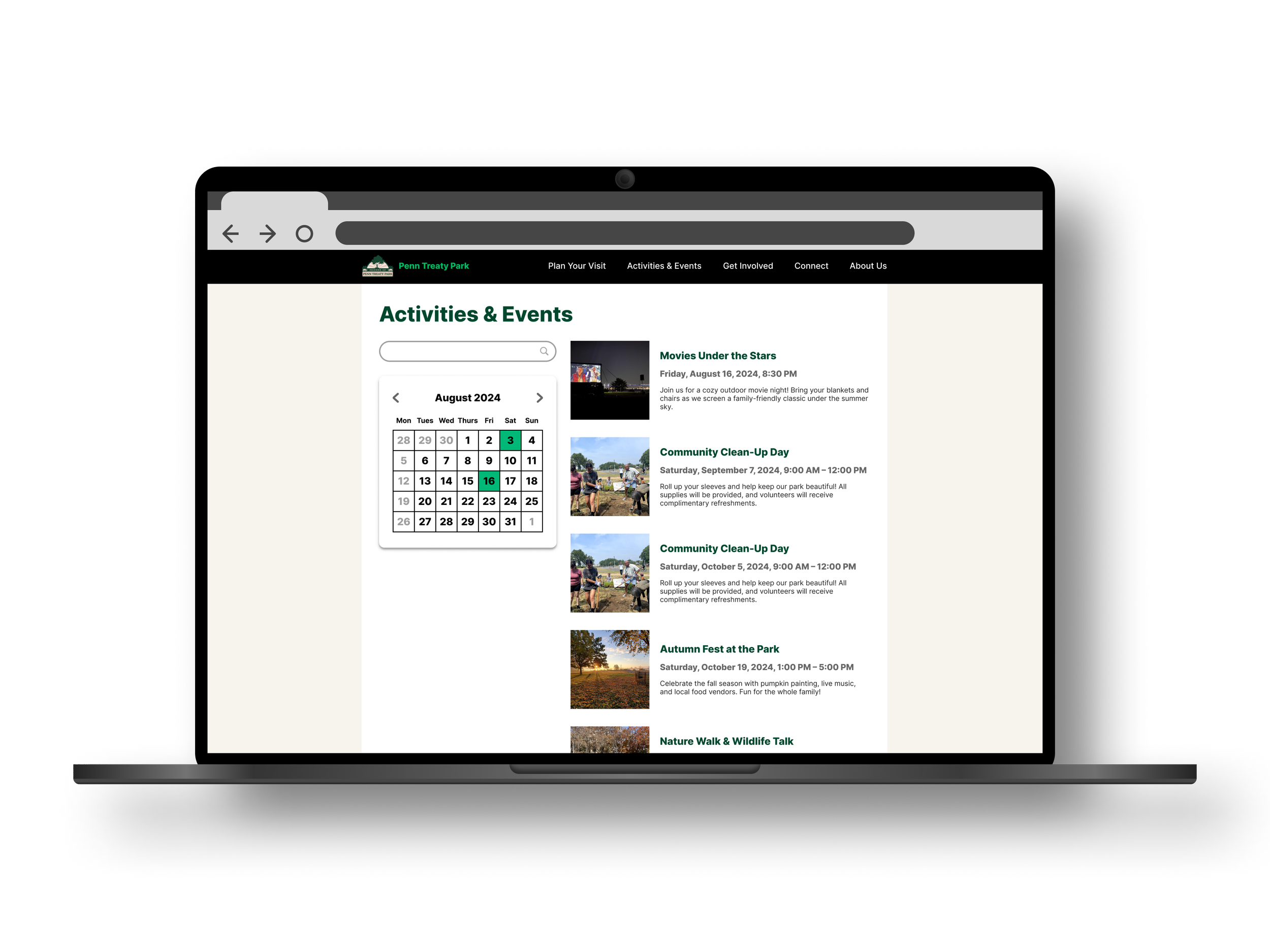
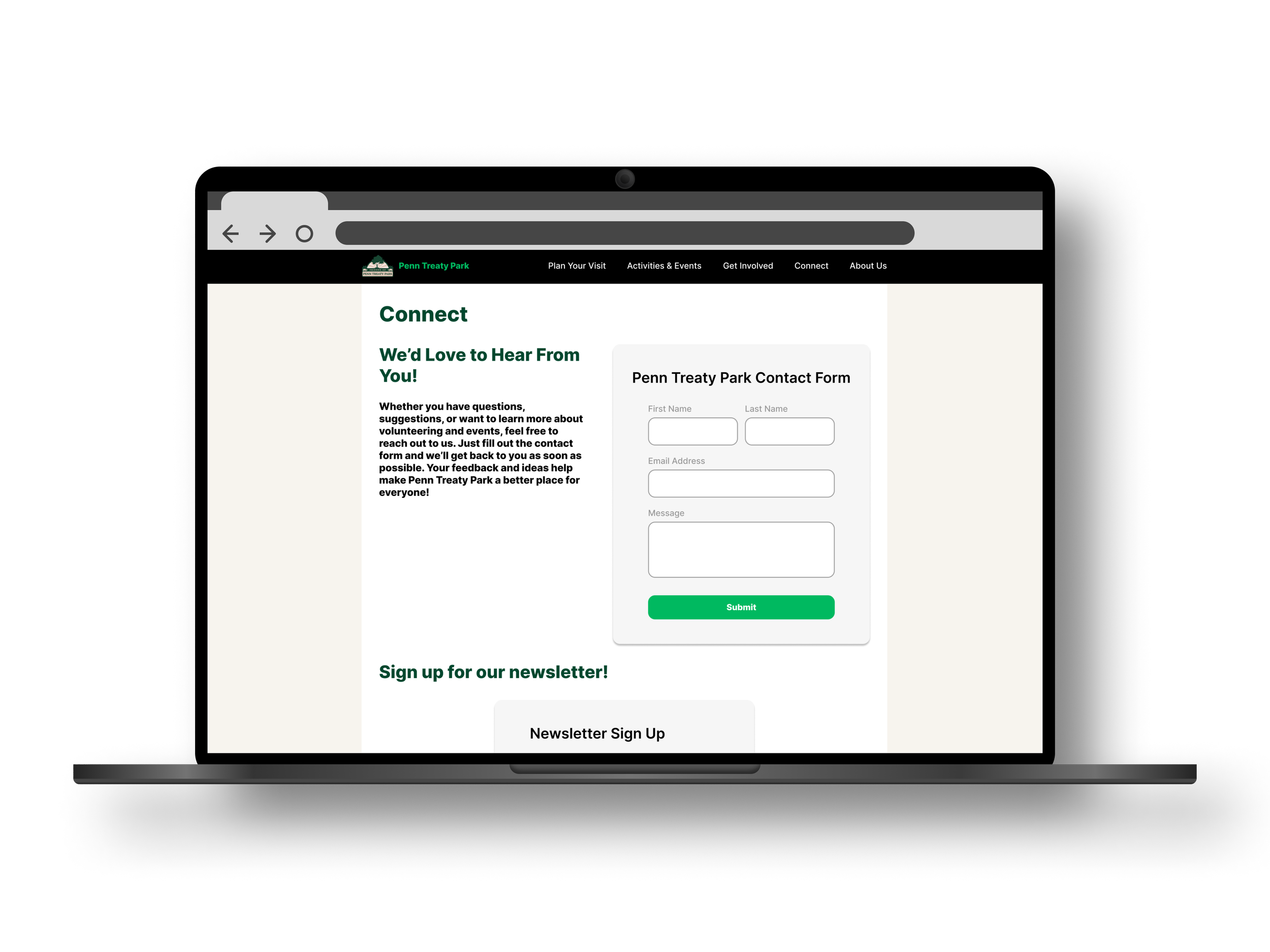
High Fidelity Mockups
Logo Refresh
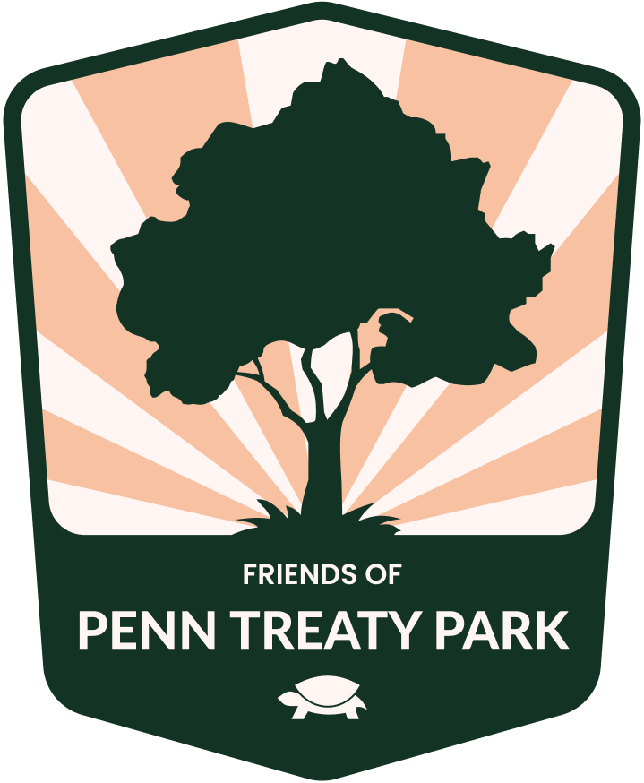
Although I consider myself more of a UX designer rather than a branding designer, the original high quality files of the park’s logo were lost. As a result, I decided to remake it myself to avoid using low quality versions of the logo pulled from the park’s Facebook and Instagram pages.
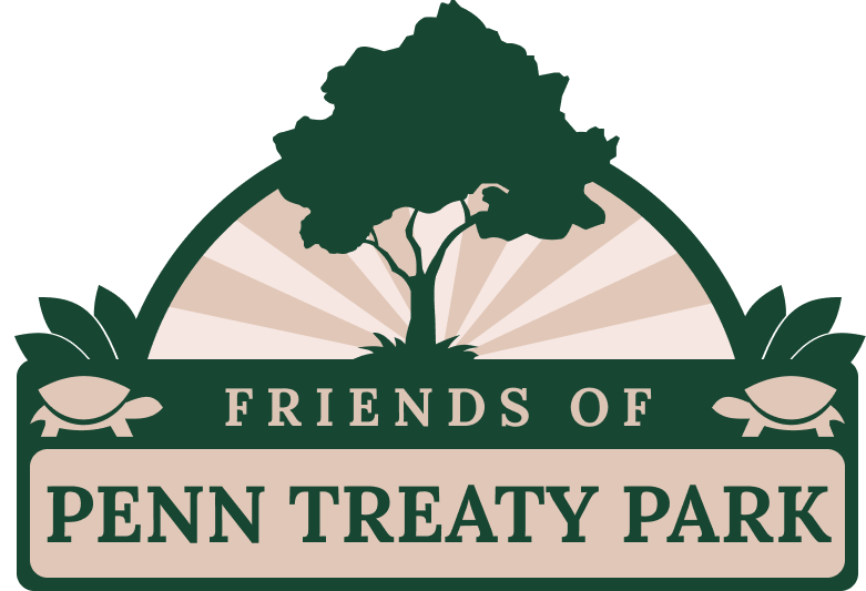
I decided to have a little fun with it and pitched a few variations of the logo, but we wound up going with something more similar to the existing logo for consistency.
Old low resolution logo
Alternative logo design
Final logo design
Potential banner designs for email newsletters
Challenges and Constraints
Platform Limitations and Budget Considerations
My initial pitch to the Friends of Penn Treaty Park board was a Squarespace site, as I didn’t have the ability to both design and develop a website from scratch. While they approved my Figma designs, budget constraints made a paid platform unrealistic. Instead, we opted for Google Sites, a free alternative that another park volunteer had experience using.
While Google Sites is user-friendly and cost-effective, it comes with significant design limitations. Customizing spacing, margins, button sizes, and navigation elements was restrictive, and embedding external features like Givebutter donations and MailerLite signups required workarounds. Additionally, while Google Sites ensures responsiveness across devices, it doesn’t allow for specific mobile optimizations, limiting control over the user experience on smaller screens.
Maintaining Continuity in a Volunteer-Run Organization
As the Friends of Penn Treaty Park organization is purely volunteer-based, the membership naturally shrinks and grows over time. As a result, it was a challenge to consolidate and secure access to various existing systems of the park’s including the domain ownership and email account. Going forward, I hope to make a plan to utilize the Google Workspaces to keep the nonprofit organized and prepared for whomever leaves or joins.
Additionally, marketing assets, such as existing typefaces, colors, and even the park’s logo, were not maintained as the park’s leadership has transitioned over the years. As a result, I decided to attempt to remake the park’s logo to use on the website and newsletters.
Key Takeaways
My First Client Project
As I develop my skills as a UX designer, this was my first experience designing for a real client rather than just within the structured environment of the Google UX Certificate program. This project introduced new challenges, including navigating client expectations, adapting to budget constraints, and making design decisions based on both user needs and organizational limitations. I also had to balance creative control with practicality, ensuring my designs were not only visually appealing but also feasible within the constraints of Google Sites.
Additionally, this experience reinforced the importance of clear communication, especially when working with a volunteer-led organization where roles and responsibilities shift over time. I learned how to advocate for design choices while remaining flexible, as well as how to collaborate with stakeholders who may not have a background in UX. Moving forward, I’ll take these lessons with me as I continue working on real-world projects, improving both my technical skills and my ability to navigate the complexities of working with clients.
Going Forward
While the website is live, there are still opportunities to improve the park’s digital presence and internal organization. I hope to assist the Friends of Penn Treaty Park in transitioning to Google Workspace, which would provide better account security and continuity as volunteers change. Additionally, I’d like to streamline marketing efforts by creating newsletter templates, park signage with QR codes for donations and engagement, and optimize SEO implementation. These ideas are still in the early stages, but I hope to continue working with the board to explore how they can best support the park’s long-term sustainability.


